OPEN TO ROLES · 2026
ANNA ROGOTSKA · AI-NATIVE PRODUCT DESIGNER & FRONT-END ENGINEER · LISBON

Product designer and front-end engineer in Lisbon. I've led design on live, regulated products alongside engineering teams — and now I design and build entire front-ends myself, design to shipped code, in Claude Code and Claude Design. React, Next.js, TypeScript, Tailwind.

Selected work

What I've shipped.

All work →
Featured

A recent build.

Open to product design + engineering roles.

I'm looking for a senior product design or design-engineering role, from 2026 — remote or Lisbon-based. Always glad to talk.

Get in touch
Selected work · 2019–2026

End-to-end design and front-end across fintech, crypto, EdTech, and AI tooling — research to shipped product.

Veyrun

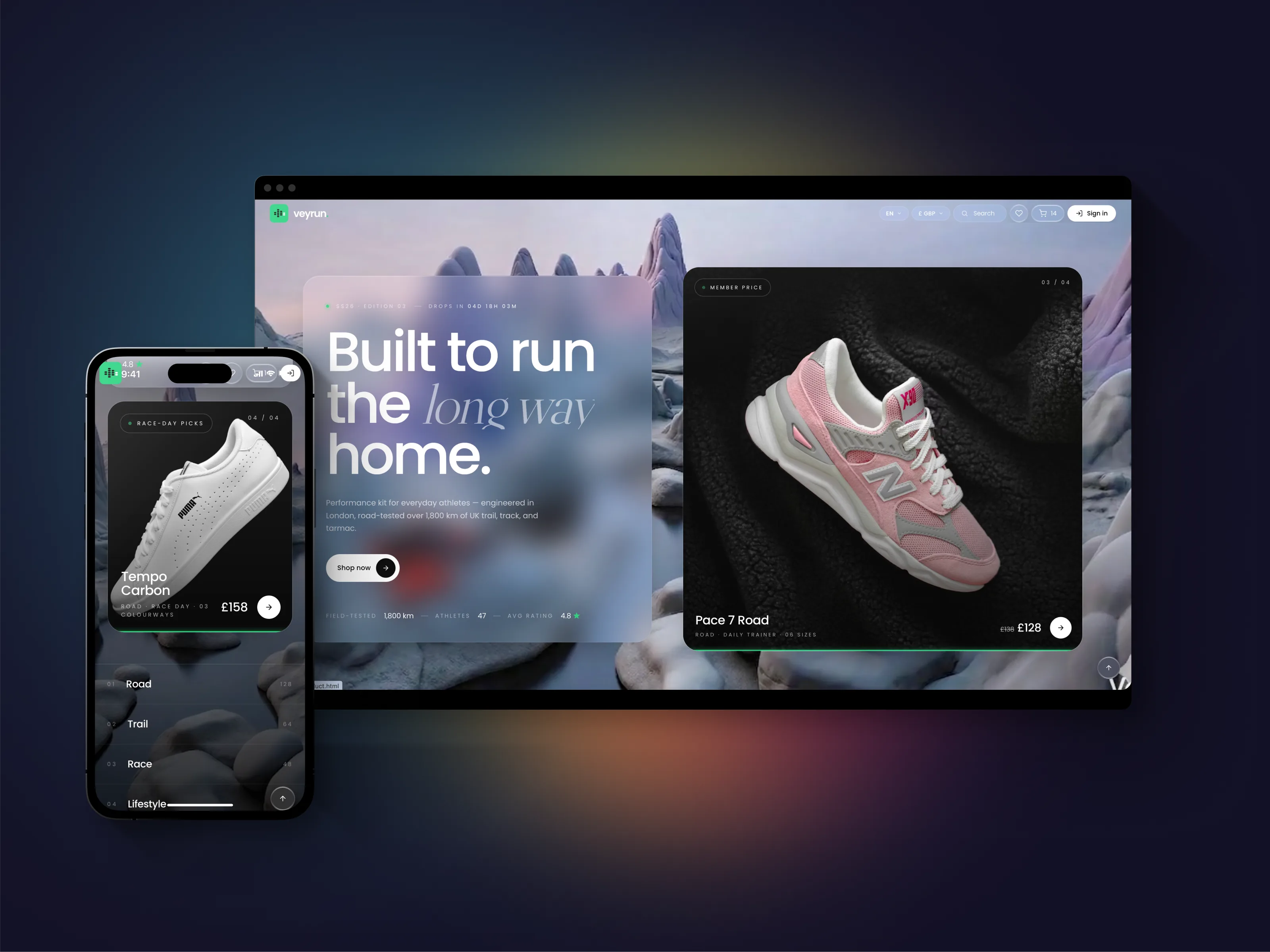
A digital-first running brand for the UK and EU performance market. Twenty-six React routes — brand, storefront, mock-backed checkout, and an owner-facing admin — designed and shipped solo in one week, paired with Claude Code. 15 unit tests and 11 Playwright specs, with the build gated on green.

◆ BUILT IN CLAUDE DESIGN + CLAUDE CODE · NO FIGMA

Solo design + build

Designed in Claude Code and Claude Design. Front-end built by me, end-to-end.

I design directly in the codebase — no Figma-to-engineer hand-off, no translation loss between the mock and the thing that ships. Paired with Claude Code, the whole loop from art direction to shipped front-end compresses into one person and roughly a quarter of the usual time. Brand, every page, every interaction, every line of front-end — built in one run.

I own design and testing. The backend is owned by a backend engineer; that's the layer I'm learning next.

The Challenge

The brief was simple, which made it dangerous: make it feel like an art-direction site and perform like a tight React build — for a fictitious UK running label — and ship it fast.

Two instincts pull against each other there. Art-direction sites invite indulgence; performance builds punish it. So the real question was never "can I make it pretty" or "can I make it fast." It was where to spend the budget so the thing reads as editorial without the front-end paying for it.

Constraints I set going in:

  • 26 routes across the customer journey, an editorial layer, and admin
  • 7 days, solo, paired with Claude Code
  • Zero external designers, agencies, or off-the-shelf stack components

Understanding the Audience

I wrote this before touching a layout.

The buyer is design-aware, 28–45, running four to six sessions a week — the sub-3 marathon hopeful, the person who reads shoe reviews before they read the news. They follow Believe in the Run and RunningShoeGeeks. They've seen every hero carousel and every soft-focus trail shot, and they tune them out on sight.

So the design question became concrete: what is the minimum a runner needs to decide? The answer was three numbers — drop (mm), stack height, and plate stiffness. Everything on a product page bends toward surfacing those fast and then getting out of the way. The home page earns attention once; the catalogue is the real shop, so it opens fast and lays the spec bare.

The Idea

One idea, held everywhere: liquid glass over a single green pulse.

Glass surfaces layered on soft 3D product renders — backdrop-filter blur with saturation, glass-on-glass depth, subtle inner gradients. The language is borrowed from Apple's visionOS but warmed with editorial type, so it doesn't read as cold OS chrome. Space Grotesk carries spec and navigation. The green is the one accent, used as a pulse rather than a fill — it signals without shouting.

I prototyped the glass in twelve variants directly in code, testing blur depth and inner-border opacity as "premium" versus "uncertain." That line is narrow, and it's only visible in the browser — in motion, against real product shots.

Building the system

The backend is owned by a backend engineer. I own all design and all testing, and I build on a shared architecture my team and I developed together — the same provider tree, routing rules, and file-size discipline behind every project — so everything here starts from a proven foundation, not a blank page.

The product is barely an interface — it's a small system. One header, one canonical footer, one shared product card, and every component built to earn its place on more than one page.

Three locales made the gate (EN / DE / ES), with a live currency switch. EUR and GBP never auto-convert. Layout holds at 360px with zero horizontal scroll.

The whole thing runs on our fifteen-rule ARCHITECTURE.md — the ruleset we converged on as a team after I authored the architecture solo on the first projects. I held to it: break a rule, and either I fixed the page or we rewrote the rule. Never both at once.

React 18 TypeScript Vite react-router 7 Tailwind v4 Lingui Zod axios Vitest Playwright

Effective execution

Five reusable patterns do the heavy lifting — each defined in exactly one place, then propagated everywhere:

  • Category-aware URLs — one template drives every listing.
  • Auto-rotating hero — pause on hover, advance on click, progress bar mapped to time.
  • Live drop countdown + roll-ups — real-time, with no layout shift when the number changes.
  • Editorial motion — spec-led reveals on headlines, intersection-observer driven, reduced on mobile and honouring prefers-reduced-motion.
  • Image-fallback observer — global, so a missing product shot degrades to a placeholder instead of a broken frame. Zero "missing image" cards across the build.

How Claude paired in

One week solo wouldn't have been possible without a pair. My toolchain is Claude Design and Claude Code, run through Agent Skills — Anthropic's and custom ones I've written — so the process itself is repeatable, not improvised project to project.

I described the system in plain English; Claude spun up the scaffolding. I owned the brand, the type system, the layout, and all twenty-six route compositions — every design decision, every line of copy, every product call, and the test suite.

One rule held the whole time: never paste a result into the project without reading it first. If I didn't understand a thing, I rewrote it in my own voice before it shipped. The codebase is mine, not the model's.

Shipping the brand

Seven days, four phases:

  • Days 1–2 — Brand & system. Logo, palette, type pairing, glass tokens, the core component set.
  • Days 3–4 — Storefront. Home, hero rotation, catalogue, product detail, search.
  • Day 5 — Commerce & auth. Cart, mock-backed checkout, account, order history.
  • Days 6–7 — Admin & polish. Owner admin, motion pass, accessibility, test suite green.
CASE · E-COMMERCE · EDITORIAL SOLO DESIGN + FRONT-END 2 WEEKS · 22 SCREENS · 68 E2E TESTS NIKO TECHNOLOGIES · 2026
◆ BUILT IN CLAUDE DESIGN + CLAUDE CODE · NO FIGMA

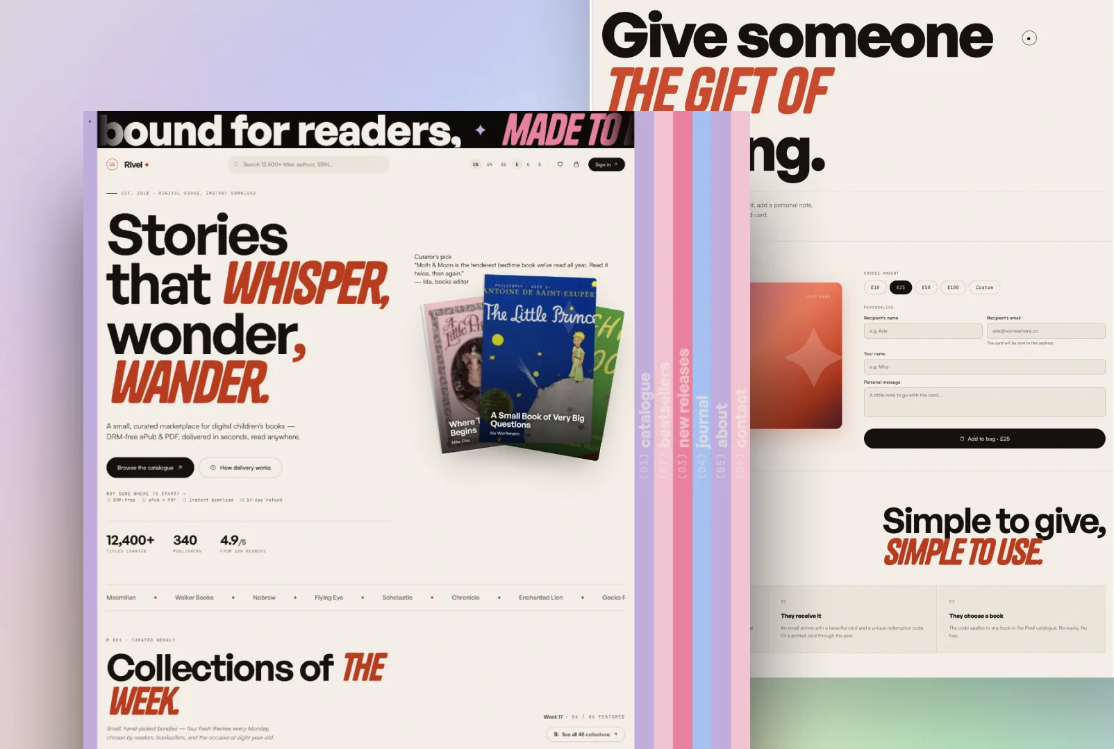
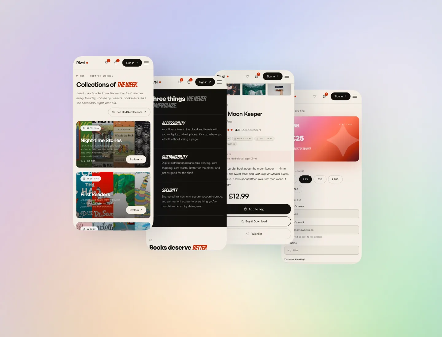
An editorial digital bookshop for children's literature. Twenty-two screens and 68 end-to-end tests — brand designed, front-end built, and a working SPA shipped solo in a week and a half, then handed to one backend developer. Made in Claude Design and Claude Code, covered with Playwright across Chromium, Pixel 5, and iPhone 13.
Staging · coming soon

Solo design + build + tests

Designed in Claude Design. Built in Claude Code. Tested with Playwright. Handed off as a working SPA.

No Figma. I design in the codebase, so there's no translation loss between the brand and the build — what I draw is what ships. I build on a shared architecture my team and I developed together — a stack and a 15-rule ruleset we converged on, after I authored the architecture solo on the earlier projects — and own the design, the entire front-end, the copy, and the test suite on top of it. One backend developer owns the data layer — that's the layer I'm learning next.

The problem

A children's-literature bookshop has a split audience and a split job: parents buy, children are the reason. The store has to read as editorial — closer to a magazine than a catalogue — without losing the plumbing a real shop needs underneath: search, filters, cart, checkout, account.

So the design question was where the editorial voice earns its keep, and where it has to step aside for the boring, reliable mechanics of buying a book.

Catalogue — find a book, fast

The catalogue is the real shop, so it opens fast and filters hard. One template drives every listing — filter by age, theme, and language, read straight from the URL, so any filtered view is a shareable, bookmarkable link. Search returns covers and copy in one place; lazy-loaded covers keep the grid quick even when the catalogue runs long.

Book detail — flip before you pay

Every book gets the editorial treatment: sample spreads, reader age, theme, and language up front, and a clear path to add it to the cart without making anyone wade through marketing copy first. The decision is parent-led, so the page earns trust before it asks for anything.

Rivel — book detail page with sample spreads

Collections — the editorial layer

Collections are the magazine inside the shop: hand-picked, themed groupings refreshed on a cadence, each with its own landing page and voice. This is where Rivel stops feeling like a store and starts feeling like something you'd browse on a slow morning.

STACK
React 18 TypeScript Vite 6 React Router v7 Tailwind v4 Lingui v5 Zod Axios GSAP 3 + CustomEase Playwright FingerprintJS Stripe

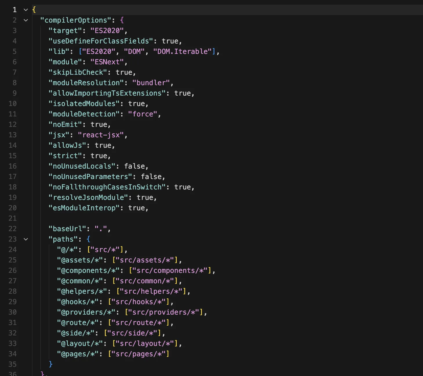
SPA built on React Router v7 with strict architectural rules. Single ApiProvider.api<T>(url, config, schema) HTTP entry validates every response with Zod. Three locales (en/de/es) wired through Lingui, ~900 source messages. Role-based routes split into guestRoutes, userRoutes, adminRoutes in a single routes.tsx, driven by useSession().getRoleFromToken(). Mock-backed front-end: no VITE_API_URL falls back to mock-data.ts, which means the whole product runs and is testable without a backend.

Built like a system, not a website.

The visible product is the storefront. The invisible product is the 15-rule architecture I built it on — the shared template my team and I developed, set before the first screen, every rule written down, so the front-end began from a known foundation, not a blank page.

22
Screens
14
Providers
900+
i18n strings
3
Locales
68
E2E tests
149
Max LOC / file

The page-transition is the brand.

The signature isn't a logo — it's a transition. The navigation itself becomes the curtain between pages, and that single motion is what people remember about Rivel. Not the wordmark, not the colour. The way it moves.

The build log.

A week and a half, four phases, one designer. Architecture-first — the rules were set before the screens, so reworking a page late was a composition change, not a debate.

SHIP TIMELINE
PHASE 1

Brand & system

Logo, palette (cream, sage, blush, ink), type pairing, motion language. Wireframes for all 22 pages.

PHASE 2

Foundation

Vite + React + TS scaffold. Provider tree. ApiProvider with Zod-validated mock data. Role-based route splitting. Path aliases. Lingui boilerplate.

PHASE 3

Screens

22 pages across general / guest / user / admin. Cart + wishlist in localStorage. FingerprintJS for guest sessions. Stripe checkout flow.

PHASE 4

Motion + tests

Page transition, hero parallax, card tilt, preloader, custom cursor, reveal-on-scroll. 68 Playwright tests across Chromium / Pixel 5 / iPhone 13.

How I worked with Claude.

Claude Design held the visual decisions; Claude Code held the keyboard, both run through Agent Skills — Anthropic's and custom ones I've written. I drove all of it — the model is a fast pair, not the one steering. The design calls, the brand, the copy, and the choreography were mine.

One rule held every day: read everything before it lands in the project. If I couldn't explain a line, it didn't ship until I'd rewritten it in my own voice.

Rivel — page-transition source
DAY 12 · SIX-PHASE TRANSITION · GSAP + REACT ROUTER
> ANNA
Intercept link clicks at the NavigationProvider level. Start the GSAP timeline, then call navigate() at phase 4 — not phase 1 — so the new page is mounted underneath while the sidebar is still expanded. Don't unmount the old page until phase 5.
> CLAUDE
Added a useTransitionRouter hook that wraps useNavigate, queues the navigation via a timeline callback, and exposes isTransitioning. Routes now render with a 1-frame double-mount during phases 4–5 — mounted but invisible behind the curtain. Edge case: if a transition is interrupted by a second click, the timeline kills itself and starts a new one. Tested at __e2e__/transition.spec.ts.
> ANNA
Good. Now lock scroll during the transition and restore the new page's scroll position at phase 6, not phase 4.

What shipped.

Handed to the backend developer at the end of the week and a half: a working SPA — every screen, every transition, the full front-end, and 68 Playwright specs across Chromium, Pixel 5, and iPhone 13 gating the build. The data layer is his; the interface is mine.

I owned
Brand and visual language. IA for 22 routes. The 15 architecture rules. Animation choreography (transition, tilt, parallax, preloader, custom cursor). Component library and provider tree. Stripe checkout flow. 900+ source strings across en / de / es. 68 Playwright tests across Chromium + Pixel 5 + iPhone 13 WebKit.
Paired with Claude
Claude Design for layout exploration and copy iteration. Claude Code for GSAP timeline boilerplate, the React Router transition hook, Zod schema generation from mock data, Playwright scaffolds, and Lingui catalogue tooling. Every decision reviewed and signed off by me before commit.
Handed off to
One backend developer received the SPA at the end of the build: typed API contract, Zod-validated response shapes, mock data as documentation, full E2E suite as acceptance criteria. No design hand-off doc — the codebase itself is the spec.
Where I'm headed
Rivel is the closest I've come to shipping a product end-to-end alone. Next step is the backend layer — I want to own the full delivery, not just the front half. The architecture template, the mock-first discipline, and the test coverage are the runway I'm building toward that.

What this build taught me.

Three takeaways that hold true for this workflow:

DESIGNING IN CODE

Kills the hand-off tax. There's no "the build doesn't match the mock" conversation, because the mock is the build.

ARCHITECTURE BEFORE SCREENS

With the rules set before the first screen, late changes were cheap — I was recomposing, not renegotiating.

FAST PAIR, ONE DRIVER

Claude moves quickly; my job was to own every decision it accelerated, not to outsource the judgement.

CASE · EDTECH · TWO-SIDED MARKETPLACE LEAD DESIGNER + FULL FRONT-END 3 WEEKS · 28 FRAMES · 8-COMPONENT ANIMATION LIBRARY NIKO TECHNOLOGIES · 2025
◆ BUILT IN CLAUDE CODE + FIGMA

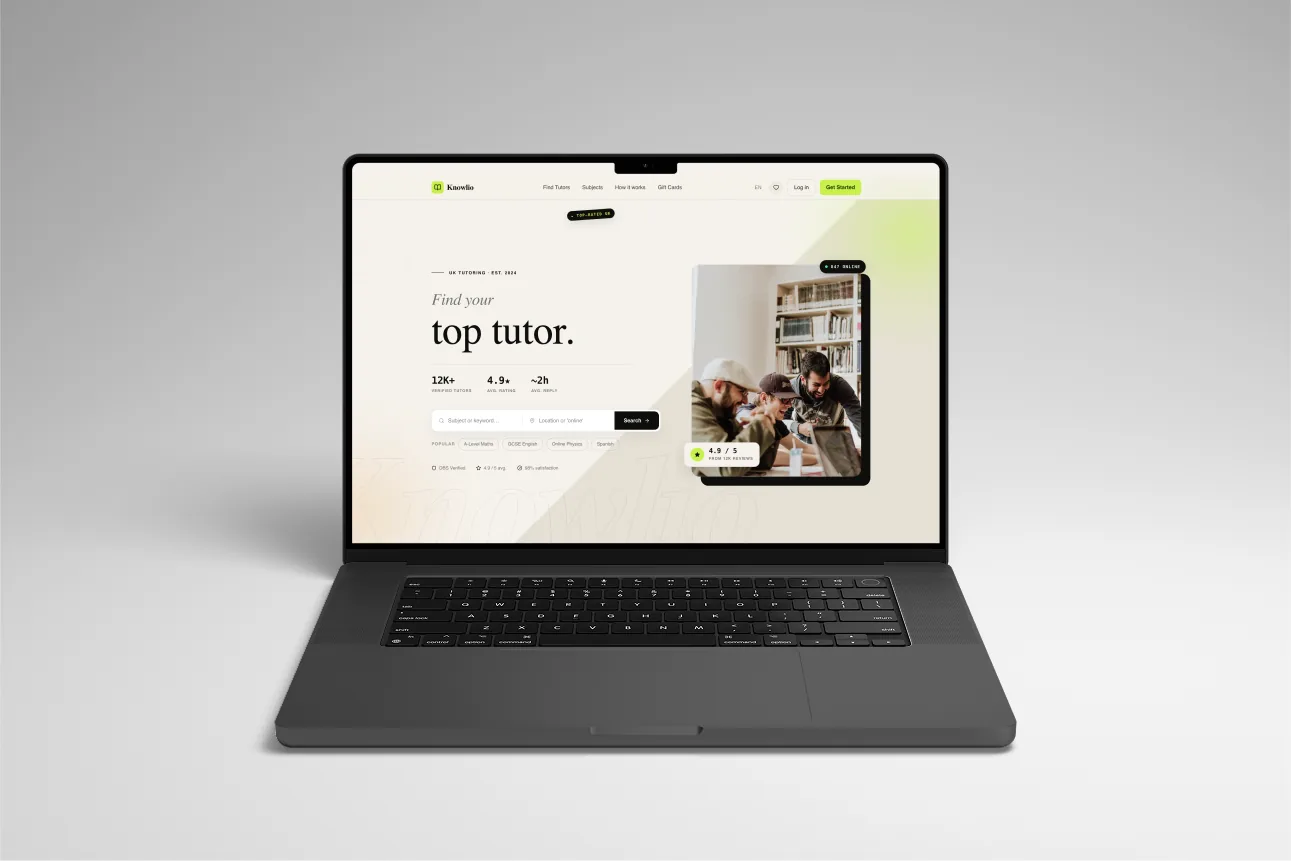
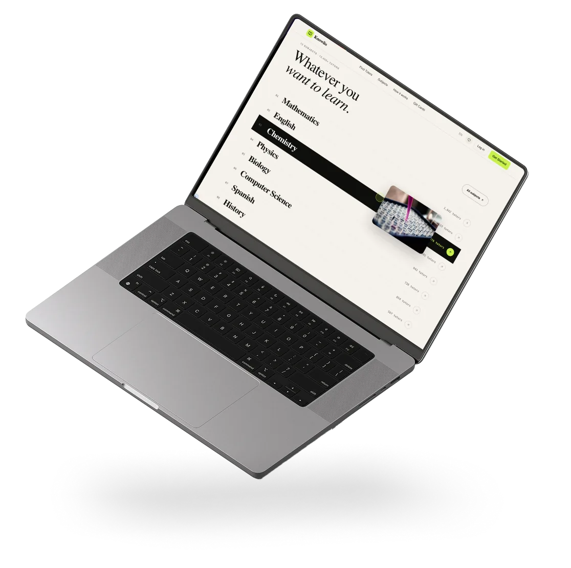
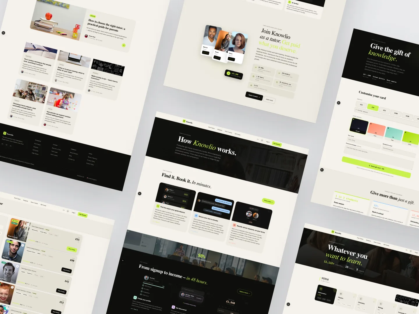
A tutor marketplace for the UK that reads like an editorial magazine, not a SaaS table. Brand, design system, an eight-component animation library, and the entire front-end — designed solo and built paired with one backend engineer in a week and a half. Made in Claude Design and Claude Code.
Staging · coming soon

Solo design + lead front-end

I owned the brand, the design system, the entire Next.js 16 front-end, and the typed contract the backend built against.

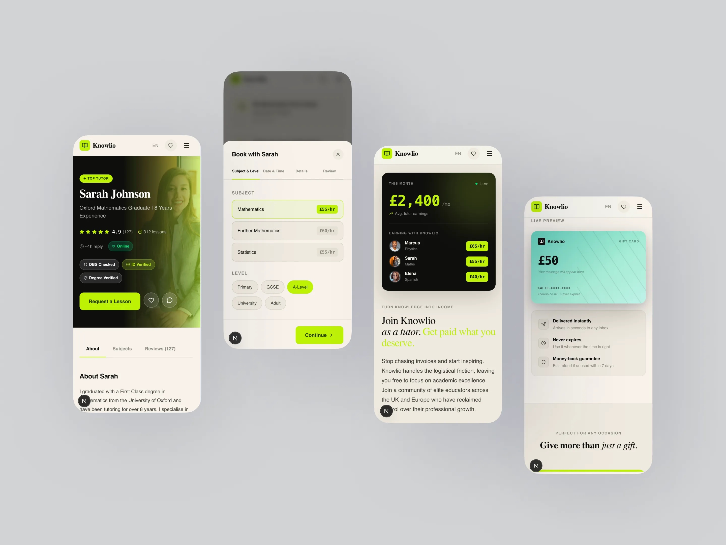
I designed Knowlio across 28 Figma frames — marketing, catalogue, tutor profile, the 4-step booking modal, both dashboards — wrote the design tokens and the eight-component animation library spec-to-code, and mirrored the design 1:1 in the build. I build on a shared architecture my team and I developed together — a stack and ruleset we converged on, after I authored the architecture solo on the earlier projects — and own the brand, the design system, the entire Next.js 16 front-end, and the typed contract (shared Zod schemas) I hand the backend as the spec. One backend engineer owns the data layer. The backend is the layer I'm learning to own next.

The problem

UK tutoring sites sell trust badly. They compress a tutor — their teaching, their results, the reason a parent would hand them an hour with their child — into a search-results row: a price, a star rating, a "book now." It reads like a spreadsheet of strangers. The category feels crowded and interchangeable precisely because every site looks the same.

I pulled apart six of them — Preply, italki, Tutorful, MyTutor, Superprof, Wyzant — and the same three levers surfaced as the things parents actually decide on: DBS verification, response time, and lesson packs. Those became the trust signals the whole editorial direction pivots on.

Knowlio — marketplace overview

The positioning — editorial, not transactional

Knowlio looks like a magazine, not a dashboard. Cream and ink, a single neon-lime accent used as a signal rather than a fill, Playfair italic for voice and an editorial type system for everything else.

The whole product runs on one tension: the editorial surface earns the trust, the transactional surface closes the booking. Every page knows which job it's doing. Where most marketplaces lead with the price, Knowlio leads with the person — and lets the mechanics arrive only once you've decided you care.

Catalogue — find a tutor

The catalogue is the real entry point, so it filters hard and loads fast. Filter by subject, level, language, and location, read straight from the URL so any filtered view is shareable. Cards stagger into the grid on scroll — motion that signals quality without slowing the search.

Tutor profile — the trust surface

This is where the marketplace earns the booking. DBS verification shown with a date and reference, reviews surfaced with context, qualifications and teaching style up front. Everything on the page answers the one question a parent is actually asking: can I trust this person with an hour of my child's time?

Knowlio — tutor profile with trust signals

Booking model — a 4-step wizard

Subject & level → date & time → details → review. One decision per screen, no dead ends, live total calculation, and state held so a back-step never loses progress. The flow is deliberately boring — once someone has chosen a tutor, the job is to get out of their way.

Student dashboard — lessons & wishlist

Upcoming lessons with filtering, completed lessons with one-tap rebook, and a wishlist for tutors a student is still deciding between. The dashboard treats a booking as a relationship, not a transaction that ends at checkout — and it reads like a magazine, not a CRM.

Tutor dashboard — schedule & earnings

The supply side of a marketplace usually gets a worse interface than the demand side. Here it gets the more polished half: a weekly schedule grid with drag-to-block availability, a profile editor, and an earnings and payout view via Stripe Connect. Tutors are the supply — if their experience doesn't feel professional, the marketplace never fills.

Brand surface — supporting screens

The marketing and edge-case screens flex from the same system: error states, gift cards, the journal, about, contact. Even the empty states and the 404 stay on-brand — the editorial voice doesn't stop at the storefront.

Knowlio — supporting brand surfaces
STACK
Next.js 16 (App Router, RSC) React 19 TypeScript 5.9 Tailwind v4 Supabase (auth + DB) TanStack Query 5 Zustand 5 react-hook-form + Zod Framer Motion 12 next-intl 4 Stripe

The animation library is half the design system.

Eight components in components/animations/. Every motion choice in the product flows through one of them — no per-screen ad-hoc Framer code. The brand reads as editorial because nothing moves the way a normal SaaS moves: the cursor is a custom dot-and-ring, the hero headline scrambles through three phrases, tutor cards tilt in 3D against the mouse. prefers-reduced-motion short-circuits all of it.

01

CustomCursor

RAF-driven dot + ring with lerp 0.12, hover states for links and cards, hidden on touch devices. Sets the tone before the first interaction.

02

CardTilt

3D tilt by mouse position, perspective: 800px. Used on tutor cards and pricing tiles. prefers-reduced-motion cleanly disables it.

03

TextScramble

Matrix-style reveal that cycles random glyphs before settling on the target string. Hero headline animates between three phrases on a timer.

04

MagneticWrapper

Elements within a hover zone pull toward the cursor with springy damping. Reserved for the primary CTA so it stays a moment, not a pattern.

· PLUS · CountUp · MarqueeTicker · ScrollReveal · StaggerReveal ·

Design tokens.

Three colours, three typefaces, three easing curves, one edge-padding rhythm. Everything else in the product is a derivation — when the founder asked for a dark-mode preview late in week three, it shipped in two hours because the system was tokens, not stylesheets.

COLOR · 3 PRIMARIES
#F5F2EC Cream · surface
#0E0E0C Ink · text
#C8F04D Lime · accent
TYPE · 3 ROLES
Aa Playfair Display · Display
Aa DM Sans · Body
12K DM Mono · Numbers

Plus easing tokens (--ease-out-expo, --ease-spring, --ease-in-out-quart) and a single edge-padding variable --cx: clamp(20px, 6vw, 80px) for layout rhythm across breakpoints.

The build log.

A week and a half, paired with one backend engineer. Architecture-first. The dashboards came last on purpose — they lean on the most schema, and the marketing site had to lock the brand voice before anything depended on it.

SHIP TIMELINE
PHASE 1

Research

Competitor teardown across six platforms. Mapped both roles, their pain points, and where the category was identical to itself. DBS verification, response time, and lesson packs surfaced as the trust levers.

PHASE 2

Design

Brand, palette, type, animation-library spec. 28 Figma frames spanning marketing, catalogue, tutor profile, the 4-step booking modal, and both dashboards. Design tokens written as code before the first page shipped.

PHASE 3

Front-end · part 1

Next.js 16 App Router scaffold. Animation library shipped before any page, so every later screen inherited the brand. Marketing, catalogue, tutor profile, the 4-step booking wizard with live total. Supabase auth and tables wired alongside the backend engineer.

PHASE 4

Front-end · part 2

Both dashboards (tutor + student) with separate layouts. Stripe checkout + tutor payout flow. next-intl scaffolding. Admin views. Mobile pass across catalogue and modals. Integration testing against the backend's DBS-verification webhook and Stripe Connect.

How I worked with Claude.

Claude Design held the layout iteration on the dashboards and the booking wizard; Claude Code held the keyboard — both run through Agent Skills, Anthropic's and custom ones I've written. I drove all of it. The brand, the type, the motion language, the copy, and every product decision were mine. Claude handled the grind I delegated and reviewed: animation primitives (RAF loops, easing math), the Zod schemas shared with the backend, TanStack Query keys and cache strategy, the Stripe checkout client, next-intl scaffolding, and refactors once patterns started to repeat.

One rule held every commit: every decision was reviewed before it landed. If I couldn't explain a line, it didn't ship until I'd rewritten it in my own voice.

What shipped.

What was on staging at the end of the build:

FOR PARENTS & STUDENTS

Browse 12,000+ tutors, filter by subject and level, read verified signals (DBS, rating, response time, live availability), book single sessions or packs through a 4-step modal with live total. A student dashboard for lessons, wishlist, and settings that reads like a magazine, not a CRM.

FOR TUTORS

Onboarding with DBS upload, schedule management, profile editor, earnings and payout view via Stripe Connect. The tutor side is deliberately the more polished half of the product.

DESIGN SYSTEM

Eight-component animation library (CustomCursor, CardTilt, MagneticWrapper, TextScramble, CountUp, MarqueeTicker, ScrollReveal, StaggerReveal). Three colours, three typefaces, three easing curves. Mirrored 1:1 from design to code. Reusable across the next project.

FOR THE BACKEND PARTNER

Shared Zod schemas between client and server: one source of truth for tutor / student / lesson / payment shapes. Zero "what does the API return?" round-trips. The frontend contract was the design spec.

I owned
Brand and visual language. Research and competitor teardown across six platforms. All 28 Figma frames. Design tokens and the 8-component animation library, spec to code. The entire Next.js 16 front-end — marketing, catalogue, profile, booking modal, both dashboards, admin views, mobile pass. All copy. Front-end / backend integration on my side.
Paired with Claude
Claude Design for layout iteration on the dashboards and the booking wizard. Claude Code for animation primitives (RAF loops, easing math), Zod schemas shared with the backend, TanStack Query keys + cache strategy, Stripe checkout client, next-intl scaffolding, and refactors when patterns started to repeat. Every decision reviewed before commit.
Backend partner
Supabase schema (tutors, students, lessons, payments), server-side auth + RLS, DBS-verification webhook integration, Stripe Connect payouts, transactional email flows. Received a typed frontend contract on day 8; integrated against shared Zod schemas, not freeform JSON.
Where I'm headed
Knowlio is a clear marker of where I want to sit on a product team: lead designer who owns the front-end too, working with one backend engineer instead of three layers of hand-off. The next step is closing that last gap and owning the backend layer myself — Knowlio's Zod-shared schemas and clean role separation are the runway for that.
CASE · AI PLATFORM · MARKETING + PRODUCT LEAD DESIGNER · FIGMA NIKO TECHNOLOGIES · CLIENT · 2026

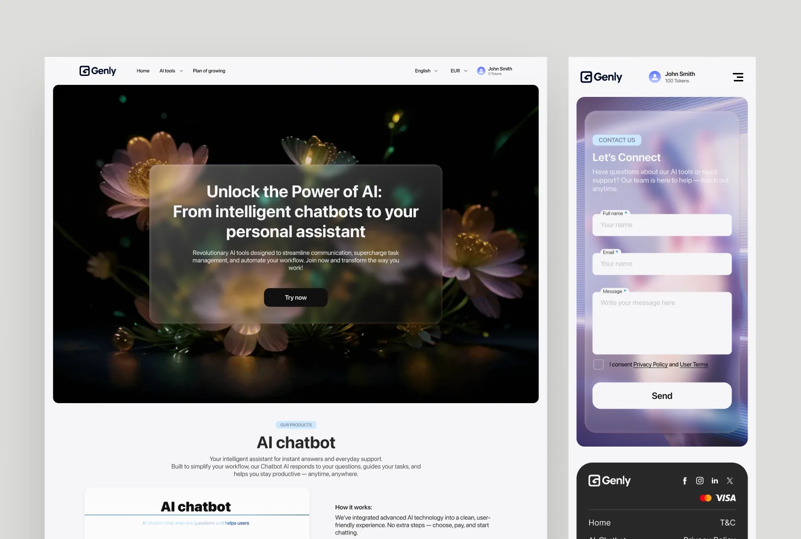
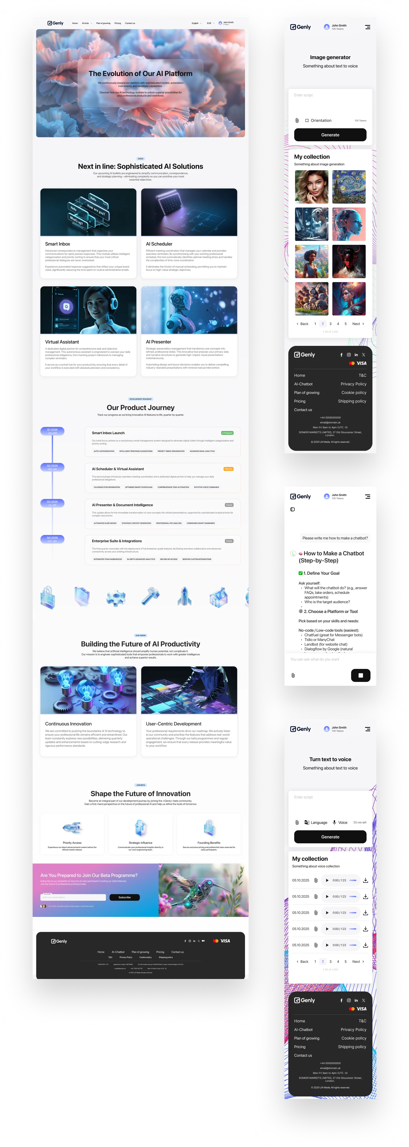
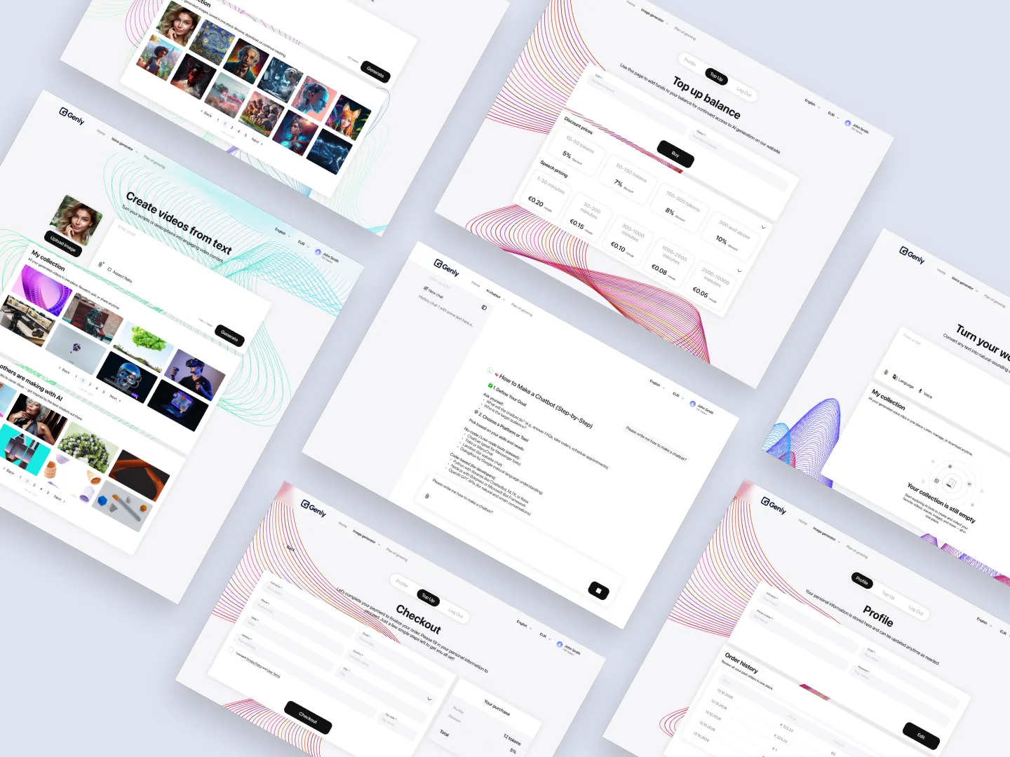
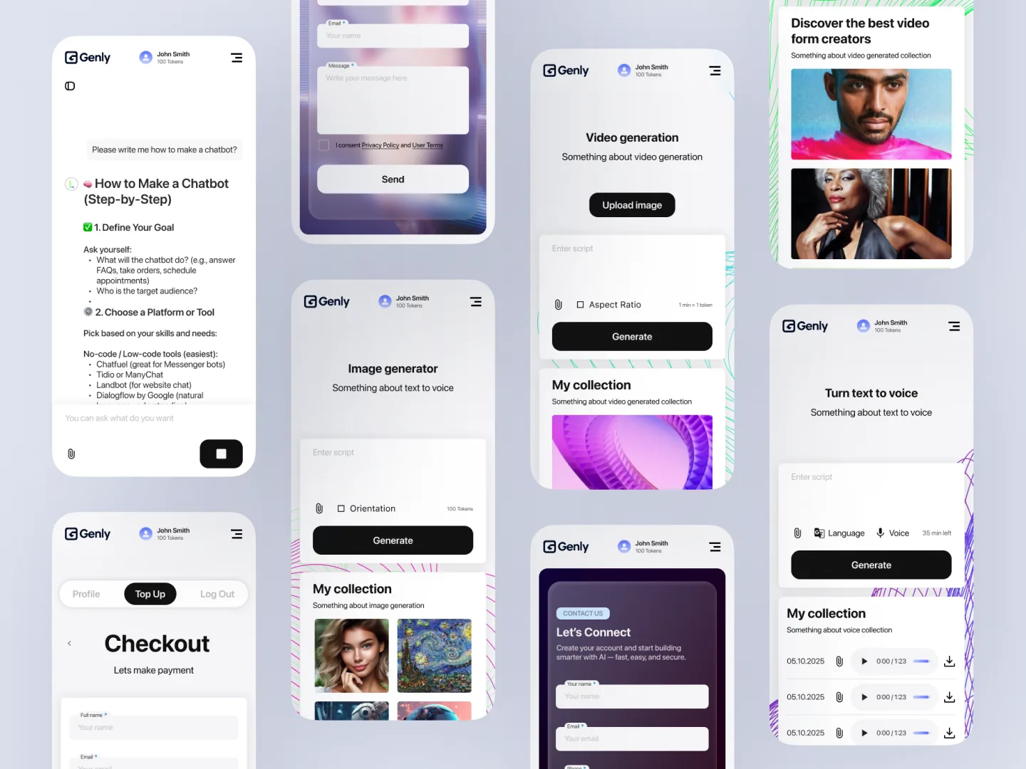
An AI platform uniting chatbot, audio, image, and video studios under one product. Designed end-to-end in Figma.

◆ BUILT FULLY IN FIGMA

The brief

The client wanted a single home for the AI tools they were rolling out — chatbot, audio studio, image studio, video studio — that read as one product rather than four. The audience: professionals automating their workflow, not "AI enthusiasts."

The bar: a marketing surface that earns trust on first scroll, multilingual (English / EUR locale switching live in nav), and a token-aware account header (a real "0 tokens" balance, not a fake counter).

Genly — hero · Unlock the power of AI

AI Chatbot · the entry surface

The chatbot is the first tool a new user touches. A glass-card mock of the chat input lives on the landing page so the user sees the product before they sign in — "AI chatbot that answers questions and helps users" with a working Ask field preview.

Genly — AI Chatbot landing preview

Studios · audio, image, video

An accordion that opens the three creation tools side-by-side with a single hero render. Audio Studio (text → audio), Image Studio (generate + explore creativity), Video Studio (generate like a pro). The user picks one and lands in a tool with the same shell as the marketing site.

Genly — studios: audio, image, video
STACK
Figma FigJam Design tokens Auto-layout components i18n (en / UA / DE) Multi-currency (£ / € / $) Hand-off to in-house engineering

100% designed in Figma — every screen, every state, and a token-based design system built specifically for this platform. Currency + language live in the nav (English / UA / DE / £ / € / $). Account header carries the token balance — same number on landing and in-product, modelled as a single source of truth in the Figma spec. Engineering shipped from the Figma file.

I owned
Brand and visual language. Marketing site + in-product UI for the four tools. Token-aware account shell. Coming-soon carousel. Locale + currency picker. Token-based design system in Figma. All copy. Design-side QA against the live deploy.
Engineering
The client's in-house team built the front-end + back-end from the Figma source of truth. Tokens shared in a defined export so spacing and colour never drift between design and implementation.
LAB · NATIVE MACOS DICTATION SOLO · 3 DAYS 2026

Murmur

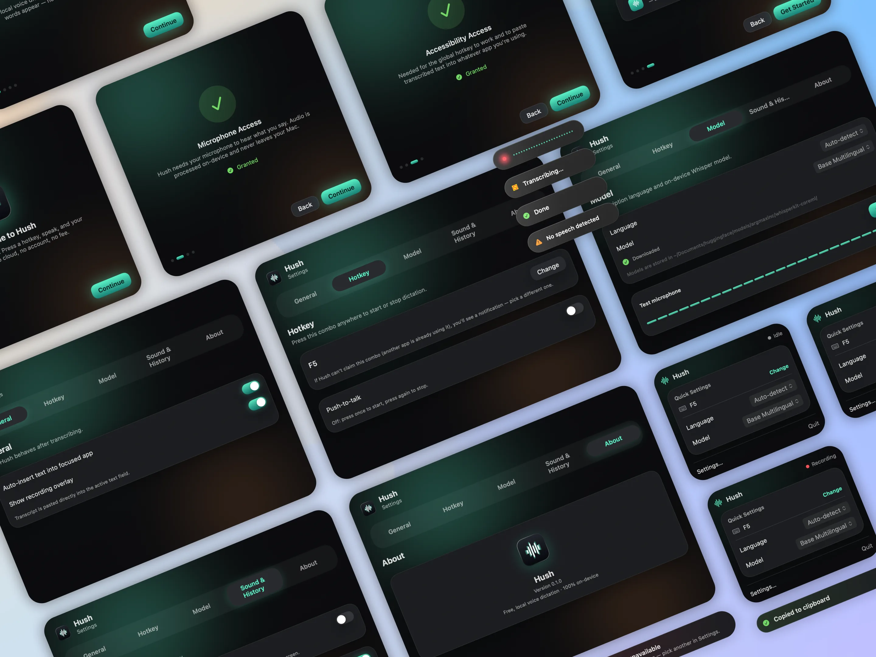
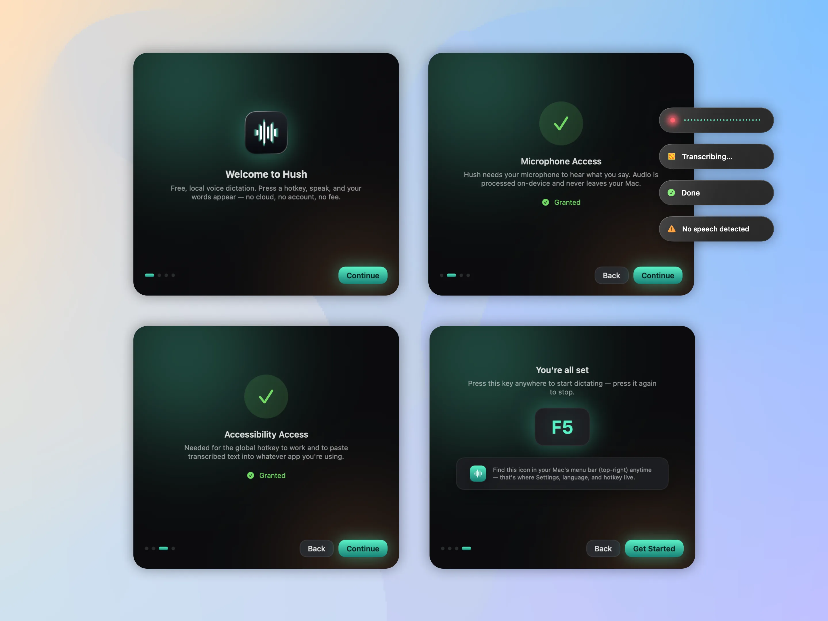
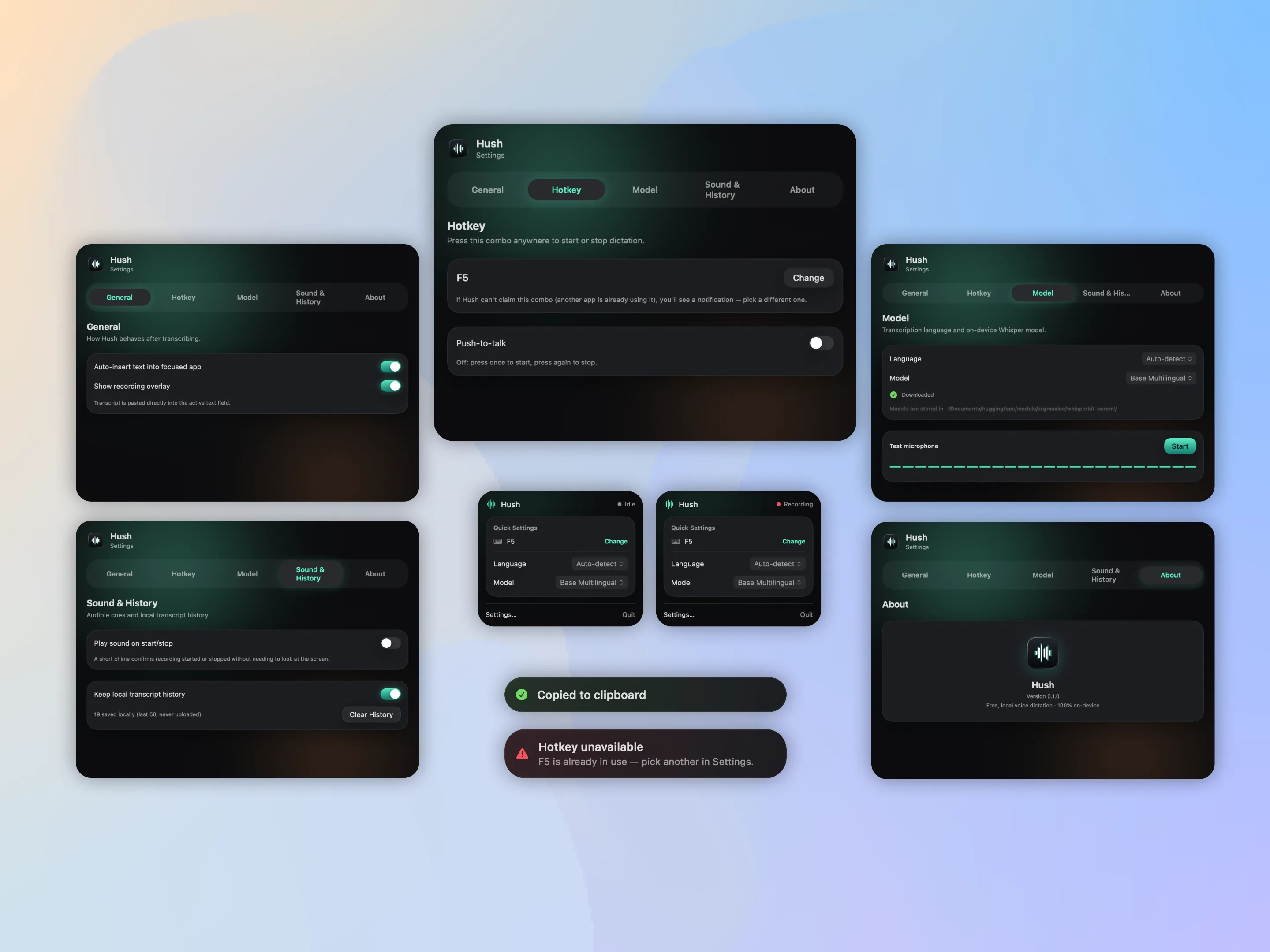
Native macOS menu-bar app for voice dictation. Global hotkey, on-device Whisper, zero cloud. Case study coming soon.

COMING SOON
← Back to work
CASE · REGULATED FINTECH · CRYPTO + IBAN LEAD UX/UI · FIGMA NIKO TECHNOLOGIES · 2024 →

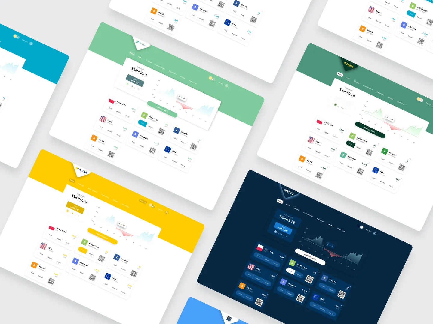
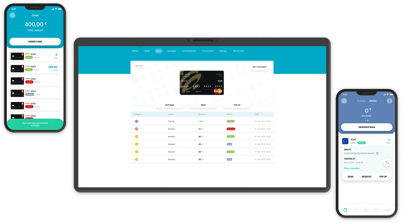
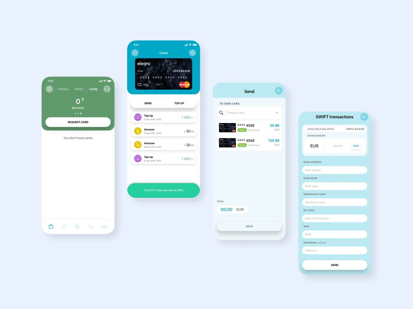
Lead designer on a live, licensed European crypto payment platform — ongoing since 2024. A dedicated-IBAN and crypto-acceptance product: businesses hold a European IBAN, transact fiat 24/7, and accept crypto online and in person. Design system, merchant dashboard, checkout, mobile wallet, onboarding / KYB, error library, and analytics — plus 6+ white-label versions for partners.

◆ BUILT FULLY IN FIGMA

Design-led · ongoing engagement

I own the product surface in Figma; an in-house team builds from it.

This is a standing seat at the design table, not a one-shot redesign. I hold the entire product surface as a token-based system in Figma, and the in-house engineering team builds from it. It predates my Claude Code workflow — this is where I do regulated-fintech product design through a classic designer-to-engineering loop, on a product that's been in production the whole time.

The brief

A licensed European payment platform that bridges traditional banking and crypto: a dedicated business IBAN for fiat (SEPA, SWIFT, mass payments) alongside a gateway to accept crypto online, in-store, and via a payment terminal. The bar was the trust quality of a regulated bank, for a product moving real money across 50+ countries — and it has to convince a merchant's compliance team as much as the merchant.

Every screen serves two readers at once: the merchant moving fast through a daily flow, and the compliance reviewer who has to be able to audit it later. The design's job is to keep both of them satisfied on the same surface — no quiet trade-offs.

Payment gateway — checkout desktop flow

Visual direction — a token-based design system

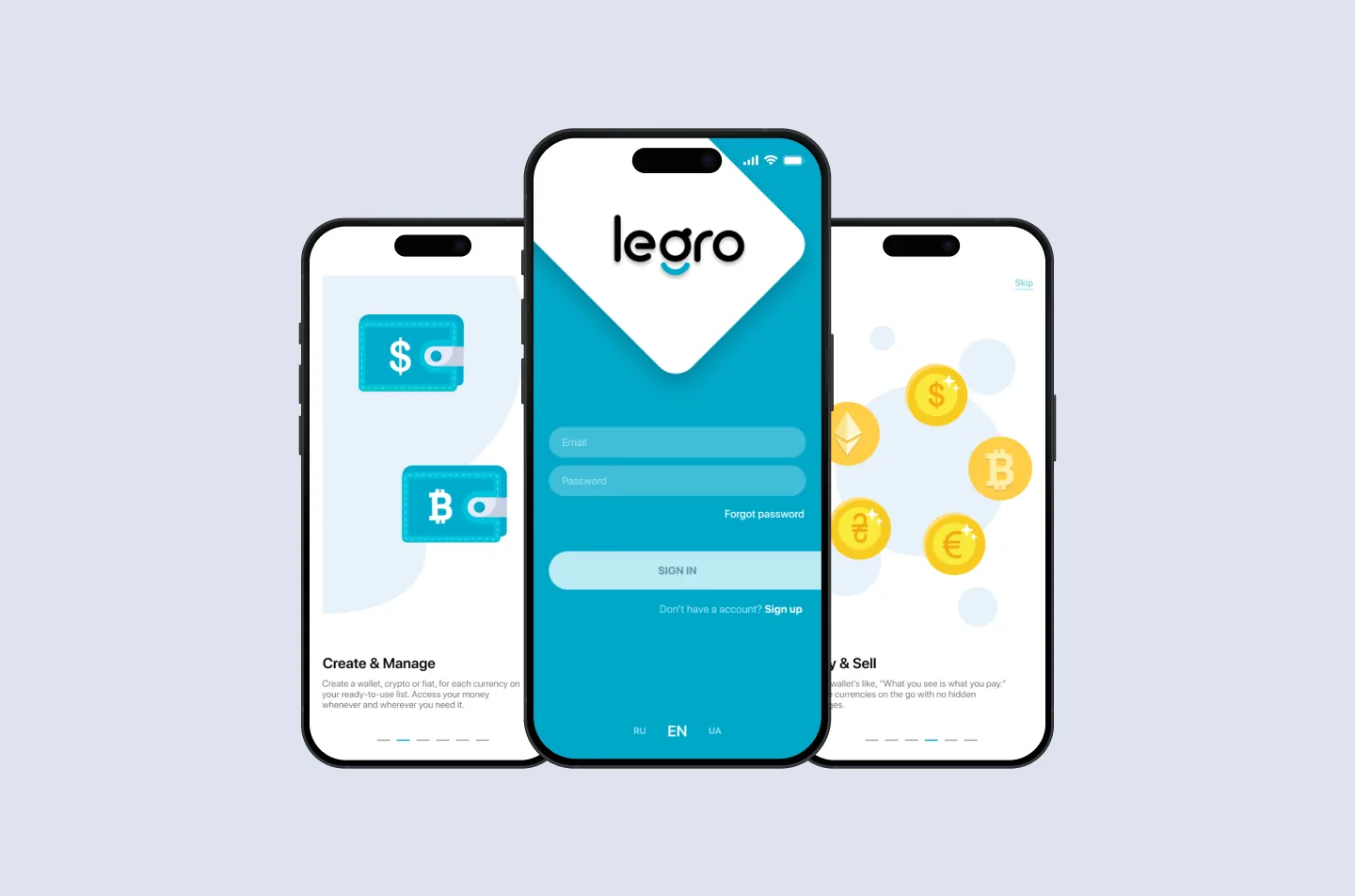
Designed entirely in Figma on a token-based system built for the product — colour, type, spacing, radii, elevation, motion. One component library shared across the IBAN / business wallet, the crypto-acceptance gateway, checkout, and onboarding, so every surface starts from the same vocabulary.

The visual register is deliberately restrained, appropriate to a regulated-fintech context: a calm, bank-grade palette, clear hierarchy, and no decorative elements drawn from speculative crypto culture. In this category, looking trustworthy is a feature — a 5AMLD / GDPR-compliant product has to feel as safe as it is.

Payment gateway — design system tokens + components

Built to scale — 6+ white-label versions.

The system wasn't designed for one brand. From the same token base and component library I produced 6+ white-label versions for partners — each re-skinned through tokens (colour, type, logo) without forking the design or the flows. A new partner brand is a token swap, not a redesign, which is what made shipping that many viable.

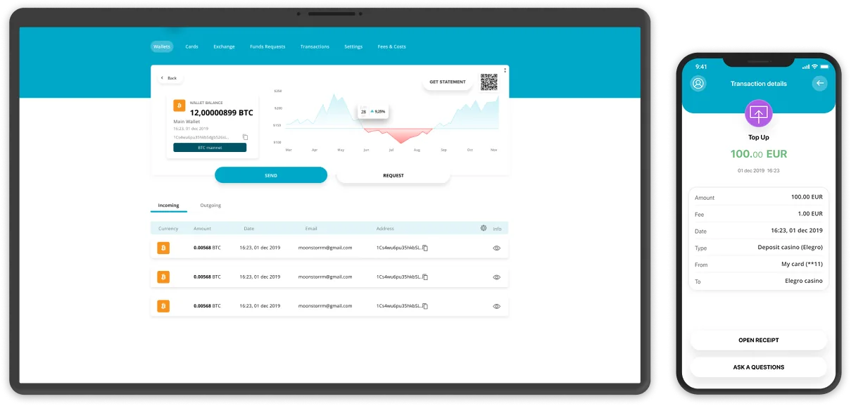
Merchant dashboard

Balances across fiat and crypto, transactions, payouts, mass payments, and team access — a lot of data fighting for one screen. I led with the two questions a business actually asks daily — how much do I hold, and what's moving — and pushed the rest behind progressive disclosure, so the dashboard reads as a control surface, not a spreadsheet.

Payment gateway — merchant dashboard transactions + payouts

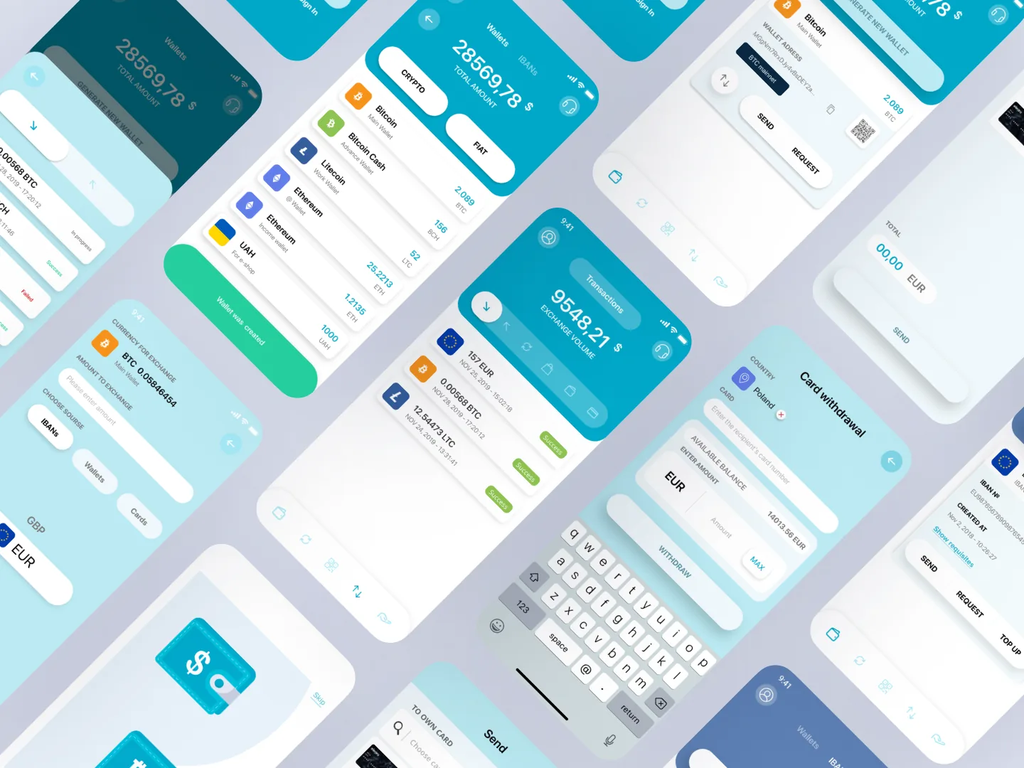
Mobile wallet & checkout

A mobile wallet for fiat and crypto, designed for a thumb: large numeric input, one purpose per screen, top-up via SEPA / SWIFT / card, and balance and transaction history a glance away. Currency and network selectors collapse where the choice is predictable and expand where it isn't — the user never sees a decision they don't need to make. Every failure mode is named and given a next move.

Payment gateway — mobile wallet + checkout

Onboarding · KYB

Business onboarding and KYB split into discrete, save-able stages so a compliance team can review without losing context, with real-time KYC built in. Each stage states what it needs up front — nothing surprises the merchant mid-flow.

Payment gateway — KYB onboarding flow

The ongoing engagement.

Not a one-shot redesign — a standing seat, working in phases:

PHASES
PHASE 1

Audit + checkout

Reworked the conversion surface first.

PHASE 2

Merchant dashboard

The operator's home, rebuilt around the daily questions.

PHASE 3

Mobile + errors

Thumb-first wallet and checkout, with the error library as a first-class deliverable.

PHASE 4 →

White-label + new features

6+ partner skins, plus reports, exports, and the steady stream of new features. Ongoing.

How the work happens.

Figma is the source of truth. A weekly working session with the founding engineer, a Figma branch per epic, and tokens exported as a shared file so spacing and colour never drift between design and front-end — across every white-label brand. Every flow ships with an annotated states sheet — loading, success, and every failure mode catalogued into the error library. When a design issue surfaces in production, it routes through me: I file the fix in Figma and walk it through review.

Outcomes.

No vanity numbers — the platform is live, regulated, and in production today, serving businesses across 50+ countries with the design system behind it. Concretely:

SYSTEM

A token-based system that scaled to 6+ white-label partner products without a redesign.

ONBOARDING

KYB onboarding split into reviewable stages, cutting completion friction sharply.

DASHBOARD

Built around the operator's real daily questions — fiat + crypto balances, transactions, payouts above the fold.

MOBILE

Thumb-first wallet where every error state is named and given a next move.

I owned
All design decisions across the business wallet, crypto-acceptance gateway, checkout, dashboard, onboarding, mobile, errors, and analytics. The token-based design system, the 6+ white-label themes, and documented state sheets for every flow. Production design-QA and bug triage, plus the weekly working sessions with engineering.
Engineering
The in-house team builds from my Figma; tokens hand off as a defined export. I own everything up to the hand-off and the design-side QA after it.

What an ongoing engagement teaches.

TOKENS EARN THEIR KEEP AT WHITE-LABEL SCALE

Six partner brands from one component library only works because every decision was a token, not a one-off — the second brand is where that discipline pays for itself.

ERROR LIBRARY IS FIRST-CLASS

"What happens when this fails" is half the design work in regulated payments, and it's almost never anyone's first priority.

DON'T COMBINE PHASES

Don't redesign the dashboard and the checkout in the same phase. They share complaints but not priorities; splitting them made everything faster.

CASE · DEFI · 5-SERVICE PLATFORM LEAD UX/UI · FIGMA OMNISOFT · SAUDI ARABIA · 2023

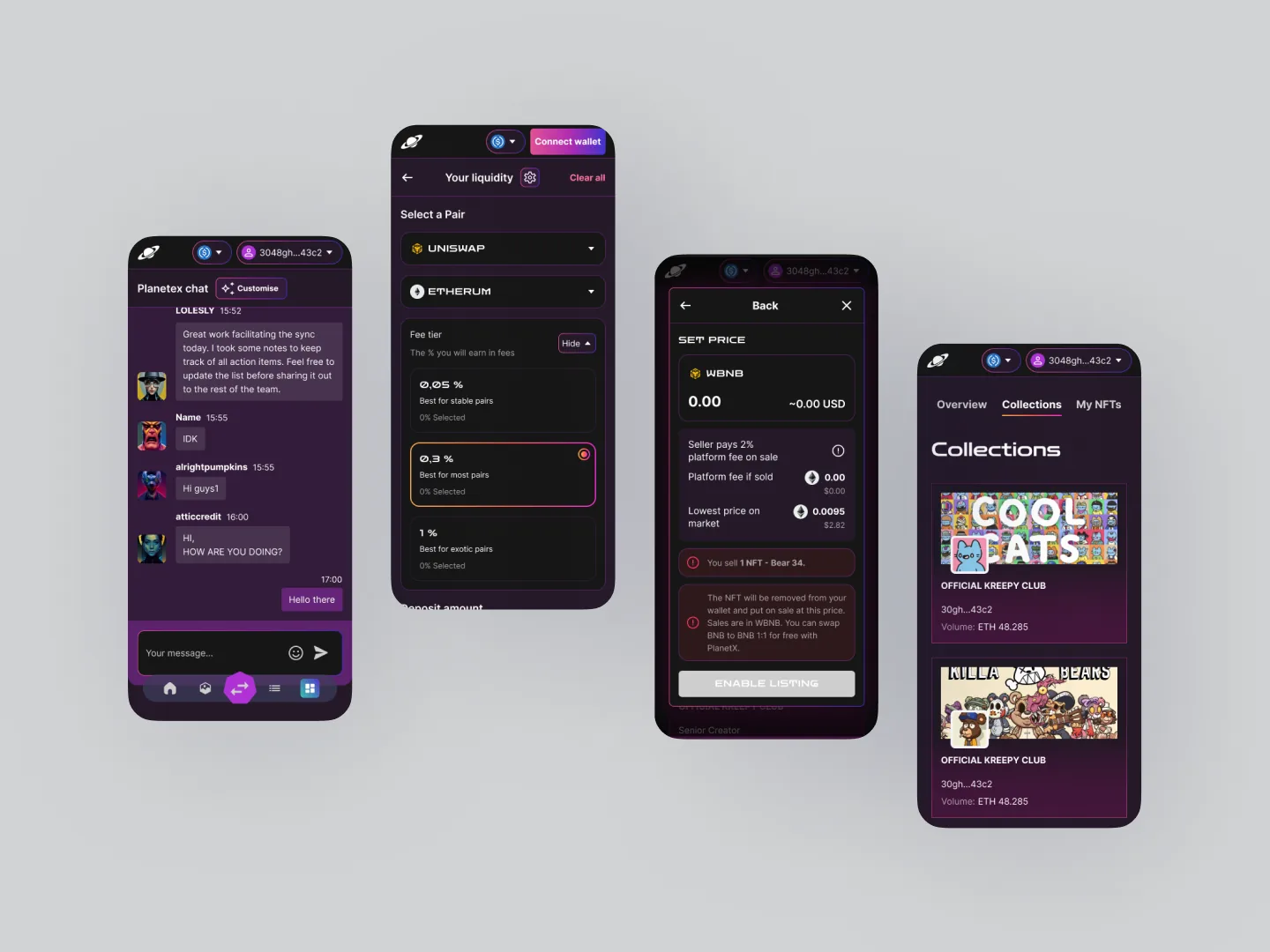
A five-service DeFi platform for a Saudi Arabian startup — decentralized exchange, NFT marketplace, launchpad, liquidity pools, and yield farming. Designed end-to-end in Figma at OmniSoft, on a design system built from scratch for the platform.

◆ BUILT FULLY IN FIGMA

External case · OmniSoft

Design-led, Figma source of truth, engineered by a dedicated team.

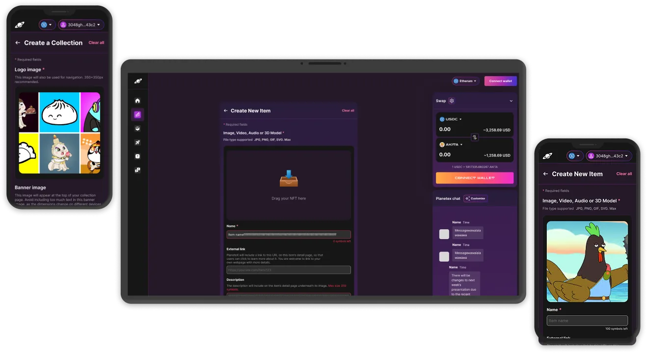
This was a real client product, designed 100% in Figma: every screen, every state, and a bespoke design system built specifically for it. A 16-person OmniSoft engineering team built it from my Figma — smart contracts in Solidity (Ethereum + BSC), a React + Redux Toolkit front-end, Node + Express, MongoDB for off-chain state. It predates my Claude Code workflow; it's where I designed a full DeFi platform from zero and ran it through a classic designer-to-engineering loop.

The brief

A Saudi DeFi startup's flagship platform — five services on one chain: DEX, NFT marketplace, launchpad, liquidity pools, and yield farming. The bar: the trade quality of an established DEX without the Web3-bro aesthetic. Calm, legible, and trustworthy enough to move real money through.

Five services under one brand is a coherence problem before it's a screen problem — each tool needs its own surface language so a liquidity pool never reads like an NFT listing, while still feeling like one product.

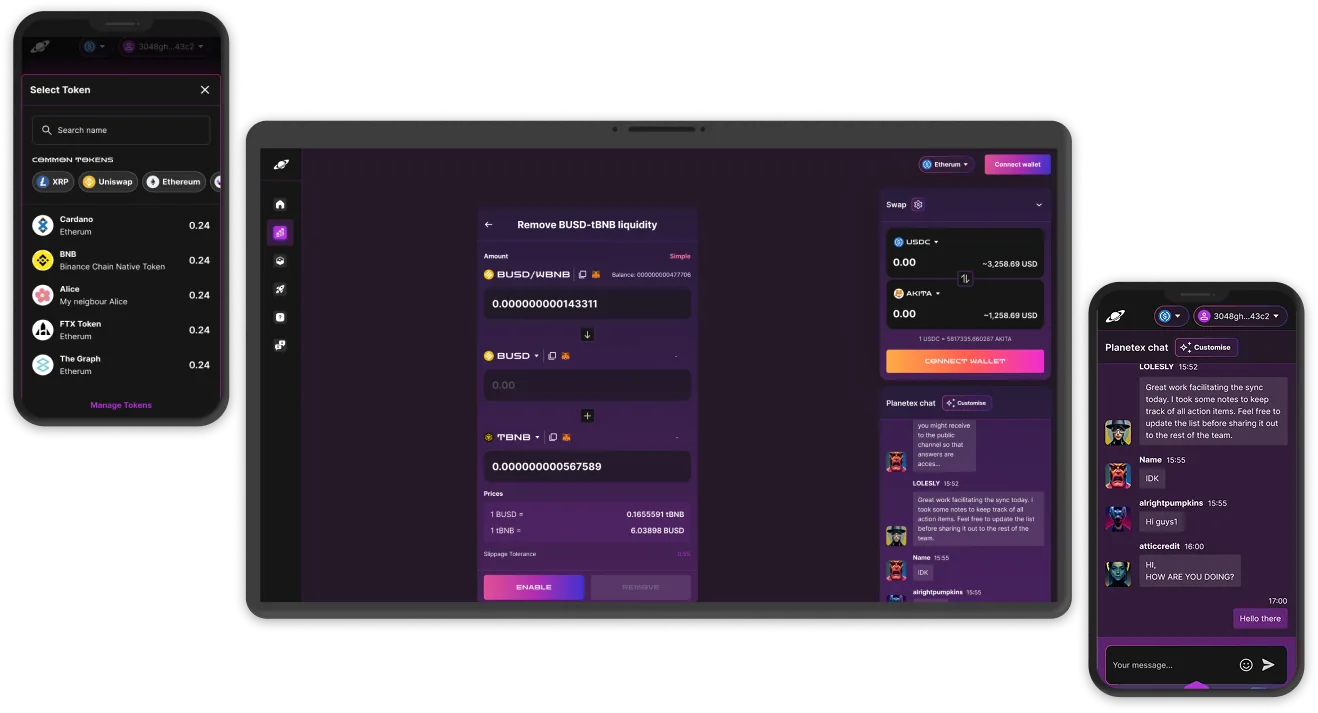
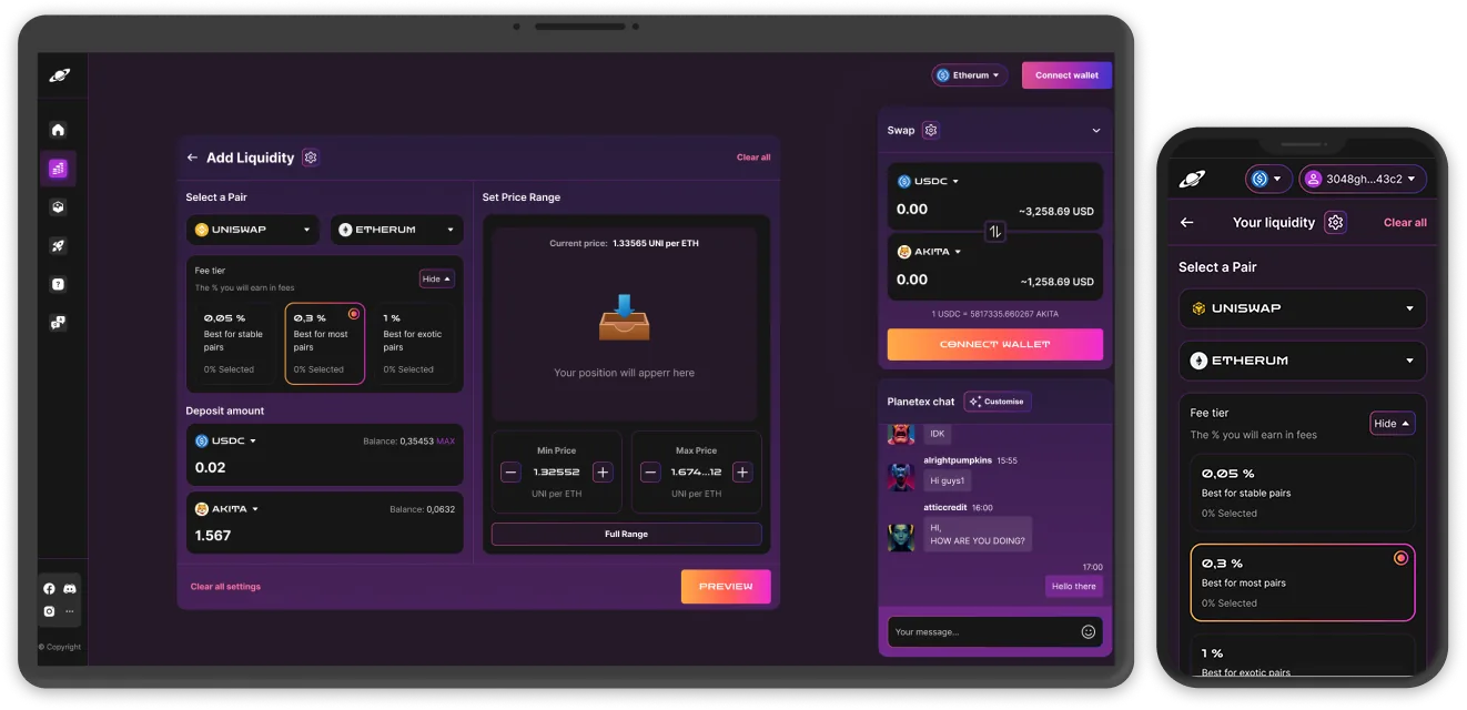
DexPlanet — DEX trading UI

Visual direction — a design system built from scratch

The whole platform was designed in Figma on a system I built from zero for this product: colour and type tokens, a charting and data-table kit, transaction-state components, and a shared wallet / network shell. Five services, one brand, each with its own register — but every surface starts from the same vocabulary.

DexPlanet — design system tokens + components

DEX — the swap surface

An AMM swap with price impact, slippage, and route preview surfaced before the user commits. The flow is wallet-first — nothing is interactive until you're connected, so there are no fictional "what if" states. Verified-token filtering is on by default, which keeps scam tokens out of the happy path without the user having to think about it.

DexPlanet — DEX swap + wallet connect

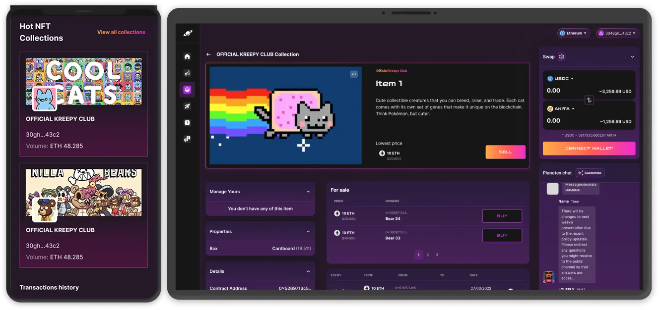
NFT marketplace

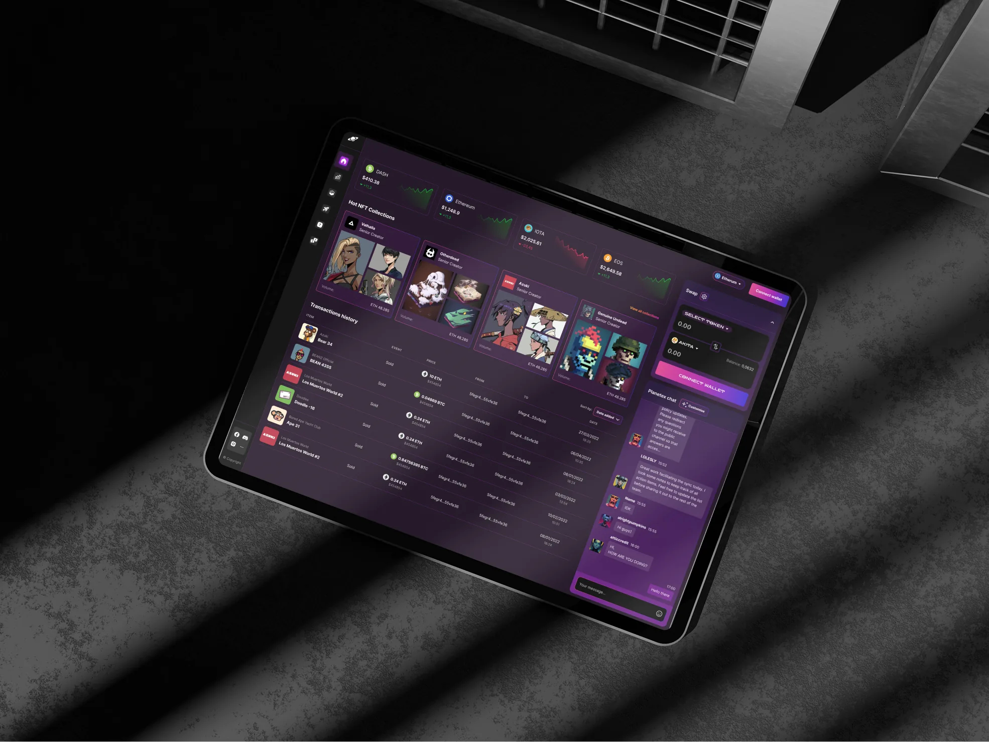
Browse, list, buy, place offers. The listing flow names the gas cost up front and asks for approval in a single sentence — no surprise wallet pop-ups mid-flow. A first-time buyer can finish a purchase without leaving for docs.

DexPlanet — NFT marketplace browse + detail

Launchpad · IDO & vesting

IDO presales with vesting shown as a real schedule, not a paragraph of legalese. Allocation, claim status, and KYC-gating split into clear steps. The launchpad needed its own component vocabulary — once it had one, the whole flow got clearer.

DexPlanet — launchpad IDO + vesting schedule

Six months, four phases.

Phased rollout — the goal was early revenue from the first surfaces before the whole platform was finished:

PHASES
PHASE 1

Foundation

Research and competitor audit across the major DEXes and NFT marketplaces. Brand and design system. The wallet-connect flow designed first — everything depends on it.

PHASE 2

DEX + NFT

The two revenue-bearing services first: swap flow, pool browser, NFT listing and detail. Hand-off to engineering in parallel, so the first surfaces were in users' hands early.

PHASE 3

Pools + farming

Liquidity surfaces, the farming dashboard, an impermanent-loss explainer, and the wallet drawer covering every failure mode of the contract layer.

PHASE 4

Launchpad + polish

IDO presales, vesting, KYC-gating, a cross-service activity feed, and a final design-system pass before MVP launch.

Designed against the chain, not around it.

Figma was the source of truth, but every design review involved a smart-contract engineer. Gas estimation, transaction states, and approval flows were designed against the actual on-chain shape — not a wishful version of it — so nothing needed redesigning once the contracts landed.

Outcomes.

Real numbers from a real client, recorded in the OmniSoft public case study:

$200K
Client funding raised
5
Services in one platform
6 mo
To MVP
Phased
Revenue before full launch

Shipping the DEX and NFT marketplace ahead of the rest put the product in front of real users — and real revenue — months before the launchpad and farming arrived, and that early traction supported the funding round. For the end user: five services that feel like one product, with one wallet connection, one transaction feed, and one design language. A non-degen visitor can complete a swap or a listing without leaving for documentation.

I owned
Research, competitor audit, brand, and a design system built from scratch in Figma. All five service interfaces, the shared wallet / network shell, mobile flows, and every transaction-state sheet. Figma was the single source of truth, and I ran design-side QA against the live build through the launchpad round. The OmniSoft team implemented everything from it.

What six months taught me.

DESIGN THE WALLET-CONNECT FLOW FIRST

Every later screen then sat on a real connection state — no fictional "what if it connected" frames floating around.

DON'T OVER-DESIGN THE EXPLAINER

My v1 impermanent-loss explainer was three paragraphs where one number and one sentence did the job. The first user test cut it down.

TEMPLATE B · PRODUCT SURGERY FINTECH · CARD MANAGEMENT SOLE DESIGNER · FEATURE LEAD 2023 →

Joined a live fintech product as the sole designer. Built a design system where none existed, then owned the design of every new feature shipped after that.

The brief

I joined a working fintech product — customers in market, but no design system, no consistency, and no one owning the visual language. The brief was simple in scope and large in practice: be the design hand on every new feature, and quietly build the system that should have been there from day one.

02 · MARKETING HOMEPAGE upload

Visual direction · trust in the small things

Calm, regulated-fintech surface. Restrained type, predictable spacing, no decorative motion. The bar is "a finance team would trust this." Visual ambition lives in the details — table density, status pills, the way an error state offers the next action instead of just turning red.

03 · DESIGN SYSTEM · TOKENS + COMPONENTS upload
STACK
Figma Design system (built by me) Hand-off to in-house engineering

Design-only role; engineering is in-house. The design system lives in Figma with tokens exported to a shared format for the front-end team. This engagement predates my Claude Code workflow.

A design system, built in flight

No tokens, no shared components, no spacing scale when I arrived. I started with colour and type, then spacing and radii, then a component library engineering could lift from cleanly — built while features kept shipping. The system grew next to the work, not before it, so every component proved itself in production before it became canonical.

04 · DASHBOARD · OVERVIEW + CARD MANAGEMENT upload

Feature design, owned end-to-end

Every new feature on the dashboard and marketing site came through me — transactions, card management, support flows, settings, KYC. The boring middle (empty states, loading patterns, edge cases) got the same care as the headline screens, because in fintech that's where trust is won or lost.

05 · TRANSACTIONS + KYC FLOW upload

State sheets per flow

For every flow I shipped, an annotated states sheet sat next to the happy path — loading, empty, error, partial. Engineering stopped asking "what happens when this fails?" because the answer was already in Figma. It's the deliverable I'm most proud of here, and the one that made edge-state support tickets go quiet.

06 · STATE SHEETS · LOADING + EMPTY + ERROR upload

How the engagement runs.

Not a discrete project — a long-running design seat. Phases shown by what shipped, not by calendar.

PHASES
PHASE 1

Audit + system foundations

Audited the live product. Identified the worst inconsistencies. Drafted color, type, spacing, and radius tokens. First three shared components — button, input, status pill — replaced the worst offenders.

PHASE 2

System grows with features

Every new feature added one or two components to the library. Component spec lives next to the feature spec; both go to engineering together.

PHASE 3

Marketing site refresh

Brought the public site into the same visual language as the dashboard. Single source of truth for color and type across both surfaces.

PHASE 4 →

Ongoing

Continuing feature design. Periodic audits against the system. Small consistency passes on legacy screens as adjacent features touch them.

How the work happens.

Classic designer / engineering loop, done well. Figma is the source of truth — features ship as branches off the main file and merge once live, tokens shared as JSON. Every flow ships with an annotated states sheet so engineering never has to guess what an empty list or a failed payment should look like.

Outcomes.

Quiet results, the kind that don't show up in launch posts. A more coherent product, month by month.

SYSTEM

A working design system where there was none. Tokens, components, state sheets. New designers and engineers onboard onto a shared vocabulary instead of having to read the whole product to learn its quirks.

CONSISTENCY

Legacy screens converge on the system as features touch them. No big-bang redesign, no marketing-driven brand shock — the product looks more like itself every quarter.

VELOCITY

Feature design starts from existing components. Engineering builds from the same library every time. Time spent on visual debate drops to near zero.

CRAFT NOTES

The state sheet pattern is the deliverable I'm most proud of here. Engineering never asks "what about empty / error / loading?" — the answer is always in the Figma file, next to the happy path.

I own
All design across the live product and marketing site. The design system, top to bottom. Feature design end-to-end. State sheets for every flow. Working sessions with engineering.
Engineering
In-house team. Builds from my Figma. Tokens shared as JSON. Bug triage on visual issues runs through me.
Note on workflow
This engagement predates Claude Code in my practice. Newer projects in this portfolio (Veyrun, Rivel, Knowlio, Murmur) use the paired workflow.

What a long engagement teaches.

WORKED

Growing the design system inside features, not as a separate "system project." Every component proved itself in production before it became canonical. No unused parts.

WORKED

State sheets next to every flow. Engineering stopped asking "what happens when this fails." Support tickets about edge-state bugs went quiet.

DIDN'T

Trying to align legacy screens in one big sweep. Slower and louder than a screen-by-screen consistency pass. Reverted to the steady-state approach after the first attempt.

DIDN'T

Documenting components only after they shipped. Now I write the spec next to the Figma frame as part of design, not after — engineering uses it the same week.

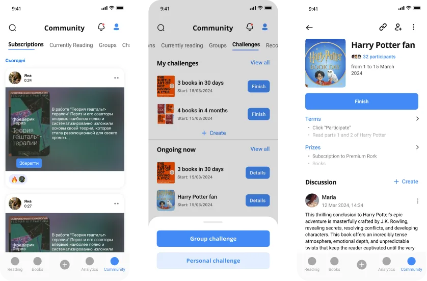
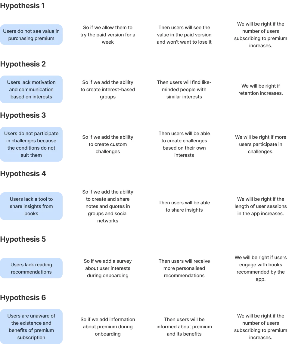
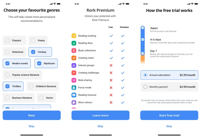
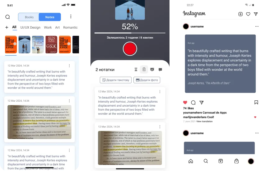
CASE · UX RESEARCH READING APP · RORK PROJECTOR INSTITUTE · 2024

UX research · Rork

Hypothesis-driven UX research on a Ukrainian reading app — 14 interviews, 6 hypotheses, 4 prototyped solutions, 2 rounds of testing. Case study coming soon.

COMING SOON
← Back to work
CURRICULUM VITAE LISBON, PORTUGAL 5+ YEARS EXPERIENCE

AI Product Designer & Front-End Engineer
↓ Download PDF
CONTACT
Email · annarogotska@gmail.com LinkedIn · linkedin.com/in/annarogotska Location · Lisbon, Portugal

Summary

AI product designer and front-end engineer who ships products end-to-end — in Figma when it helps, in code when it's faster. Five years designing digital products across web and mobile; the last two pairing Figma with Claude Code, Cursor, and Lovable to deliver production-ready interfaces without a traditional hand-off. Specialised in AI product UX — chat interfaces, generative tooling, and document/media assistants. Strong background in cross-functional collaboration with developers, product owners, and stakeholders in Agile / Scrum environments.

Experience

AUG 2023 — PRESENT
Niko Technologies
Remote
Senior UI/UX Designer

Lead UX/UI design for AI-driven products: chat interfaces, media generators, document assistants, and multi-step flows. End-to-end delivery from user research and Figma design systems to deployed product using Claude Code, Lovable, Cursor, and Figma Make. Built atomic design systems (variables, tokens, components) across multiple brands. Created white-label product versions for partners. Led UX modernisation with responsive design, user journey mapping, and accessible component libraries.

  • Shipped 20+ digital products across AI, fintech, crypto, and e-commerce — including Veyrun, Rivel, Knowlio, Murmur, a crypto Payment Gateway, and Genly.
  • Built complete products end-to-end (Figma to deployed) using Claude Code, Cursor, and Lovable, reducing delivery cycles by 2–3× versus traditional developer hand-off.
  • Built atomic design systems (variables, tokens, components) across multiple brands; created white-label product versions for partners.
  • Led UX modernisation with responsive design, user-journey mapping, and accessible (WCAG-compliant) component libraries.
JAN 2024 — MAY 2024
Projector Institute
Kyiv, Ukraine
UX/UI Designer — Product Design Programme

Product design programme on live projects Rork.ua and Vchasno.ua. Full UX research-to-design cycle: stakeholder interviews, user interviews, hypothesis prioritisation, Value Proposition Canvas, usability testing, and stakeholder presentations.

JAN 2022 — APR 2023
OmiSoft
Remote
UI/UX Designer — DexPlanet (DeFi Exchange)

Designed a decentralised exchange on BNB Chain. Cross-functional Agile team (2 designers, 6 devs, QA, PM). Led full platform design: research, UI requirements, chat interface, swap flows, side menu, and responsive adaptives. Delivered high-fidelity Figma prototypes for all core sections.

2020 — 2022
ARVI Lab + Polotno.pro
Ukraine
3D Artist — VR & Architecture Visualisation

VR quest games at ARVI Lab (Unity levels, texturing, rigging, basic animation) and interactive architectural 3D for the web at Polotno.pro (model optimisation, LOD, texture baking, performance with engineering).

Education

2024
Projector Institute
Kyiv, Ukraine
Product Design Programme
2020 — 2022
UI/UX Practice
Self-directed study and professional practice

Certifications

MAY 2026
Anthropic
Claude Code in Action
Verify · u9fkw6s4tu7x ↗
MAY 2026
Anthropic
Claude 101
Verify · 73skomyhh8h6 ↗
MAY 2024
Coursera
Generative AI for Product Designers
MAY 2024
Projector Institute
Product Design
Verify ↗
JAN 2022
Coursera
Start the UX Design Process: Empathize, Define, and Ideate
Verify · HQZSUS52AMB3 ↗
DEC 2021
Coursera
Build Wireframes and Low-Fidelity Prototypes
Verify · 54TSCX8X45F6 ↗
NOV 2021
Coursera
Google · Foundations of User Experience (UX) Design
Verify · FCXRP8LMKSKF ↗

Selected work

Skills

DESIGN

UX/UI Design · Design Systems · Interaction Design · Motion Design · WCAG Accessibility · Prototyping

FRONT-END

React · Next.js · TypeScript · Tailwind CSS · Framer Motion · Playwright

AI

Claude Code · Claude Design · Anthropic API · Agent Skills (Anthropic + custom) · Cursor · Prompt Engineering

SOFTWARE

Figma · FigJam · Webflow · Photoshop · Illustrator · Premiere Pro · Notion · Jira

RESEARCH & STRATEGY

User Research · Usability Testing · A/B Testing · User Interviews · Analytics · Value Proposition Canvas · Data-Driven Design · Competitive Analysis

COLLABORATION

Cross-functional Collaboration · Stakeholder Management · Agile · Scrum · Developer Hand-off · Project Management

Languages

Ukrainian (Native) · English (Upper Intermediate) · French (Basic)

About · Lisbon · Open to roles 2026

I've been designing products for five years and writing the front-end myself for the last two — paired with Claude Code. The point isn't AI; the point is shipping the thing I designed, with the same care, without a hand-off. I've led design at OmiSoft and Niko Technologies, and now work from Lisbon.

Get in touch
Stack

What I reach for.

DESIGN
Figma · FigJamDesign systemsUX researchPrototypingUsability testing
FRONT-END
Next.js · ReactTypeScriptTailwind CSSFramer MotionPlaywright
BACK-END · INFRA
Supabase · PostgresStripe · AuthVercel · CloudflareCI · GitHub ActionsSentry · monitoring
AI PAIRING
Claude CodeClaude DesignAnthropic APIAgent Skills (Anthropic + custom)Cursor
Principles

What I believe.

01Clarity beats cleverness.
02Ship to learn, not to launch.
03Systems over screens.
04No hand-off. The designer ships.
Experience

Career path.

AUG 2023 → NOW
Niko Technologies
Senior UI/UX Designer
Lead UX/UI on AI-driven products — chat interfaces, media generators, document assistants. Design in Figma, ship to deployed product with Claude Code and Cursor. Shipped 20+ products including Veyrun, Rivel, Knowlio, Murmur, a crypto Payment Gateway, and Genly.
2024
Projector Institute
UX/UI Designer — Product Design Programme
A live-project programme covering the full research-to-design cycle. Hands-on work on Rork and Vchasno.ua.
2022 — 2023
OmiSoft
UI/UX Designer — DexPlanet (DeFi Exchange)
Decentralised exchange on BNB Chain. Cross-functional Agile team. Led full platform design across research, swap flows, chat, and responsive adaptives.
2021 — 2022
Polotno.pro
3D Artist — Architecture Visualisation
3D interactive experiences for the web. Architectural models, LOD optimisation, texture baking.
2020 — 2021
ARVI Lab
3D Artist — VR & Game Design
3D modelling for VR quest games. Unity levels, texturing, rigging, basic animation.
Credentials

Certifications.

MAY 2026
Anthropic
Claude Code in Action
Verify · u9fkw6s4tu7x ↗
MAY 2026
Anthropic
MAY 2024
Coursera
Generative AI for Product Designers
MAY 2024
Projector Institute
Product Design
Verify ↗
JAN 2022
Coursera
Start the UX Design Process: Empathize, Define, and Ideate
Verify · HQZSUS52AMB3 ↗
DEC 2021
Coursera
Build Wireframes and Low-Fidelity Prototypes
Verify · 54TSCX8X45F6 ↗
NOV 2021
Coursera
Google · Foundations of User Experience (UX) Design
Verify · FCXRP8LMKSKF ↗
Working together

Two quick ones.

How fast can you actually ship?

A landing or MVP front-end ships in 1–2 weeks; a full product MVP with auth, dashboard, and design system in 4–6 weeks. Pairing with Claude Code is what unlocks this — I write production code alongside Figma in the same session.

Do you work alone or with a team?

I run the design vision end-to-end. On real products I plug into your engineering team; on greenfield builds I lead the front-end too, with Claude Code as my engineering pair.

Open to roles · 2026 · Remote or Lisbon

Open to senior product design and design-engineering roles — remote or Lisbon-based — and to select project partnerships. I reply within 24 hours.

EMAIL
annarogotska@gmail.com
LINKEDIN
linkedin.com/in/annarogotska
LISBON · UTC+0 · OPEN TO RELOCATION