Designed, then vibe-coded into shipped product.

AI-native product designer in Paris. I design products and ship them myself, paired with Claude Code.

HEALTHCARE/FINTECH/AI/E-COMMERCE
VIEW ALL WORK

01About

Paris · UTC+1 · Open to roles 2026

Five years designing products. The last two, shipping them myself.

I've led design on live, regulated products alongside engineering teams at Niko Technologies and OmiSoft. Now I take my own designs to shipped product, vibe-coding front-ends in Claude Code and Claude Design.

The point isn't AI. The point is shipping the thing I designed, with the same care, without a hand-off.

5+years in product design
20+products shipped
2–3×faster than a hand-off
0hand-offs on my own builds

02All work

2023 — 2026 · 15 projects

    03Stack

    What I reach for

    Design

    • Figma · FigJam
    • Design systems
    • UX research
    • Prototyping
    • Usability testing

    Front-end

    • Next.js · React
    • TypeScript
    • Tailwind CSS
    • Framer Motion
    • Playwright

    Back-end · Infra

    • Supabase · Postgres
    • Stripe · Auth
    • Vercel · Cloudflare
    • GitHub Actions
    • Sentry

    AI pairing

    • Claude Code
    • Claude Design
    • Anthropic API
    • Agent Skills
    • Cursor
    01Clarity beats cleverness.
    02Ship to learn, not to launch.
    03Systems over screens.
    04No hand-off. The designer ships.

    04Experience

    1. AUG 2023 → NOW

      Niko TechnologiesSenior UI/UX Designer · Remote

      Lead UX/UI on AI-driven products: chat interfaces, media generators, document assistants. Design in Figma, ship to deployed product with Claude Code and Cursor. Shipped 20+ products, including Veyrun, Rivel, Knowlio, Hush, a crypto Payment Gateway and Genly.

    2. 2024

      Projector InstituteUX/UI Designer · Product Design Programme

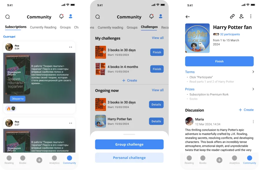
      A live-project programme covering the full research-to-design cycle. Hands-on work on Rork and Vchasno.ua.

    3. 2022 — 2023

      OmiSoftUI/UX Designer · DexPlanet

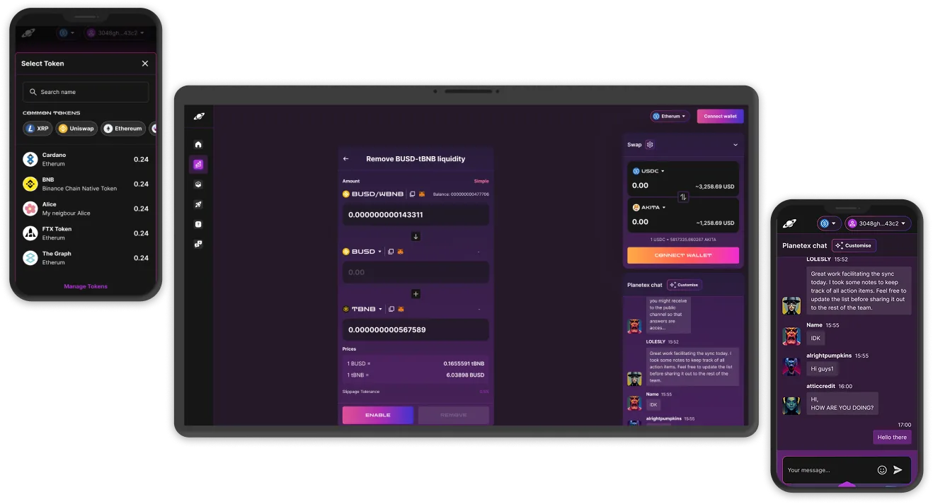
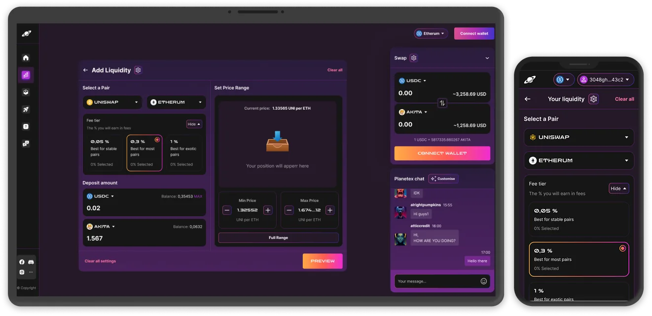
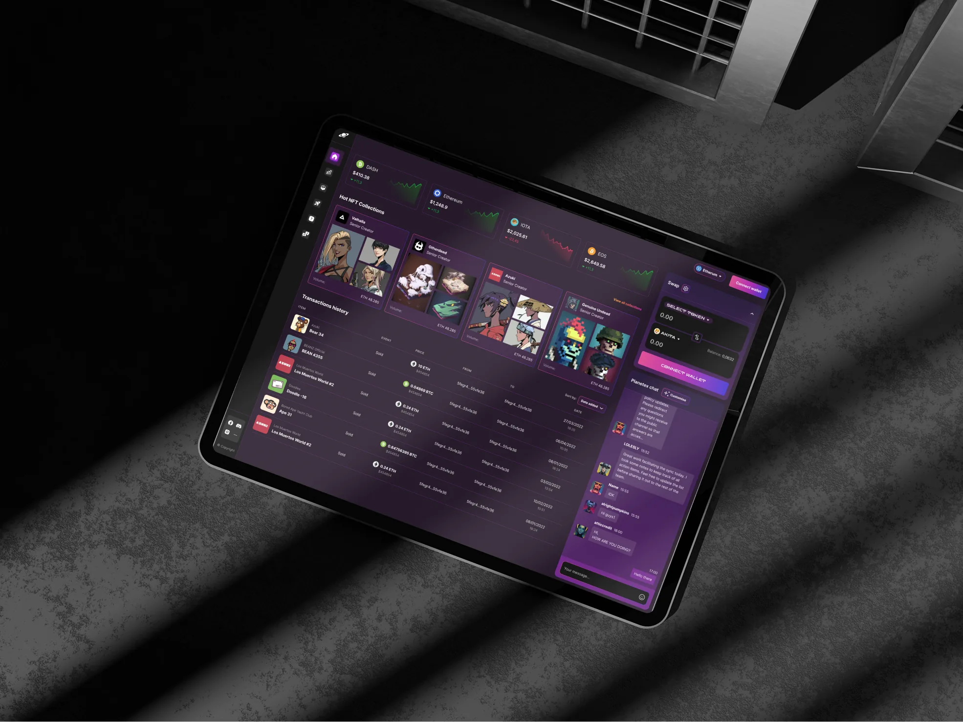
      Decentralised exchange on BNB Chain with a cross-functional Agile team. Led full platform design across research, swap flows, chat and responsive adaptives.

    4. 2021 — 2022

      Polotno.pro3D Artist · Architecture visualisation

      3D interactive experiences for the web: architectural models, LOD optimisation, texture baking.

    5. 2020 — 2021

      ARVI Lab3D Artist · VR and game design

      3D modelling for VR quest games: Unity levels, texturing, rigging, basic animation.

    15Work

    End-to-end design and front-end across healthcare, fintech, crypto, EdTech and AI2019 — 2026

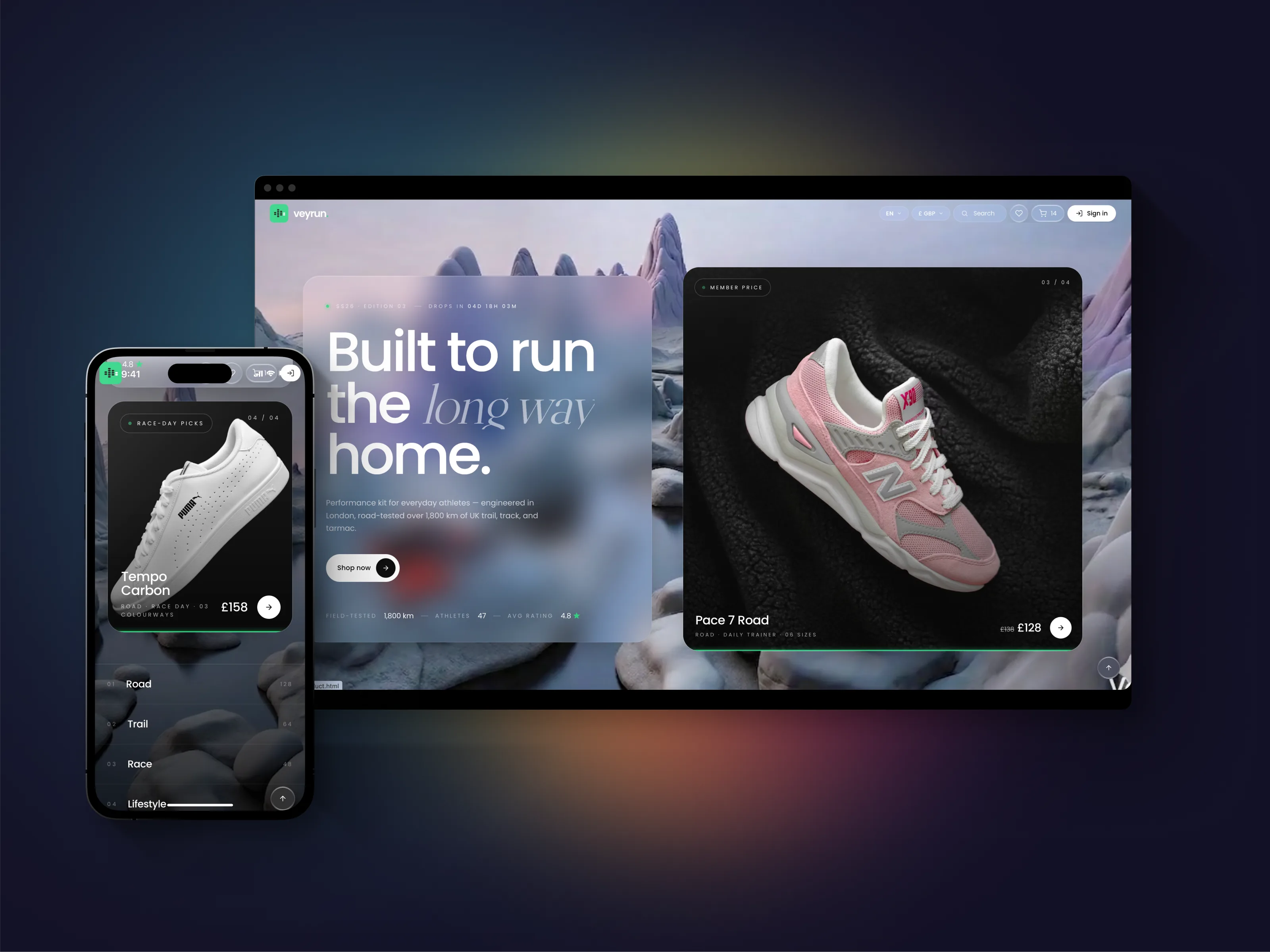
    Veyrun

    A digital-first running brand for the UK and EU performance market. Twenty-six React routes — brand, storefront, mock-backed checkout, and an owner-facing admin — designed and shipped solo in one week, paired with Claude Code. 15 unit tests and 11 Playwright specs, with the build gated on green.

    ◆ BUILT IN CLAUDE DESIGN + CLAUDE CODE · NO FIGMA

    Solo design + build

    Designed in Claude Code and Claude Design. Front-end built by me, end-to-end.

    I design directly in the codebase — no Figma-to-engineer hand-off, no translation loss between the mock and the thing that ships. Paired with Claude Code, the whole loop from art direction to shipped front-end compresses into one person and roughly a quarter of the usual time. Brand, every page, every interaction, every line of front-end — built in one run.

    I own design and testing. The backend is owned by a backend engineer; that's the layer I'm learning next.

    The Challenge

    The brief was simple, which made it dangerous: make it feel like an art-direction site and perform like a tight React build — for a fictitious UK running label — and ship it fast.

    Two instincts pull against each other there. Art-direction sites invite indulgence; performance builds punish it. So the real question was never "can I make it pretty" or "can I make it fast." It was where to spend the budget so the thing reads as editorial without the front-end paying for it.

    Constraints I set going in:

    • 26 routes across the customer journey, an editorial layer, and admin
    • 7 days, solo, paired with Claude Code
    • Zero external designers, agencies, or off-the-shelf stack components

    Understanding the Audience

    I wrote this before touching a layout.

    The buyer is design-aware, 28–45, running four to six sessions a week — the sub-3 marathon hopeful, the person who reads shoe reviews before they read the news. They follow Believe in the Run and RunningShoeGeeks. They've seen every hero carousel and every soft-focus trail shot, and they tune them out on sight.

    So the design question became concrete: what is the minimum a runner needs to decide? The answer was three numbers — drop (mm), stack height, and plate stiffness. Everything on a product page bends toward surfacing those fast and then getting out of the way. The home page earns attention once; the catalogue is the real shop, so it opens fast and lays the spec bare.

    The Idea

    One idea, held everywhere: liquid glass over a single green pulse.

    Glass surfaces layered on soft 3D product renders — backdrop-filter blur with saturation, glass-on-glass depth, subtle inner gradients. The language is borrowed from Apple's visionOS but warmed with editorial type, so it doesn't read as cold OS chrome. Space Grotesk carries spec and navigation. The green is the one accent, used as a pulse rather than a fill — it signals without shouting.

    I prototyped the glass in twelve variants directly in code, testing blur depth and inner-border opacity as "premium" versus "uncertain." That line is narrow, and it's only visible in the browser — in motion, against real product shots.

    Building the system

    The backend is owned by a backend engineer. I own all design and all testing, and I build on a shared architecture my team and I developed together — the same provider tree, routing rules, and file-size discipline behind every project — so everything here starts from a proven foundation, not a blank page.

    The product is barely an interface — it's a small system. One header, one canonical footer, one shared product card, and every component built to earn its place on more than one page.

    Three locales made the gate (EN / DE / ES), with a live currency switch. EUR and GBP never auto-convert. Layout holds at 360px with zero horizontal scroll.

    The whole thing runs on our fifteen-rule ARCHITECTURE.md — the ruleset we converged on as a team after I authored the architecture solo on the first projects. I held to it: break a rule, and either I fixed the page or we rewrote the rule. Never both at once.

    React 18 TypeScript Vite react-router 7 Tailwind v4 Lingui Zod axios Vitest Playwright

    Effective execution

    Five reusable patterns do the heavy lifting — each defined in exactly one place, then propagated everywhere:

    • Category-aware URLs — one template drives every listing.
    • Auto-rotating hero — pause on hover, advance on click, progress bar mapped to time.
    • Live drop countdown + roll-ups — real-time, with no layout shift when the number changes.
    • Editorial motion — spec-led reveals on headlines, intersection-observer driven, reduced on mobile and honouring prefers-reduced-motion.
    • Image-fallback observer — global, so a missing product shot degrades to a placeholder instead of a broken frame. Zero "missing image" cards across the build.

    How Claude paired in

    One week solo wouldn't have been possible without a pair. My toolchain is Claude Design and Claude Code, run through Agent Skills — Anthropic's and custom ones I've written — so the process itself is repeatable, not improvised project to project.

    I described the system in plain English; Claude spun up the scaffolding. I owned the brand, the type system, the layout, and all twenty-six route compositions — every design decision, every line of copy, every product call, and the test suite.

    One rule held the whole time: never paste a result into the project without reading it first. If I didn't understand a thing, I rewrote it in my own voice before it shipped. The codebase is mine, not the model's.

    Shipping the brand

    Seven days, four phases:

    • Days 1–2 — Brand & system. Logo, palette, type pairing, glass tokens, the core component set.
    • Days 3–4 — Storefront. Home, hero rotation, catalogue, product detail, search.
    • Day 5 — Commerce & auth. Cart, mock-backed checkout, account, order history.
    • Days 6–7 — Admin & polish. Owner admin, motion pass, accessibility, test suite green.
    CASE · E-COMMERCE · EDITORIAL SOLO DESIGN + FRONT-END 2 WEEKS · 22 SCREENS · 68 E2E TESTS NIKO TECHNOLOGIES · 2026
    ◆ BUILT IN CLAUDE DESIGN + CLAUDE CODE · NO FIGMA

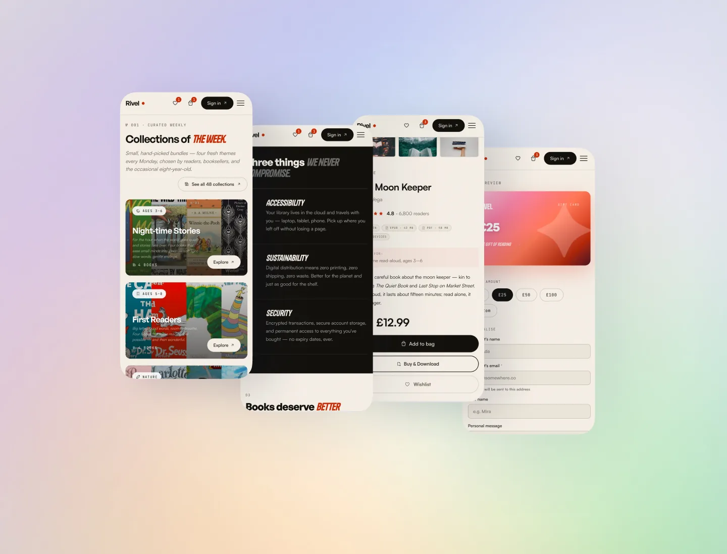
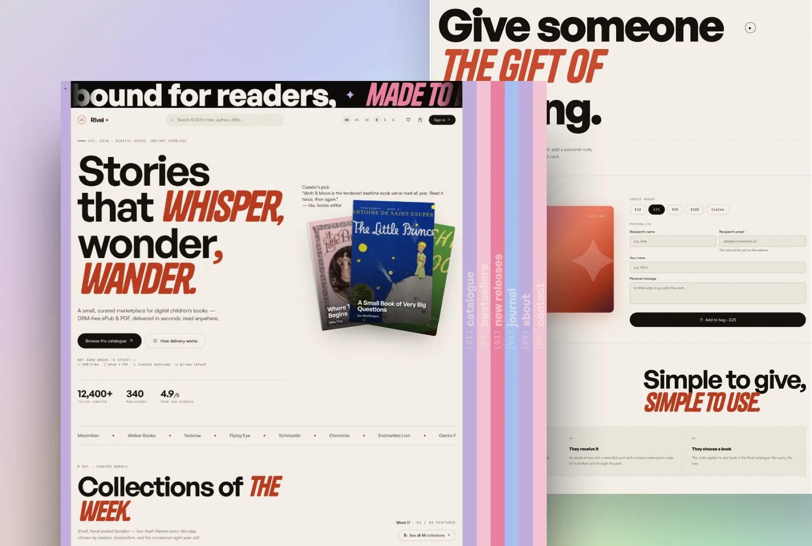
    An editorial digital bookshop for children's literature. Twenty-two screens and 68 end-to-end tests — brand designed, front-end built, and a working SPA shipped solo in a week and a half, then handed to one backend developer. Made in Claude Design and Claude Code, covered with Playwright across Chromium, Pixel 5, and iPhone 13.
    Staging · coming soon

    Solo design + build + tests

    Designed in Claude Design. Built in Claude Code. Tested with Playwright. Handed off as a working SPA.

    No Figma. I design in the codebase, so there's no translation loss between the brand and the build — what I draw is what ships. I build on a shared architecture my team and I developed together — a stack and a 15-rule ruleset we converged on, after I authored the architecture solo on the earlier projects — and own the design, the entire front-end, the copy, and the test suite on top of it. One backend developer owns the data layer — that's the layer I'm learning next.

    The problem

    A children's-literature bookshop has a split audience and a split job: parents buy, children are the reason. The store has to read as editorial — closer to a magazine than a catalogue — without losing the plumbing a real shop needs underneath: search, filters, cart, checkout, account.

    So the design question was where the editorial voice earns its keep, and where it has to step aside for the boring, reliable mechanics of buying a book.

    Catalogue — find a book, fast

    The catalogue is the real shop, so it opens fast and filters hard. One template drives every listing — filter by age, theme, and language, read straight from the URL, so any filtered view is a shareable, bookmarkable link. Search returns covers and copy in one place; lazy-loaded covers keep the grid quick even when the catalogue runs long.

    Book detail — flip before you pay

    Every book gets the editorial treatment: sample spreads, reader age, theme, and language up front, and a clear path to add it to the cart without making anyone wade through marketing copy first. The decision is parent-led, so the page earns trust before it asks for anything.

    Rivel — book detail page with sample spreads

    Collections — the editorial layer

    Collections are the magazine inside the shop: hand-picked, themed groupings refreshed on a cadence, each with its own landing page and voice. This is where Rivel stops feeling like a store and starts feeling like something you'd browse on a slow morning.

    STACK
    React 18 TypeScript Vite 6 React Router v7 Tailwind v4 Lingui v5 Zod Axios GSAP 3 + CustomEase Playwright FingerprintJS Stripe

    SPA built on React Router v7 with strict architectural rules. Single ApiProvider.api<T>(url, config, schema) HTTP entry validates every response with Zod. Three locales (en/de/es) wired through Lingui, ~900 source messages. Role-based routes split into guestRoutes, userRoutes, adminRoutes in a single routes.tsx, driven by useSession().getRoleFromToken(). Mock-backed front-end: no VITE_API_URL falls back to mock-data.ts, which means the whole product runs and is testable without a backend.

    Built like a system, not a website.

    The visible product is the storefront. The invisible product is the 15-rule architecture I built it on — the shared template my team and I developed, set before the first screen, every rule written down, so the front-end began from a known foundation, not a blank page.

    22
    Screens
    14
    Providers
    900+
    i18n strings
    3
    Locales
    68
    E2E tests
    149
    Max LOC / file

    The page-transition is the brand.

    The signature isn't a logo — it's a transition. The navigation itself becomes the curtain between pages, and that single motion is what people remember about Rivel. Not the wordmark, not the colour. The way it moves.

    The build log.

    A week and a half, four phases, one designer. Architecture-first — the rules were set before the screens, so reworking a page late was a composition change, not a debate.

    SHIP TIMELINE
    PHASE 1

    Brand & system

    Logo, palette (cream, sage, blush, ink), type pairing, motion language. Wireframes for all 22 pages.

    PHASE 2

    Foundation

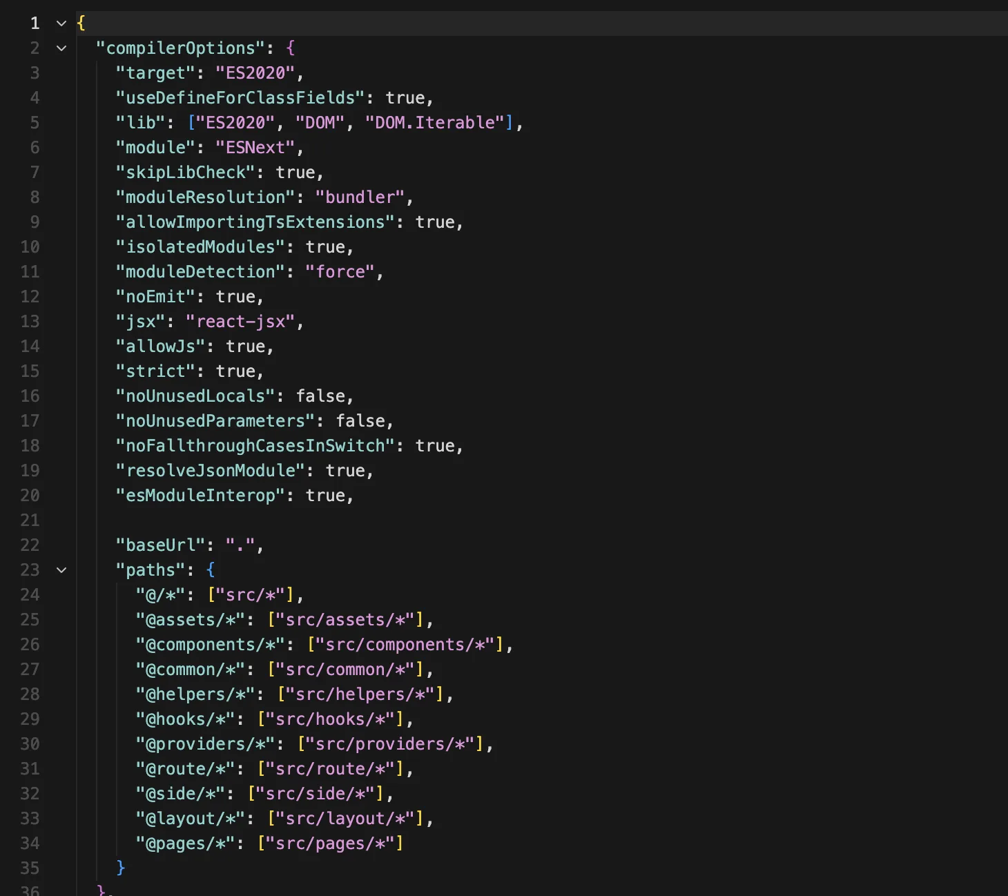
    Vite + React + TS scaffold. Provider tree. ApiProvider with Zod-validated mock data. Role-based route splitting. Path aliases. Lingui boilerplate.

    PHASE 3

    Screens

    22 pages across general / guest / user / admin. Cart + wishlist in localStorage. FingerprintJS for guest sessions. Stripe checkout flow.

    PHASE 4

    Motion + tests

    Page transition, hero parallax, card tilt, preloader, custom cursor, reveal-on-scroll. 68 Playwright tests across Chromium / Pixel 5 / iPhone 13.

    How I worked with Claude.

    Claude Design held the visual decisions; Claude Code held the keyboard, both run through Agent Skills — Anthropic's and custom ones I've written. I drove all of it — the model is a fast pair, not the one steering. The design calls, the brand, the copy, and the choreography were mine.

    One rule held every day: read everything before it lands in the project. If I couldn't explain a line, it didn't ship until I'd rewritten it in my own voice.

    Rivel — page-transition source
    DAY 12 · SIX-PHASE TRANSITION · GSAP + REACT ROUTER
    > ANNA
    Intercept link clicks at the NavigationProvider level. Start the GSAP timeline, then call navigate() at phase 4 — not phase 1 — so the new page is mounted underneath while the sidebar is still expanded. Don't unmount the old page until phase 5.
    > CLAUDE
    Added a useTransitionRouter hook that wraps useNavigate, queues the navigation via a timeline callback, and exposes isTransitioning. Routes now render with a 1-frame double-mount during phases 4–5 — mounted but invisible behind the curtain. Edge case: if a transition is interrupted by a second click, the timeline kills itself and starts a new one. Tested at __e2e__/transition.spec.ts.
    > ANNA
    Good. Now lock scroll during the transition and restore the new page's scroll position at phase 6, not phase 4.

    What shipped.

    Handed to the backend developer at the end of the week and a half: a working SPA — every screen, every transition, the full front-end, and 68 Playwright specs across Chromium, Pixel 5, and iPhone 13 gating the build. The data layer is his; the interface is mine.

    I owned
    Brand and visual language. IA for 22 routes. The 15 architecture rules. Animation choreography (transition, tilt, parallax, preloader, custom cursor). Component library and provider tree. Stripe checkout flow. 900+ source strings across en / de / es. 68 Playwright tests across Chromium + Pixel 5 + iPhone 13 WebKit.
    Paired with Claude
    Claude Design for layout exploration and copy iteration. Claude Code for GSAP timeline boilerplate, the React Router transition hook, Zod schema generation from mock data, Playwright scaffolds, and Lingui catalogue tooling. Every decision reviewed and signed off by me before commit.
    Handed off to
    One backend developer received the SPA at the end of the build: typed API contract, Zod-validated response shapes, mock data as documentation, full E2E suite as acceptance criteria. No design hand-off doc — the codebase itself is the spec.
    Where I'm headed
    Rivel is the closest I've come to shipping a product end-to-end alone. Next step is the backend layer — I want to own the full delivery, not just the front half. The architecture template, the mock-first discipline, and the test coverage are the runway I'm building toward that.

    What this build taught me.

    Three takeaways that hold true for this workflow:

    DESIGNING IN CODE

    Kills the hand-off tax. There's no "the build doesn't match the mock" conversation, because the mock is the build.

    ARCHITECTURE BEFORE SCREENS

    With the rules set before the first screen, late changes were cheap — I was recomposing, not renegotiating.

    FAST PAIR, ONE DRIVER

    Claude moves quickly; my job was to own every decision it accelerated, not to outsource the judgement.

    CASE · EDTECH · TWO-SIDED MARKETPLACE LEAD DESIGNER + FULL FRONT-END 3 WEEKS · 28 FRAMES · 8-COMPONENT ANIMATION LIBRARY NIKO TECHNOLOGIES · 2025
    ◆ BUILT IN CLAUDE CODE + FIGMA

    A tutor marketplace for the UK that reads like an editorial magazine, not a SaaS table. Brand, design system, an eight-component animation library, and the entire front-end — designed solo and built paired with one backend engineer in a week and a half. Made in Claude Design and Claude Code.
    Staging · coming soon

    Solo design + lead front-end

    I owned the brand, the design system, the entire Next.js 16 front-end, and the typed contract the backend built against.

    I designed Knowlio across 28 Figma frames — marketing, catalogue, tutor profile, the 4-step booking modal, both dashboards — wrote the design tokens and the eight-component animation library spec-to-code, and mirrored the design 1:1 in the build. I build on a shared architecture my team and I developed together — a stack and ruleset we converged on, after I authored the architecture solo on the earlier projects — and own the brand, the design system, the entire Next.js 16 front-end, and the typed contract (shared Zod schemas) I hand the backend as the spec. One backend engineer owns the data layer. The backend is the layer I'm learning to own next.

    The problem

    UK tutoring sites sell trust badly. They compress a tutor — their teaching, their results, the reason a parent would hand them an hour with their child — into a search-results row: a price, a star rating, a "book now." It reads like a spreadsheet of strangers. The category feels crowded and interchangeable precisely because every site looks the same.

    I pulled apart six of them — Preply, italki, Tutorful, MyTutor, Superprof, Wyzant — and the same three levers surfaced as the things parents actually decide on: DBS verification, response time, and lesson packs. Those became the trust signals the whole editorial direction pivots on.

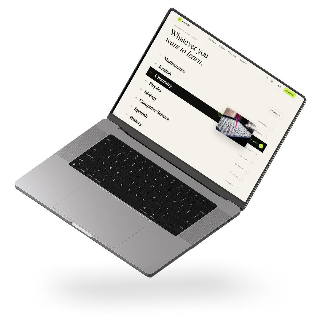
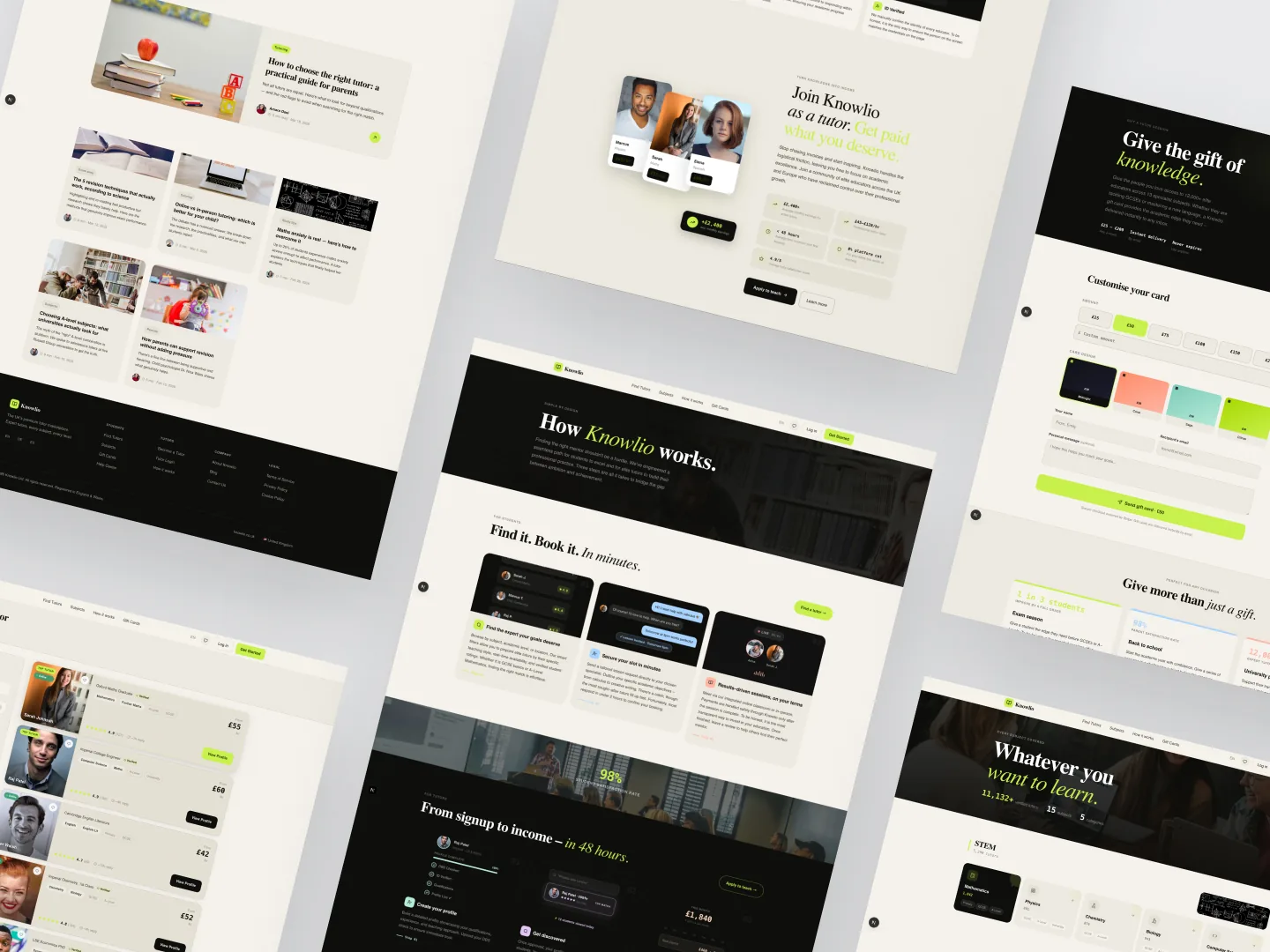
    Knowlio — marketplace overview

    The positioning — editorial, not transactional

    Knowlio looks like a magazine, not a dashboard. Cream and ink, a single neon-lime accent used as a signal rather than a fill, Playfair italic for voice and an editorial type system for everything else.

    The whole product runs on one tension: the editorial surface earns the trust, the transactional surface closes the booking. Every page knows which job it's doing. Where most marketplaces lead with the price, Knowlio leads with the person — and lets the mechanics arrive only once you've decided you care.

    Catalogue — find a tutor

    The catalogue is the real entry point, so it filters hard and loads fast. Filter by subject, level, language, and location, read straight from the URL so any filtered view is shareable. Cards stagger into the grid on scroll — motion that signals quality without slowing the search.

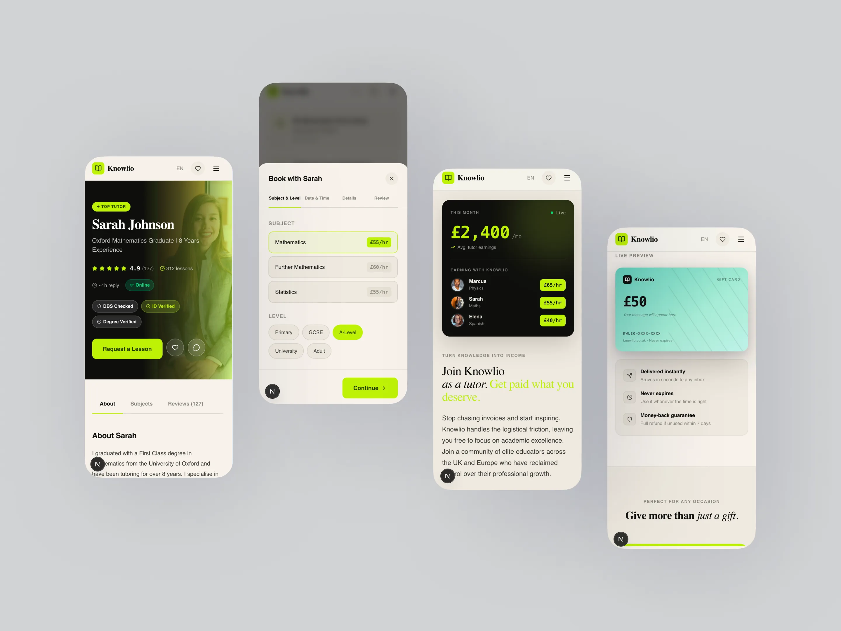
    Tutor profile — the trust surface

    This is where the marketplace earns the booking. DBS verification shown with a date and reference, reviews surfaced with context, qualifications and teaching style up front. Everything on the page answers the one question a parent is actually asking: can I trust this person with an hour of my child's time?

    Knowlio — tutor profile with trust signals

    Booking model — a 4-step wizard

    Subject & level → date & time → details → review. One decision per screen, no dead ends, live total calculation, and state held so a back-step never loses progress. The flow is deliberately boring — once someone has chosen a tutor, the job is to get out of their way.

    Student dashboard — lessons & wishlist

    Upcoming lessons with filtering, completed lessons with one-tap rebook, and a wishlist for tutors a student is still deciding between. The dashboard treats a booking as a relationship, not a transaction that ends at checkout — and it reads like a magazine, not a CRM.

    Tutor dashboard — schedule & earnings

    The supply side of a marketplace usually gets a worse interface than the demand side. Here it gets the more polished half: a weekly schedule grid with drag-to-block availability, a profile editor, and an earnings and payout view via Stripe Connect. Tutors are the supply — if their experience doesn't feel professional, the marketplace never fills.

    Brand surface — supporting screens

    The marketing and edge-case screens flex from the same system: error states, gift cards, the journal, about, contact. Even the empty states and the 404 stay on-brand — the editorial voice doesn't stop at the storefront.

    Knowlio — supporting brand surfaces
    STACK
    Next.js 16 (App Router, RSC) React 19 TypeScript 5.9 Tailwind v4 Supabase (auth + DB) TanStack Query 5 Zustand 5 react-hook-form + Zod Framer Motion 12 next-intl 4 Stripe

    The animation library is half the design system.

    Eight components in components/animations/. Every motion choice in the product flows through one of them — no per-screen ad-hoc Framer code. The brand reads as editorial because nothing moves the way a normal SaaS moves: the cursor is a custom dot-and-ring, the hero headline scrambles through three phrases, tutor cards tilt in 3D against the mouse. prefers-reduced-motion short-circuits all of it.

    01

    CustomCursor

    RAF-driven dot + ring with lerp 0.12, hover states for links and cards, hidden on touch devices. Sets the tone before the first interaction.

    02

    CardTilt

    3D tilt by mouse position, perspective: 800px. Used on tutor cards and pricing tiles. prefers-reduced-motion cleanly disables it.

    03

    TextScramble

    Matrix-style reveal that cycles random glyphs before settling on the target string. Hero headline animates between three phrases on a timer.

    04

    MagneticWrapper

    Elements within a hover zone pull toward the cursor with springy damping. Reserved for the primary CTA so it stays a moment, not a pattern.

    · PLUS · CountUp · MarqueeTicker · ScrollReveal · StaggerReveal ·

    Design tokens.

    Three colours, three typefaces, three easing curves, one edge-padding rhythm. Everything else in the product is a derivation — when the founder asked for a dark-mode preview late in week three, it shipped in two hours because the system was tokens, not stylesheets.

    COLOR · 3 PRIMARIES
    #F5F2EC Cream · surface
    #0E0E0C Ink · text
    #C8F04D Lime · accent
    TYPE · 3 ROLES
    Aa Playfair Display · Display
    Aa DM Sans · Body
    12K DM Mono · Numbers

    Plus easing tokens (--ease-out-expo, --ease-spring, --ease-in-out-quart) and a single edge-padding variable --cx: clamp(20px, 6vw, 80px) for layout rhythm across breakpoints.

    The build log.

    A week and a half, paired with one backend engineer. Architecture-first. The dashboards came last on purpose — they lean on the most schema, and the marketing site had to lock the brand voice before anything depended on it.

    SHIP TIMELINE
    PHASE 1

    Research

    Competitor teardown across six platforms. Mapped both roles, their pain points, and where the category was identical to itself. DBS verification, response time, and lesson packs surfaced as the trust levers.

    PHASE 2

    Design

    Brand, palette, type, animation-library spec. 28 Figma frames spanning marketing, catalogue, tutor profile, the 4-step booking modal, and both dashboards. Design tokens written as code before the first page shipped.

    PHASE 3

    Front-end · part 1

    Next.js 16 App Router scaffold. Animation library shipped before any page, so every later screen inherited the brand. Marketing, catalogue, tutor profile, the 4-step booking wizard with live total. Supabase auth and tables wired alongside the backend engineer.

    PHASE 4

    Front-end · part 2

    Both dashboards (tutor + student) with separate layouts. Stripe checkout + tutor payout flow. next-intl scaffolding. Admin views. Mobile pass across catalogue and modals. Integration testing against the backend's DBS-verification webhook and Stripe Connect.

    How I worked with Claude.

    Claude Design held the layout iteration on the dashboards and the booking wizard; Claude Code held the keyboard — both run through Agent Skills, Anthropic's and custom ones I've written. I drove all of it. The brand, the type, the motion language, the copy, and every product decision were mine. Claude handled the grind I delegated and reviewed: animation primitives (RAF loops, easing math), the Zod schemas shared with the backend, TanStack Query keys and cache strategy, the Stripe checkout client, next-intl scaffolding, and refactors once patterns started to repeat.

    One rule held every commit: every decision was reviewed before it landed. If I couldn't explain a line, it didn't ship until I'd rewritten it in my own voice.

    What shipped.

    What was on staging at the end of the build:

    FOR PARENTS & STUDENTS

    Browse 12,000+ tutors, filter by subject and level, read verified signals (DBS, rating, response time, live availability), book single sessions or packs through a 4-step modal with live total. A student dashboard for lessons, wishlist, and settings that reads like a magazine, not a CRM.

    FOR TUTORS

    Onboarding with DBS upload, schedule management, profile editor, earnings and payout view via Stripe Connect. The tutor side is deliberately the more polished half of the product.

    DESIGN SYSTEM

    Eight-component animation library (CustomCursor, CardTilt, MagneticWrapper, TextScramble, CountUp, MarqueeTicker, ScrollReveal, StaggerReveal). Three colours, three typefaces, three easing curves. Mirrored 1:1 from design to code. Reusable across the next project.

    FOR THE BACKEND PARTNER

    Shared Zod schemas between client and server: one source of truth for tutor / student / lesson / payment shapes. Zero "what does the API return?" round-trips. The frontend contract was the design spec.

    I owned
    Brand and visual language. Research and competitor teardown across six platforms. All 28 Figma frames. Design tokens and the 8-component animation library, spec to code. The entire Next.js 16 front-end — marketing, catalogue, profile, booking modal, both dashboards, admin views, mobile pass. All copy. Front-end / backend integration on my side.
    Paired with Claude
    Claude Design for layout iteration on the dashboards and the booking wizard. Claude Code for animation primitives (RAF loops, easing math), Zod schemas shared with the backend, TanStack Query keys + cache strategy, Stripe checkout client, next-intl scaffolding, and refactors when patterns started to repeat. Every decision reviewed before commit.
    Backend partner
    Supabase schema (tutors, students, lessons, payments), server-side auth + RLS, DBS-verification webhook integration, Stripe Connect payouts, transactional email flows. Received a typed frontend contract on day 8; integrated against shared Zod schemas, not freeform JSON.
    Where I'm headed
    Knowlio is a clear marker of where I want to sit on a product team: lead designer who owns the front-end too, working with one backend engineer instead of three layers of hand-off. The next step is closing that last gap and owning the backend layer myself — Knowlio's Zod-shared schemas and clean role separation are the runway for that.
    CASE · AI PLATFORM · MARKETING + PRODUCT LEAD DESIGNER · FIGMA NIKO TECHNOLOGIES · CLIENT · 2026

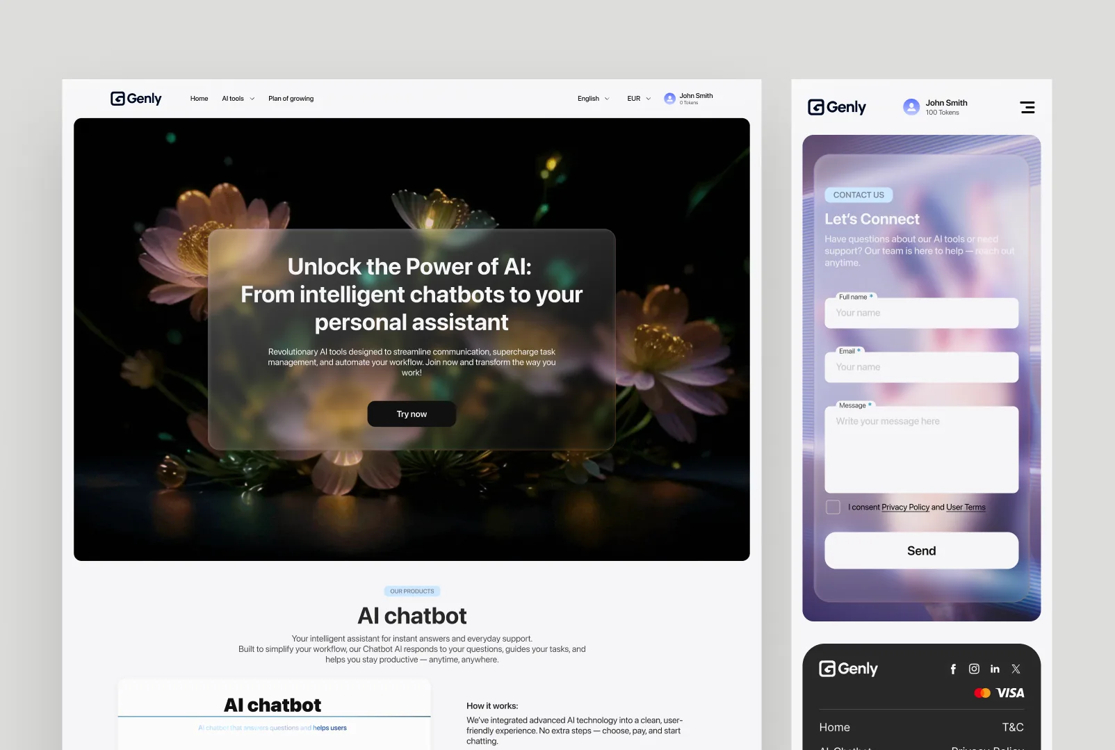
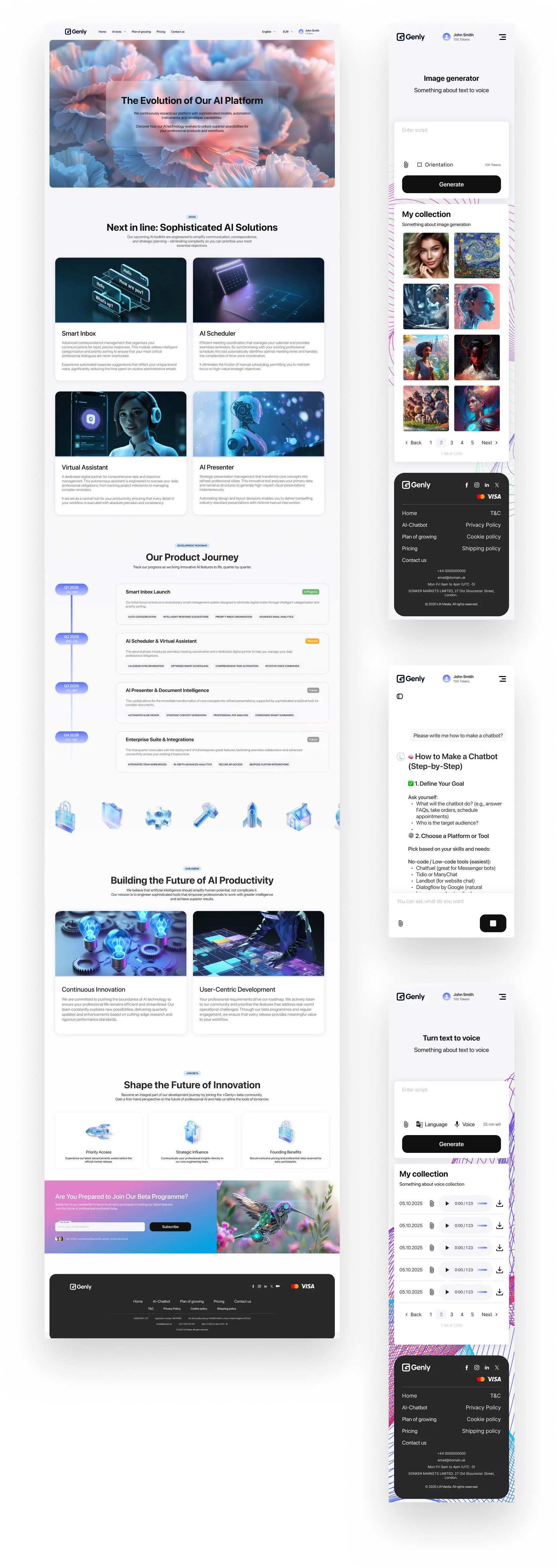
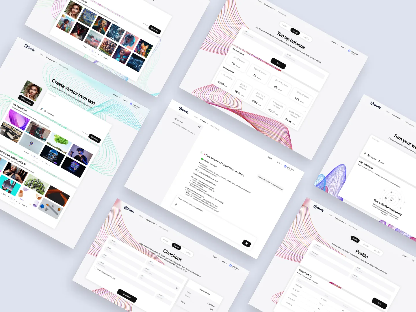
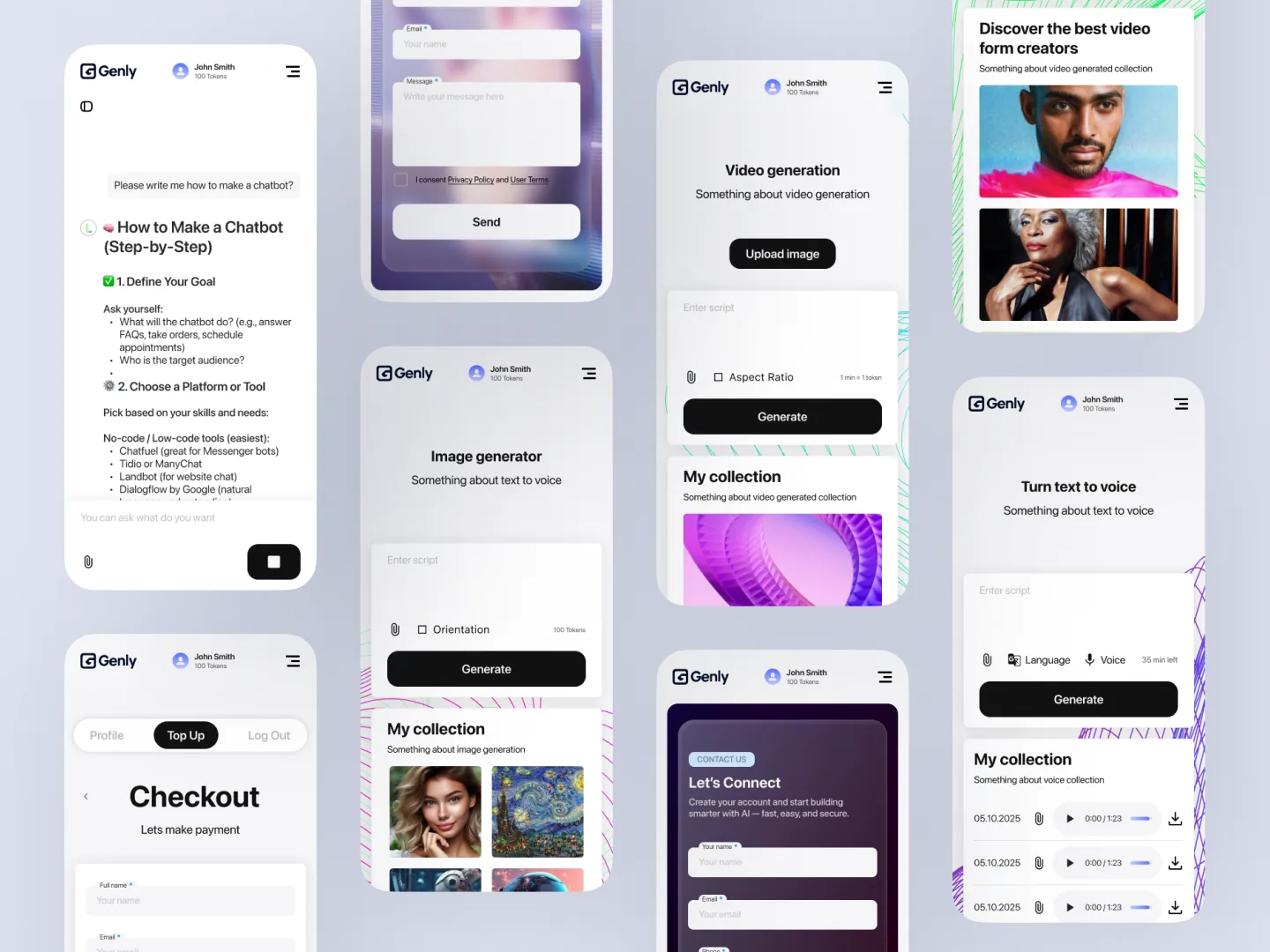
    An AI platform uniting chatbot, audio, image, and video studios under one product. Designed end-to-end in Figma.

    ◆ BUILT FULLY IN FIGMA

    The brief

    The client wanted a single home for the AI tools they were rolling out — chatbot, audio studio, image studio, video studio — that read as one product rather than four. The audience: professionals automating their workflow, not "AI enthusiasts."

    The bar: a marketing surface that earns trust on first scroll, multilingual (English / EUR locale switching live in nav), and a token-aware account header (a real "0 tokens" balance, not a fake counter).

    Genly — hero · Unlock the power of AI

    AI Chatbot · the entry surface

    The chatbot is the first tool a new user touches. A glass-card mock of the chat input lives on the landing page so the user sees the product before they sign in — "AI chatbot that answers questions and helps users" with a working Ask field preview.

    Genly — AI Chatbot landing preview

    Studios · audio, image, video

    An accordion that opens the three creation tools side-by-side with a single hero render. Audio Studio (text → audio), Image Studio (generate + explore creativity), Video Studio (generate like a pro). The user picks one and lands in a tool with the same shell as the marketing site.

    Genly — studios: audio, image, video
    STACK
    Figma FigJam Design tokens Auto-layout components i18n (en / UA / DE) Multi-currency (£ / € / $) Hand-off to in-house engineering

    100% designed in Figma — every screen, every state, and a token-based design system built specifically for this platform. Currency + language live in the nav (English / UA / DE / £ / € / $). Account header carries the token balance — same number on landing and in-product, modelled as a single source of truth in the Figma spec. Engineering shipped from the Figma file.

    I owned
    Brand and visual language. Marketing site + in-product UI for the four tools. Token-aware account shell. Coming-soon carousel. Locale + currency picker. Token-based design system in Figma. All copy. Design-side QA against the live deploy.
    Engineering
    The client's in-house team built the front-end + back-end from the Figma source of truth. Tokens shared in a defined export so spacing and colour never drift between design and implementation.

    Hush

    A native macOS menu-bar app for on-device voice dictation. Press a hotkey, speak, and the text lands wherever the cursor is — browser, notes, chat. Built solo in three days, paired with Claude Code, as a free, private alternative to a paid dictation subscription.

    ◆ 100% ON-DEVICE · NO CLOUD, NO ACCOUNT

    Solo lab build · 3 days

    Remove every bit of friction around the one action that matters: speak, get text.

    Three days, solo, paired with Claude Code. The idea, the scope, and every line of Swift are mine — module architecture, the build and codesign script, the permission-flow and onboarding design. Claude paired in on the narrower plumbing: Carbon API bridging, TCC permission boilerplate, AVAudioEngine format conversion.

    The problem

    The tool I was paying for does one job. Listen to the mic, transcribe speech, insert text into whatever field is focused. That's it — and it's worth paying for only because building it yourself takes real effort, not because the job is complex.

    So the answer was to build my own version: all voice processing on-device, no cloud, no account, free forever.

    What I built

    Hush is a menu bar app for macOS. Press a hotkey, speak, and the text is inserted automatically into whatever's focused — anywhere in the system.

    • Fully offline transcription via WhisperKit (Core ML, Neural Engine) — no audio ever leaves the device
    • Two hotkey modes — toggle (press to start, press to stop) and push-to-talk (hold to record, release to insert)
    • Auto-paste or clipboard — user's choice of where the transcript lands
    • Multi-language — auto-detect or pick from 12+ languages
    • Floating overlay with a live equalizer waveform during recording
    • Local transcript history, stored as JSON, never uploaded
    • 6 selectable Whisper models — 40MB fast/English-only up to 1.5GB accurate/multilingual, user picks the tradeoff
    • Universal binary — arm64 + x86_64
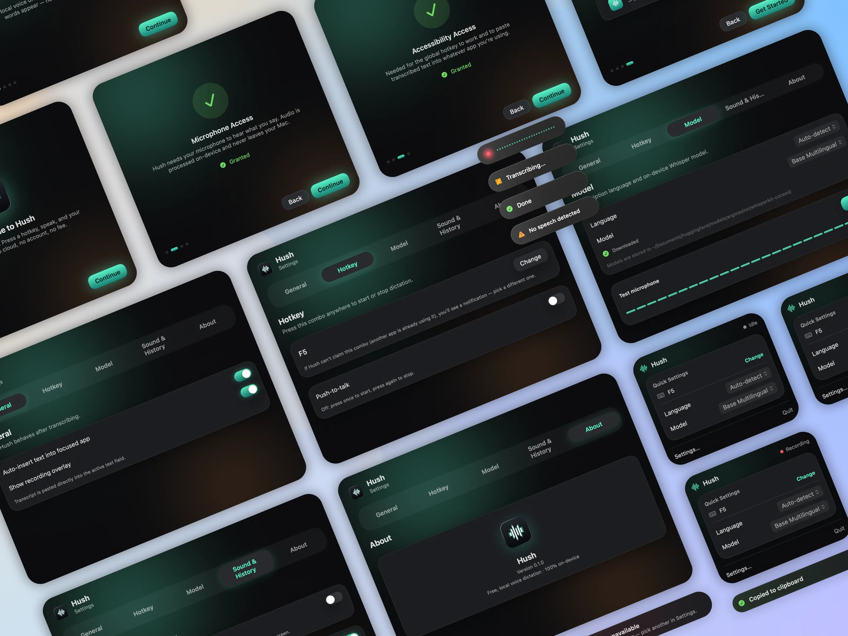
    Hush — onboarding, settings, hotkey, model, and menu bar UI screens

    Process

    The point isn't "build another dictation app" — it's removing every bit of friction around the one action that matters: speak, get text.

    1. One action, zero extra steps. Everything revolves around a single hotkey. No main window to open — the app lives in the menu bar. The interaction happens where the user is already working, not in a separate app window.

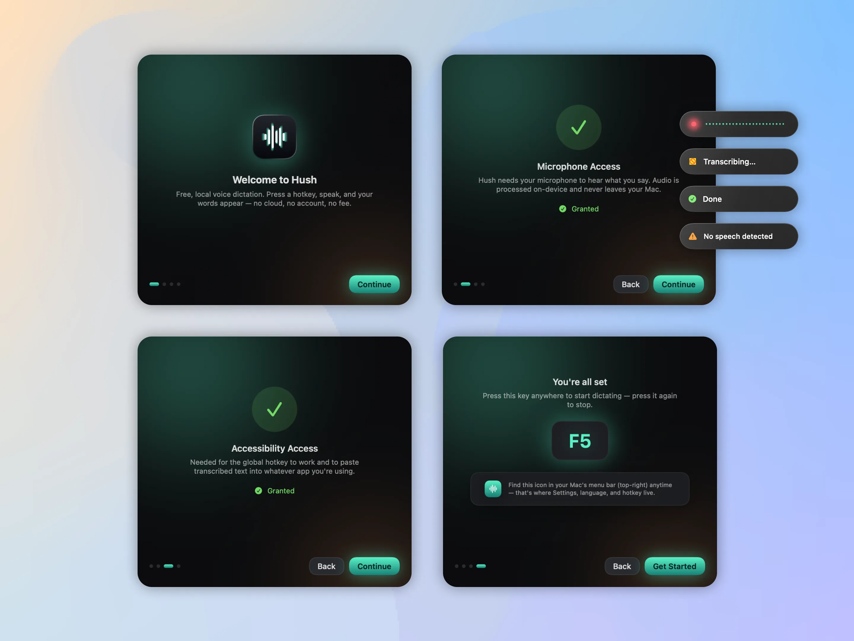
    2. Onboarding as trust-building, not a formality. Instead of silently firing system permission prompts with no context, there's a 4-step walkthrough — welcome → microphone → accessibility → ready — that explains why each permission is needed right now. A permission prompt without context gets denied; one with context gets granted.

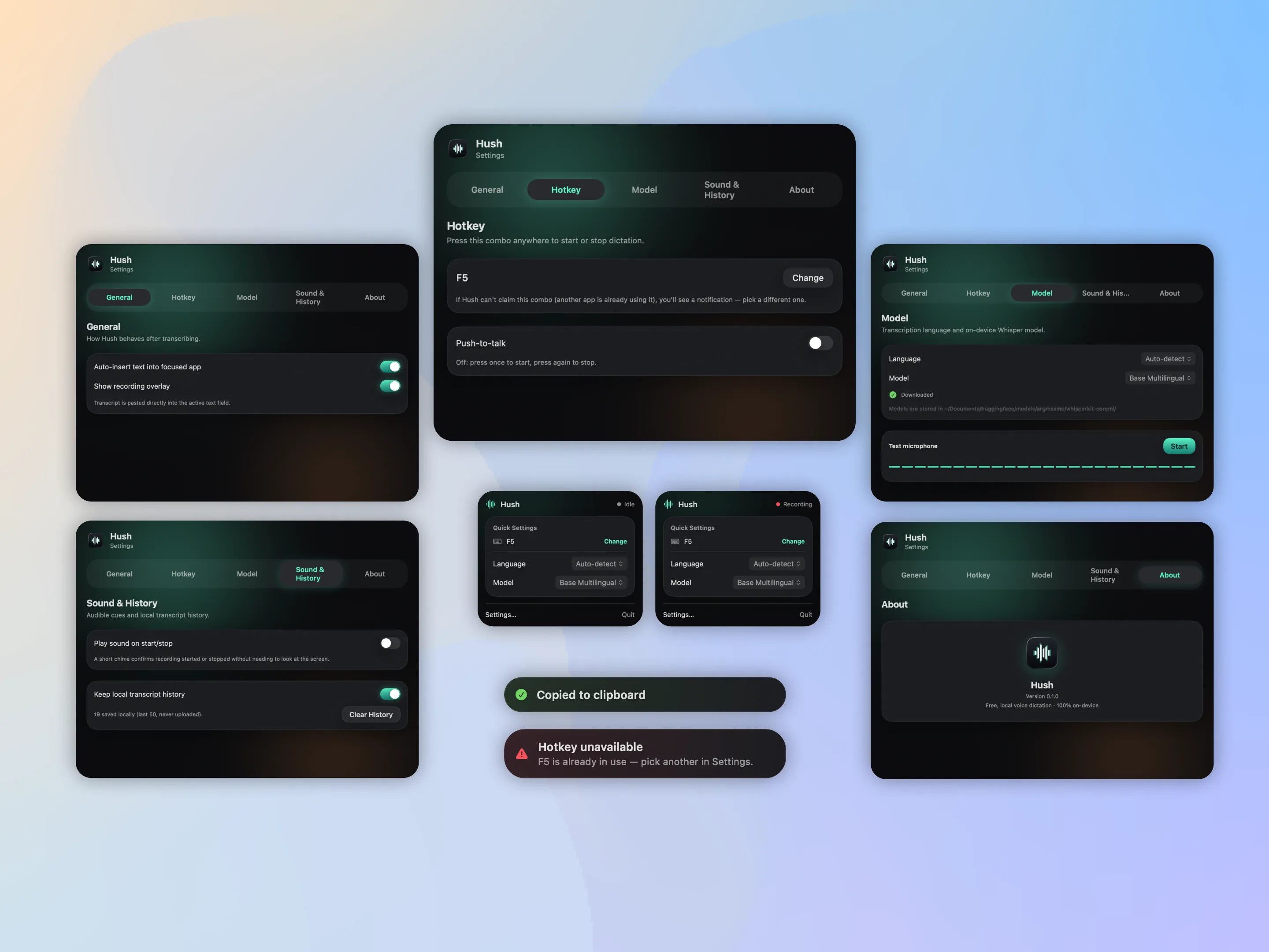
    3. A design system, not a pile of screens. Every surface — recording overlay, menu bar panel, settings, toasts — is built on shared tokens: dark palette, soft ambient glow, consistent corner radii, matching spring-animation parameters. The product reads as one coherent system even though it's several separate windows.

    4. System state is visible without reading text. Each state — idle, recording, transcribing, done — has its own color and micro-animation, so users understand what's happening peripherally, without reading a status label.

    5. Edge cases designed, not patched in later. Accessibility denied? Auto-insert silently falls back to clipboard-only. Model can't handle the selected language? Settings surfaces a warning before the user hits a confusing empty transcript. Target app blocks synthesized keystrokes? A documented manual-paste toggle, not a silent failure.

    6. Privacy as a design constraint, not a footnote. On-device transcription shapes the whole product story — no account screen, no login, no data-collection consent modal, because there's no data being collected. The push-to-talk key monitor is scoped to only react to the configured hotkey combo — stated explicitly, not just true by accident.

    Hush — 4-step onboarding: welcome, microphone, accessibility, hotkey

    ↑ Onboarding · four steps, each one explained · ↓ same tokens, applied to every settings surface

    Hush — settings tabs, menu-bar panel, and toast states sharing one design system

    Tech stack

    No backend, no network calls except a one-time model download from Hugging Face on first run.

    Swift SwiftUI AppKit AVFoundation (16kHz mono) Carbon EventHotKey WhisperKit (Core ML / Neural Engine) Swift Package Manager

    Harbor

    A clinic CRM that starts the day with what needs a person. Clinics lose patients in the gaps between the EHR, the phone and a paper waitlist. Harbor turns each gap into a named task for the front desk, the doctor or the manager.

    ◆ HEALTHCARE SAAS · WEB APP + PHONE · 3 ROLES

    RoleProduct designer, end to end
    ScopeResearch, IA, UI, design system, prototype
    PlatformsWeb app · phone
    Year2026
    At a glance

    Built to move four numbers

    Design targets for an 8-week pilot, each with a way to test it. Not measured results.

    15–30% no-shows< 8%with fast rebooking and reminder suggestions
    freed slots lostMinutesfrom a cancellation to an offer to the waitlist
    "where is my referral?"Visiblereferral status shared by staff and patient
    clicks per lookup⌘Kone shortcut to any patient, screen or action
    Problem

    Each tool works. The handoffs between them fail.

    Desk research on clinic operations and an audit of patient-portal and CRM products. Front desks get the manager's revenue dashboard; today's problems appear nowhere.

    15–30%

    typical outpatient no-show rate reported by scheduling vendors

    63%

    of referring doctors reported unhappy with referral workflows

    65%

    of healthcare leaders say referral leakage blocks their financial goals

    IH
    Ihor · Front desk4 doctors, ~40 visits a day

    Problems reach him only when an upset patient is at the counter.

    TodayScheduleWaitlistReferrals
    IP
    Dr. Petrenko · Cardiology9 patients a day

    Walks into visits without context; overdue follow-ups go unnoticed.

    My dayMy patients
    SM
    Svitlana · Clinic managerStaff, schedule, budget

    Sees the numbers change but not why.

    OverviewPatients

    Three roles, one patient record. Search, ⌘K, notifications and the account work the same everywhere. Figures come from industry and vendor sources listed below, used as direction.

    Solution

    Six pain points, six decisions

    A feature went in only if it could point to a pain point. Each row shows the desktop screen and the same flow on a phone.

    01 · Front desk
    Problem

    No-shows and open referrals surface only when a patient complains at the counter.

    Decision

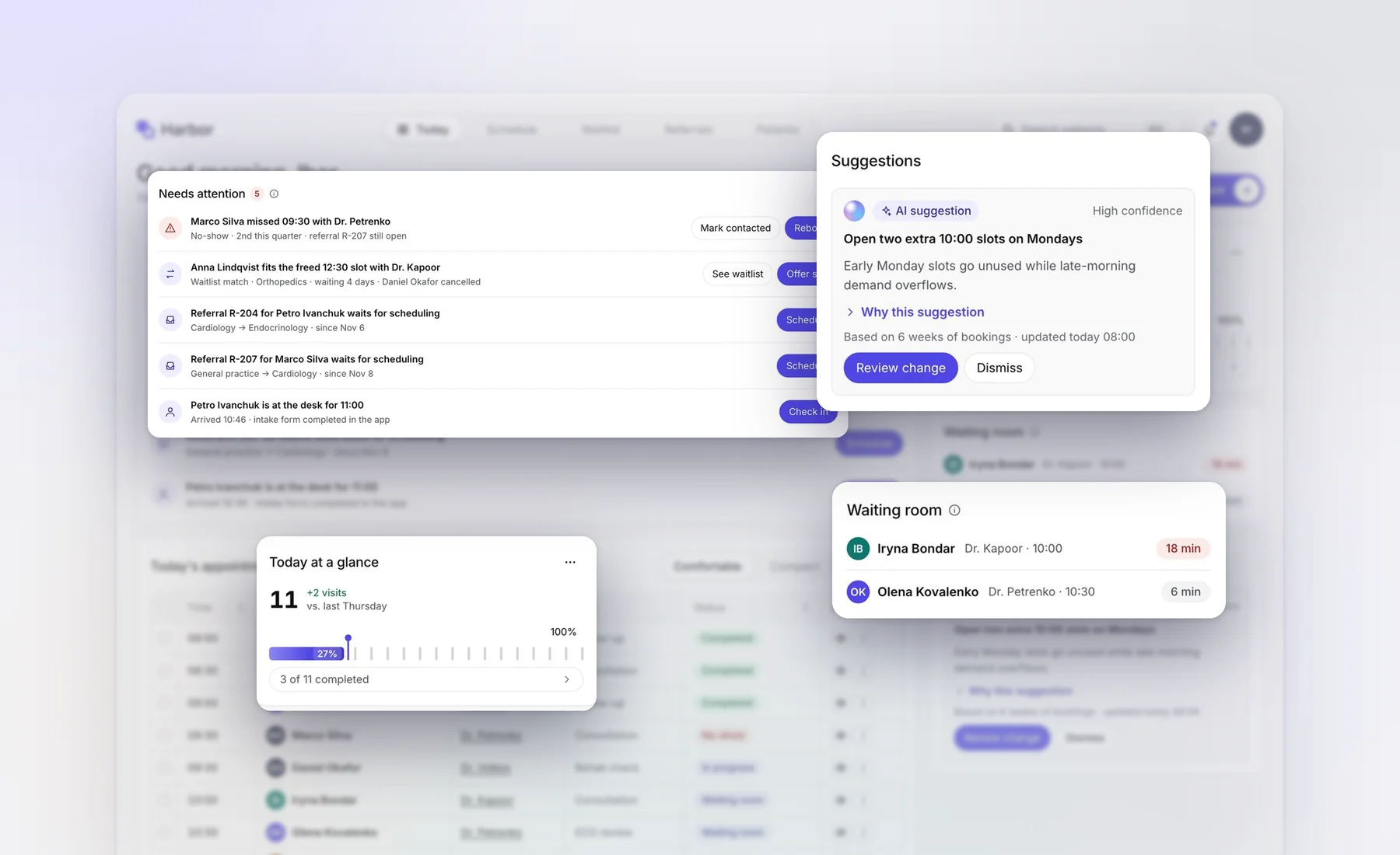
    The day opens with a “Needs attention” queue sorted by urgency. Each row names the patient, gives one line of context and carries the action. Undo on every action.

    Patient record. One timeline across departments makes the second no-show impossible to miss.

    02 · Waitlist
    Problem

    A cancelled slot stays empty while someone waits two weeks for the same doctor.

    Decision

    Cancellations are matched to the waitlist by department and preferred time. Staff press Offer slot; nothing is sent on its own.

    03 · Referrals
    Problem

    Referrals sit in an inbox until the patient calls to ask, or goes to another network.

    Decision

    Every referral has a status shared with the patient's app. When a specialty is not on staff, partner-clinic slots appear with the reason.

    04 · Doctor
    Problem

    Doctors open the door without context, and planned follow-ups are never booked.

    Decision

    “Next patient” leads the doctor's day: status, the intake filled in the app, the last relevant result. Sign-offs wait in a small side queue.

    05 · Manager
    Problem

    Managers see that no-shows rose, but not why.

    Decision

    Annotations pin events to the chart (“Flu season”, “Dr. Volkov joined”). Findings sit under the staff table, where their evidence can be checked.

    06 · AI
    Problem

    In a clinic, an AI that quietly moves appointments is a liability, however accurate.

    Decision

    One suggestion pattern everywhere. Applying it names exactly what changes and who gets an SMS before anything happens.

    Labelled as AI, with confidenceExplained with 2–4 factsSourced with data and timeConfirmed before it actsReversible with Undo
    Everyday screens

    Fast for the hundredth booking of the day

    Booking only offers free slots, so a double booking cannot happen. ⌘K reaches any patient, screen or action from the keyboard.

    Schedule. Any empty slot books in one click.

    Add appointment. Only the doctor's free slots are listed.
    ⌘K. Patients, screens, actions and role switching in one field.

    Notifications. Each one links to the record it is about.

    Mobile

    The same clinic, on a phone

    Doctors check their day between rooms; managers look at numbers away from a desk. Every screen works at 390 px with the same components.

    Tab bar in thumb reachEach role's sections move to the bottom; nothing hides off the edge.
    Tables become cardsEach row turns into a card: the name leads, actions sit top right, the rest are label/value pairs.
    One doctor at a timeThe schedule shows one column with a doctor switcher instead of a grid cut in half.
    Schedule
    Add appointment
    Patient record
    Dark theme
    Sign in
    Sign up
    Access

    Secure without friction

    Patient data needs two-step sign-in, so the code screen gets as much care as the dashboard. Sign-up answers configure the product: departments seed the schedule, the role picks the home screen.

    Sign in. The side panel shows the product's idea, not a stock photo.

    Code error. Says what happened and the two ways out.

    Sign-up, step 2 of 3. Nothing is asked for marketing.

    Account. Staff see that patients can view who opened their record.
    Design system

    Measured from a reference, not eyeballed

    I sampled a reference dashboard at pixel level and turned every value into a token, then fixed what it got wrong for healthcare: low-contrast greys and pills unreadable at 12 px.

    accent
    ink
    series 2
    success
    danger
    Label grey contrast3.4 → 5.3 : 1
    Card gap · padding · radius16 · 16 · 12 px
    Table row · status pill40 · 22 px
    ThemesLight + dark, one source
    24 componentsAttentionListAISuggestionCommandPaletteDrawerWCAG 2.2 AA
    Iterations

    What changed after review

    Every screen was checked against Nielsen's ten heuristics and WCAG 2.2 AA, at desktop and 390 px.

    Styled by eye → measured

    Early screens had bloated cards and a tooltip over the headline. Rebuilding from pixel measurements fixed density in one pass.

    Static mock → tested routes

    Rendering every route caught data bugs a mock hides, like a referral offering the wrong specialist. Each became a rule.
    Desktop only → phone

    On a phone, tabs and table columns were cut off at the edge. A bottom tab bar, card rows and a one-doctor schedule fixed it.

    People, clinics and figures in the screens are mock data. Sources, used as direction: Consentz (no-show rates) · Simbo AI (referral workflows) · Syntellis (referral leakage) · Tellescope (EHR vs CRM).

    Lintel

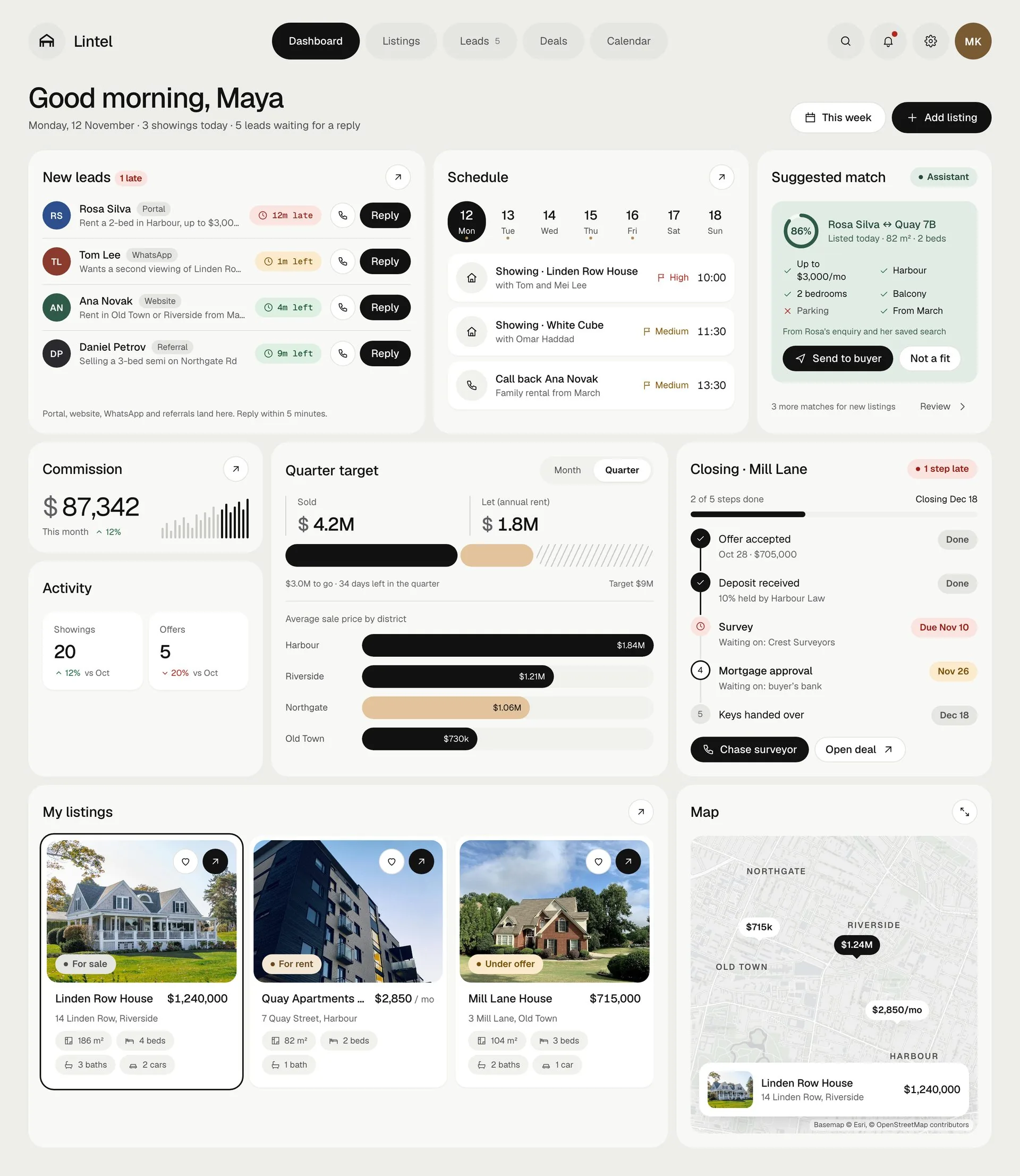
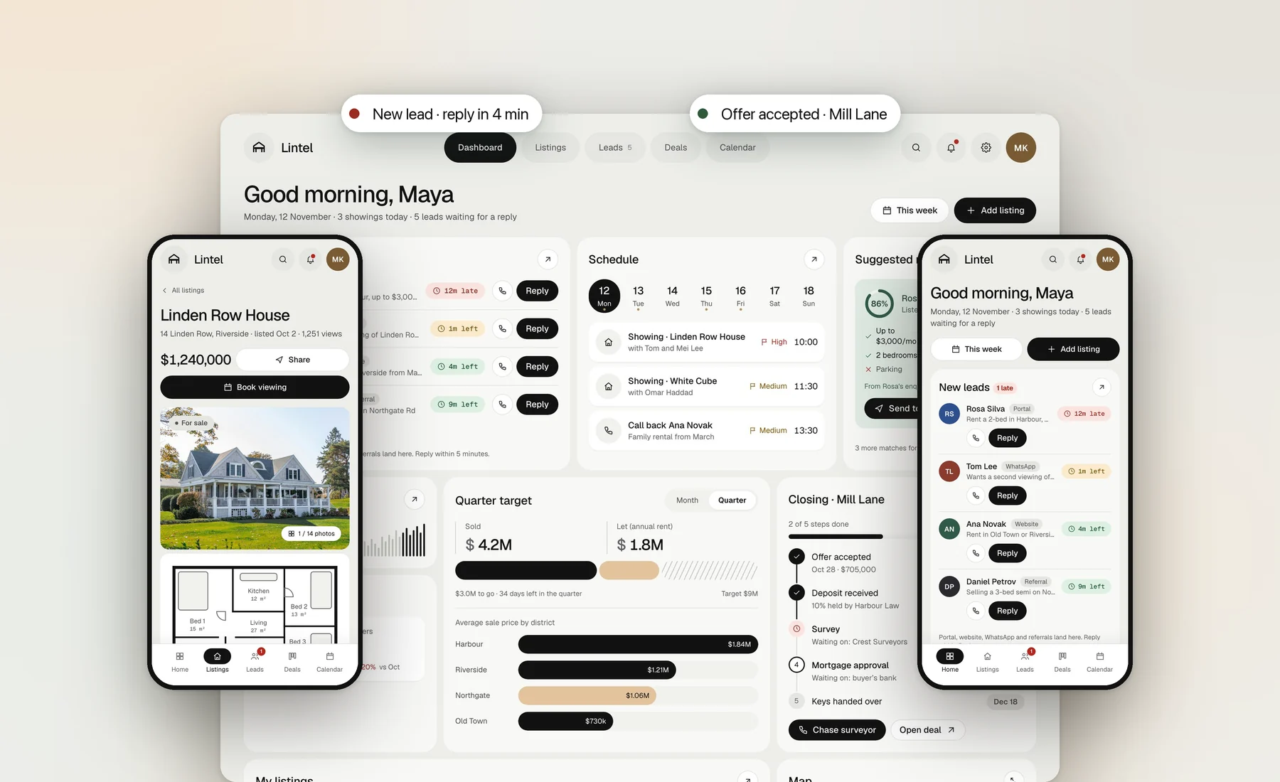
    A CRM that keeps every home sale moving. Agents lose deals in the gaps: a lead left unanswered, a match nobody noticed, a seller left guessing. Lintel shows each gap as the next thing to do.

    ◆ REAL ESTATE CRM · WEB APP + MOBILE WEB

    RoleProduct designer, end to end
    ScopeResearch, UX, UI, design system, prototype
    PlatformsWeb app · mobile web
    Year2026
    At a glance

    Four gaps closed by four features

    Each feature answers one pain point. The numbers are design targets for a pilot, not measured results.

    < 5 minfirst reply to a new lead, with a timer on every enquiry
    2 minfrom new listing to a matched buyer's shortlist
    30 sto log feedback after a showing, on the phone
    0closing steps without a named owner and due date

    Why speed matters: firms that contacted online leads within an hour were nearly 7 times more likely to qualify them than those who waited longer (Harvard Business Review, "The Short Life of Online Sales Leads", 2011).

    Problem

    Generic CRMs track records. Agents need to know who is waiting.

    I reviewed agency CRMs and portal tools and mapped a sales agent's week. The same four failures came up every time.

    Leads go cold

    Enquiries arrive from 4+ channels and sit unanswered between showings.

    The first agent to reply usually wins the client.

    Matching is memory

    New listings are matched to buyers from memory or a spreadsheet.

    Good buyers miss homes that fit them.

    Sellers chase updates

    Showing feedback lives in notes and texts, so owners call to ask.

    Weekly updates take an hour per listing.

    Closings stall quietly

    After the offer, 6+ parties own steps nobody can see in one place.

    A late survey surfaces only when the date slips.

    Maya, sales agentRuns 3–5 showings a day from her phone. Needs to know what to do next, fast.
    Team leadWatches pipeline and targets. Needs to see where deals are stuck.
    Sellers and buyersNever log in. They feel the product as faster replies and clear updates.
    Solution

    Familiar CRM, plus the four things it was missing

    Listings, pipeline, calendar and map work the way agents expect. The new features sit inside them, not on separate pages.

    01 · Leads
    Problem

    Leads from portals, website, WhatsApp and referrals end up in different inboxes.

    Decision

    One inbox sorted by reply deadline. Each lead shows a 5-minute timer, the client's criteria and reply templates.

    02 · Matches
    Problem

    Buyers are matched to new homes by memory, so good matches get missed.

    Decision

    The assistant suggests matches and shows why: each criterion met or missed. The agent sends it, never the system.

    03 · Feedback
    Problem

    Showing feedback is lost in texts, so sellers call for updates.

    Decision

    Three taps after each showing: verdict, reasons, optional note. It fills the weekly seller update automatically.

    04 · Closing
    Problem

    After the offer nobody sees which step is late or who holds it.

    Decision

    A closing tracker on every deal: each step has an owner (“Waiting on: buyer's bank”) and a due date. Late steps turn red.

    Core CRM

    The everyday screens, done properly

    Real photos and floor plans lead every listing. The map uses a real street basemap with prices as markers, synced with the list.

    Listings, map view. Hover a row and its marker turns black; the callout opens the listing.

    Listings, grid view with status and specs.

    Deals board. Photo and plan on each card, next step with date.

    Calendar. Today's showings as a numbered route.

    ⌘K finds any listing, client or action.

    Mobile

    Built for the car between showings

    Agents spend the day away from a desk. The phone version is the same product, rearranged for one hand.

    Tab bar in thumb reachFive sections at the bottom. The late-lead count stays visible.
    List, then detailLeads open full screen with a back link, instead of a cramped split view.
    Sheets, not side panelsDeals and feedback slide up from the bottom; actions sit at the bottom edge.
    Dashboard
    Leads
    Map
    Deals
    Calendar
    Dark theme
    Onboarding

    From sign-up to first lead in three steps

    Account, agency, lead sources. Password rules show as you type. Connecting sources is the step that makes the inbox useful on day one.

    Design system

    Calm neutrals. Colour only where it means something.

    Black is the one action per screen. Sand carries data. Sage belongs only to the assistant, so suggestions are always recognisable as machine output.

    canvas
    primary
    sand · data
    sage · AI
    danger
    Display 40Geist 500
    $1,240,000metric · tabular
    LT-04198 · 12m lateGeist Mono
    39 componentsLight + darkWCAG AA pairs8 px gridTab barMap viewClosing tracker
    Iterations

    What changed after review

    Every screen was checked at desktop and 390 px against spacing, contrast and Nielsen's heuristics.

    Drawings → real photos

    Illustrated houses looked like a template. Buyers decide on photos, so photos and floor plans now lead.

    Schematic → real map

    A stylised map hid real distances. A desaturated street basemap shows where homes actually are.

    Four black buttons → one

    On the phone, four full-width Reply buttons competed. Now one primary action per screen, the rest compact.

    People, agencies and listings in the screens are fictional. House photos: Unsplash License. Basemap © Esri, © OpenStreetMap contributors.

    Parcel

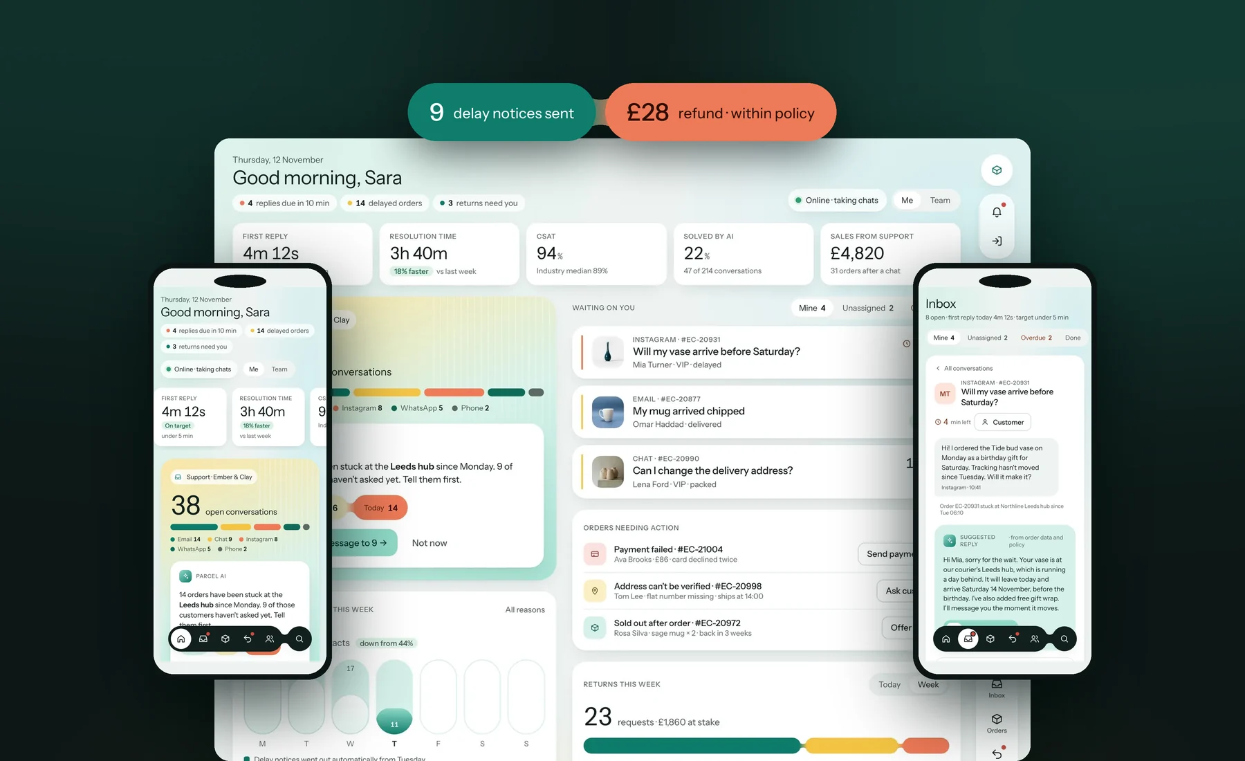
    Answer before they ask. Parcel is a support CRM for direct-to-consumer brands. It does everything a helpdesk must, then tells customers about a late parcel before they write in.

    ◆ E-COMMERCE SUPPORT CRM · WEB + PHONE

    RoleProduct designer, end to endScopeBenchmark, UX, UI, design system, prototypePlatformsWeb · phoneYear2026
    44%→25%"where is my
    order?" share
    < 5 minfirst reply 0"can I refund
    this?" pings
    Design targets for a pilot, not measured results.
    Delay notice sent to 9 Refund £28 · within policy
    01 · Benchmark

    First, everything the giants do

    I mapped the home screens of Salesforce Service Cloud, Gorgias and Shopify. Parcel had to match the core before its own ideas counted.

    NeedSalesforceGorgiasShopifyParcel
    Agent status and routing✓✓–✓
    Queues with SLA timers✓✓–✓
    First reply, resolution, CSAT, automation✓✓–✓
    Order next to the message, with refund and reship✓✓~✓
    Orders needing action✓–✓✓
    Delay notice before the customer asks–––✓
    Refund policy shown before you press refund~––✓
    Quiet VIPs with a reason and a win-back draft~––✓

    ✓ on the home or agent screen · ~ possible with add-ons or setup · – not there. Based on public docs and guides, November 2026.

    02 · A day with Sara

    Six moments, six decisions

    Sara is one of four agents at a ceramics brand with 3,000 orders a month. Each stop is a real friction in her day and the screen that removes it.

    09:05

    14 parcels are stuck. Nobody has written yet.

    Problem

    Up to half of support volume is "where is my order?", and agents answer it one copy-paste at a time.

    Decision

    Parcel spots the stuck parcels and drafts one notice. Sara previews the exact text and recipients, sends, and can undo.

    10:40

    "Will my vase arrive before Saturday?"

    Problem

    To answer, agents switch to the store admin, find the order, then come back.

    Decision

    The order, its delivery steps and four actions sit beside the message. A suggested reply uses that data and goes in with one click.

    11:15

    A chipped mug. Can she refund it?

    Problem

    Agents aren't sure what they may approve, so they ask a lead and the customer waits.

    Decision

    The refund panel checks the rule first: under £80 and within 30 days goes through; over the limit asks the lead; outside the window offers credit.

    13:30

    Seven returns, three need a call.

    Problem

    Returns live in email threads; each agent decides differently.

    Decision

    A three-column board by who it waits on. Out-of-policy requests block the refund button and suggest store credit for VIPs.

    15:00

    Mia used to order every five weeks.

    Problem

    Valuable customers drift away after one bad delivery, and nobody notices.

    Decision

    Customers 90+ days quiet surface with the reason ("right after a delayed delivery") and a win-back draft.

    17:30

    Did telling them first actually work?

    Problem

    Leads see volume, not causes, so they can't prove what reduced it.

    Decision

    Reports show why customers write, and the "where is my order" share falling from 44% to 31% after delay notices started.

    03 · Onboarding

    From sign-up to the first message in three steps

    Store owners set Parcel up themselves. Connecting the store pulls in orders, so the very first conversation already has its order beside it.

    Sign in 1Account 2Store 3Channels
    Sign in. A centred card between walls of product capsules and live numbers, unlike the split screens of my other cases. Shopify sign-in for store owners.
    1 · Account. Password rules tick off as you type; Continue stays off until they all pass.
    2 · Store. Platform decides how orders sync; volume sizes the queues and targets.
    3 · Channels. Each source is one switch. Everything lands in one inbox with its order.
    Sign in
    Account
    Store
    Channels
    04 · Mobile

    Same product, one thumb

    Agents check the queue on the way in. Every screen works at 390 px.

    Rail → dark bottom pill with a joined searchList and thread as separate screensDrawers become bottom sheetsTables become cardsKPIs scroll sideways
    Inbox
    Today
    Order actions
    Orders
    Customers
    Dark theme
    05 · Design system

    Capsules with soft joins

    One shape carries the data: capsules joined by concave necks. It reads as one thing that grows, which is exactly what a delay or a return queue does.

    Joined pills · a sequence
    Mon 3Tue 6Today 14

    Calm to loud: mint, butter, coral.

    Segment bar · parts of a whole

    Approved · waiting on customer · needs you.

    Capsule bars · a week

    Today in teal; future days as outlines.

    Colour means something
    brand · done
    action
    waiting
    needs you
    calm
    hero

    The palette was moved away from the reference's blue and lilac to teal, butter and coral, so the product doesn't look borrowed.

    In numbers
    30components
    38colour tokens
    AAboth themes
    06 · Iterations

    What changed on the way

    Each version was reviewed against Nielsen's heuristics, WCAG 2.2 and the benchmark.

    Looked like the referenceOwn palette

    Lilac and sky blue became teal, butter and coral.

    Only our three ideasCore first

    Status, queues, five KPIs, channels and orders needing action, after the benchmark.

    AI sent straight awayPreview, then send

    Exact text and recipients first; Undo after.

    Split-screen sign-inCapsule walls

    A centred card between drifting product capsules, unlike my other cases.

    2:20Seen today · Brooklyn Heights $25Sick visit with your plan DRSame doctor every time
    Linden Health Case study · Healthcare website

    From “I feel sick” to a doctor today.

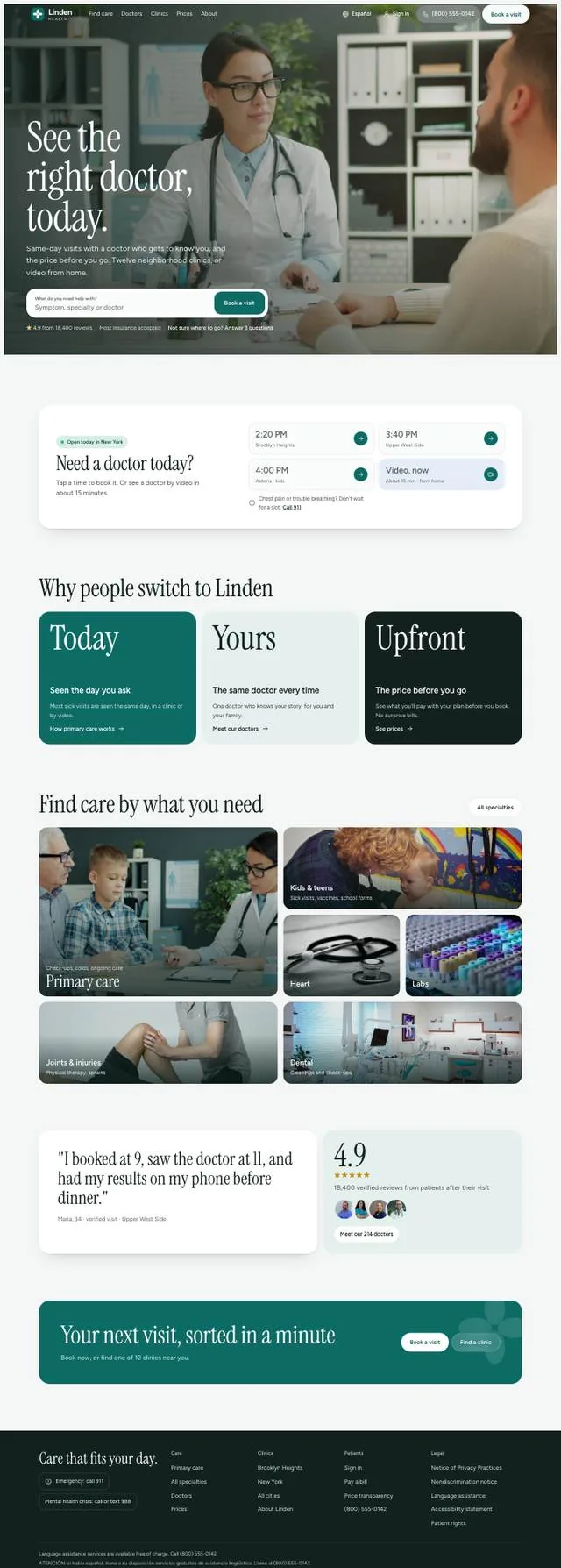
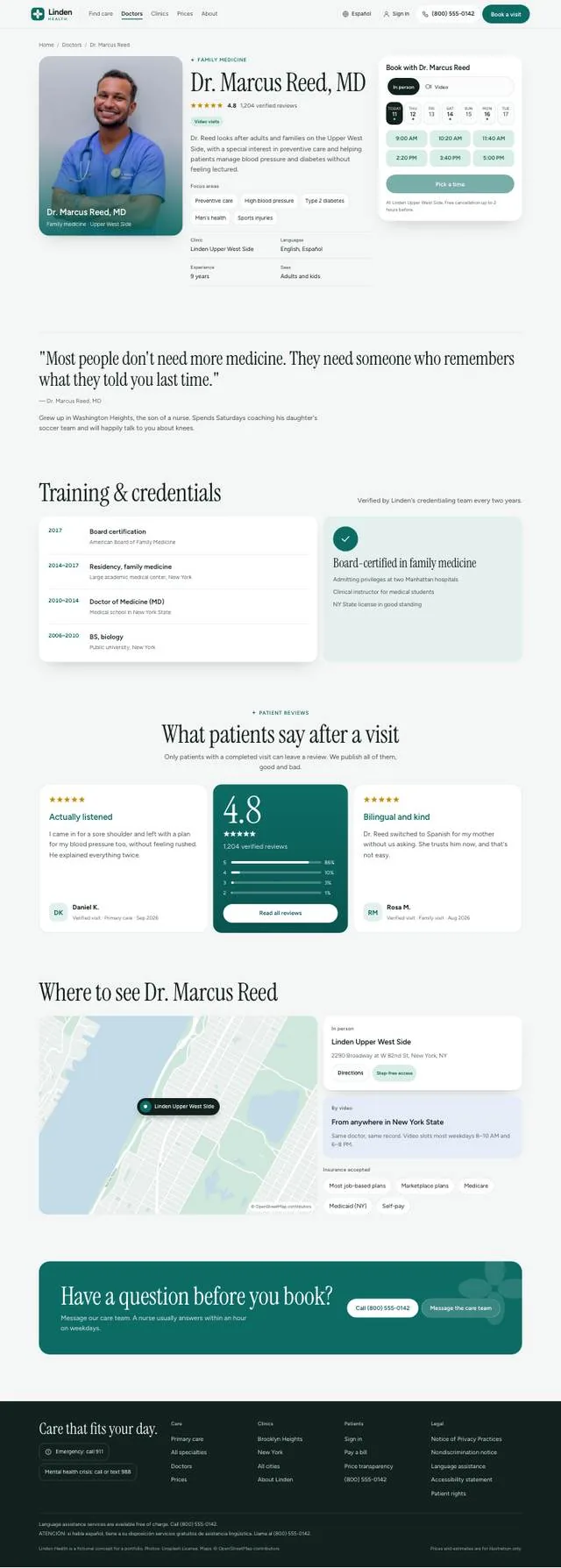
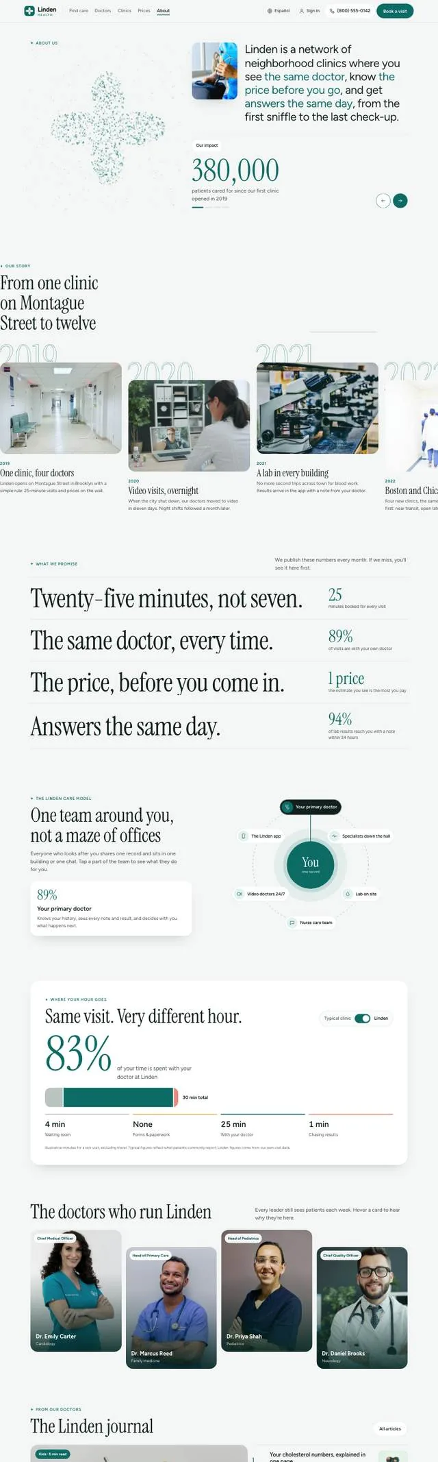
    Linden Health is a network of twelve primary-care clinics in the US. I designed its website around one job: help a worried person book the right doctor, at a known price, in about a minute.

    RoleProduct designer, end to end
    ScopeUX, UI, brand, maps, prototype
    Pages8 pages · desktop and phone
    Year2026
    At a glance

    Less to read, faster to book

    Four numbers the design was built around. The homepage figure is measured on the two versions; the others are what the site shows today.

    11.2 phone screens6.3

    homepage length on a phone after the rebuild

    “call us for pricing”16

    services with a price and a typical copay, before booking

    1

    booking window used on every page, so it always works the same way

    grey boxes on a map12

    clinics drawn on real OpenStreetMap streets and water

    Problem

    Patients arrive with three questions. Clinic sites answer none of them.

    I reviewed US clinic and doctor-finder sites (One Medical, ZocDoc, Doctify-style directories, hospital networks). Most open with a mission statement and hide the three things a sick person needs.

    Can anyone see me today?“Call to schedule. Mon–Fri 9–5.”
    When?

    Open times are buried behind a phone number or a long sign-up form.

    How much will this cost me?“Costs vary. Contact your insurer.”
    How much?

    Prices are missing, so people delay care or get a surprise bill.

    Will I see the same doctor again?“Next available provider.”
    Who?

    Doctor lists are faces and titles. Nothing about who fits you.

    Maya, 34, Brooklyn · the person I designed for

    Her son woke up with a fever. She has an employer plan, ten minutes before work, and a phone in one hand.

    Goal: booked before 8:00 am
    The homepage

    One message, one path to booking

    The first version tried to say everything on one page. I cut it to a single promise and moved detail to pages people choose to open.

    Kept on the homepage

    • ✓Search: symptom, specialty or doctor
    • ✓Today's open times, one tap to book
    • ✓Three reasons to switch, each linking deeper

    Moved to their own pages

    • →Full price list → Prices
    • →All twelve clinics and maps → Clinics
    • →Doctor filters and profiles → Doctors
    • →Story, team and journal → About
    Solution

    Five decisions

    Each one answers a single patient question. Every screen below is from the working site.

    One

    Start with a search box and today's open times

    Problem

    Hero sliders and mission statements push the booking button below the fold.

    Decision

    The hero has one field and one button. Right under it, the next three open times nearby, plus a video visit now.

    Answers “When?”
    Two

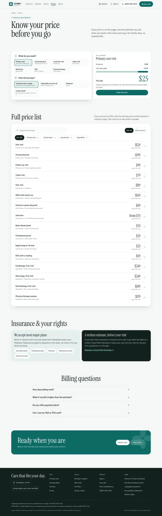
    Show the price before the booking

    Problem

    Prices hide behind “contact your insurer”, so people guess, wait, or get a surprise bill.

    Decision

    Every service shows the self-pay price and a typical copay. One switch flips the whole list to “with insurance”. Free care is simply labelled Free.

    Answers “How much?”
    Three

    Sell the doctor, not the building

    Problem

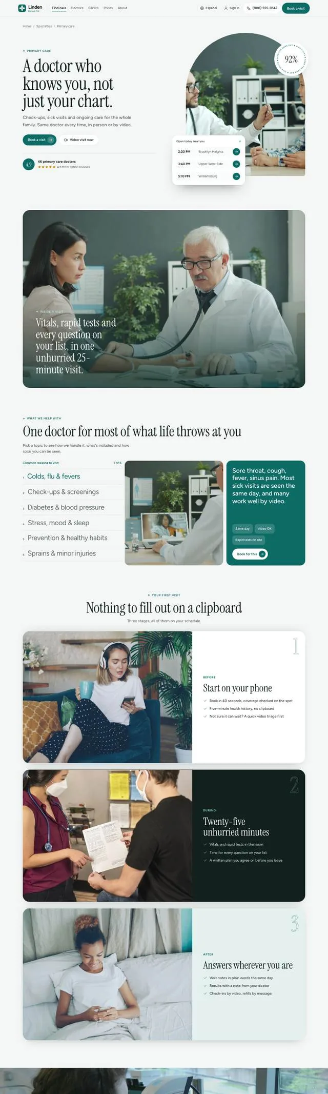
    People want continuity: one doctor who remembers them. Directories show only a name and a title.

    Decision

    Filters by what matters (takes my insurance, new patients, Spanish). Profiles lead with focus areas and real open times next to the photo.

    Answers “Who?”
    Four

    A clinic page you can actually find your way with

    Problem

    Clinic pages show an address and a generic pin. Patients still don't know which entrance, which train, or if it's step-free.

    Decision

    Hours, transit and access come first, on a map drawn from real streets. Below: what's treated here and who works here.

    Answers “Where?”
    Five

    One booking window, everywhere

    Problem

    Each “Book” button on a typical site opens a different form, or a new portal with a sign-up.

    Decision

    Every button opens the same window, already filled in with the service, doctor or clinic you came from. No account needed; cancel from the confirmation.

    Fewer steps to “booked”
    Detail

    Maps drawn from real streets

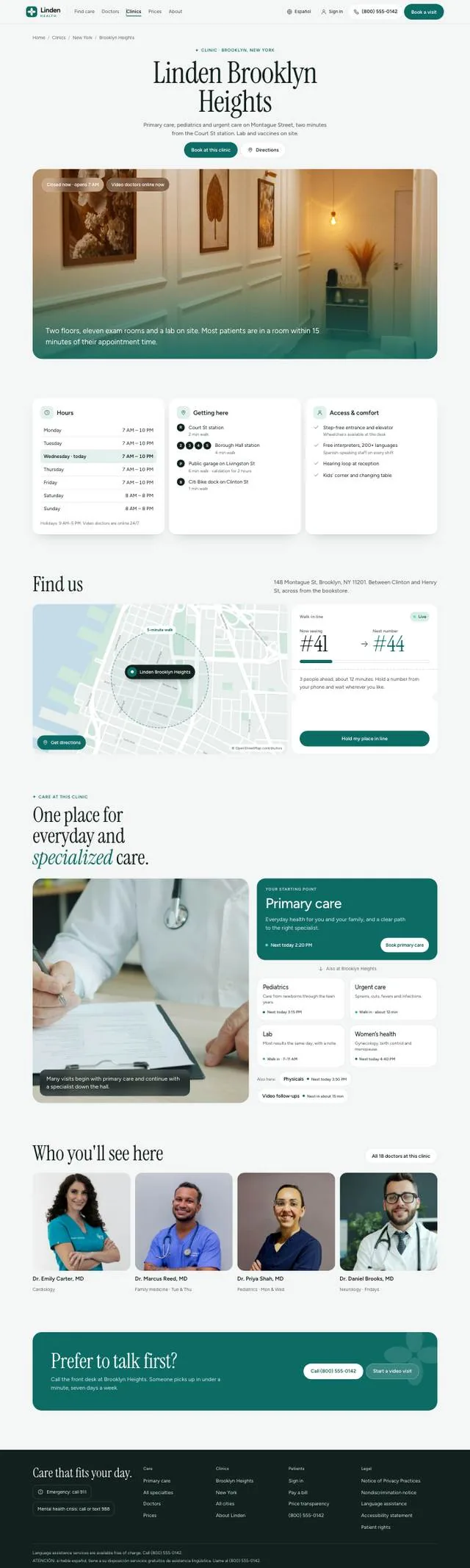
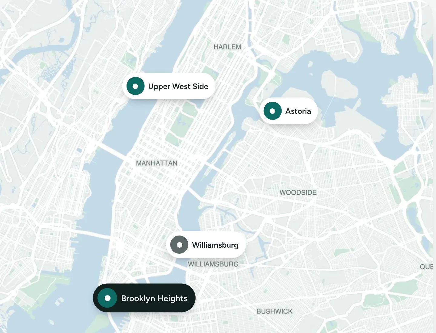
    Abstract blocks looked fake. Every map is rendered from OpenStreetMap data (streets, parks, rivers) in the Linden palette, with each clinic pinned at its real position.

    New York map with four Linden clinics pinned: Upper West Side, Astoria, Williamsburg, Brooklyn Heights
    City view · Clinics page
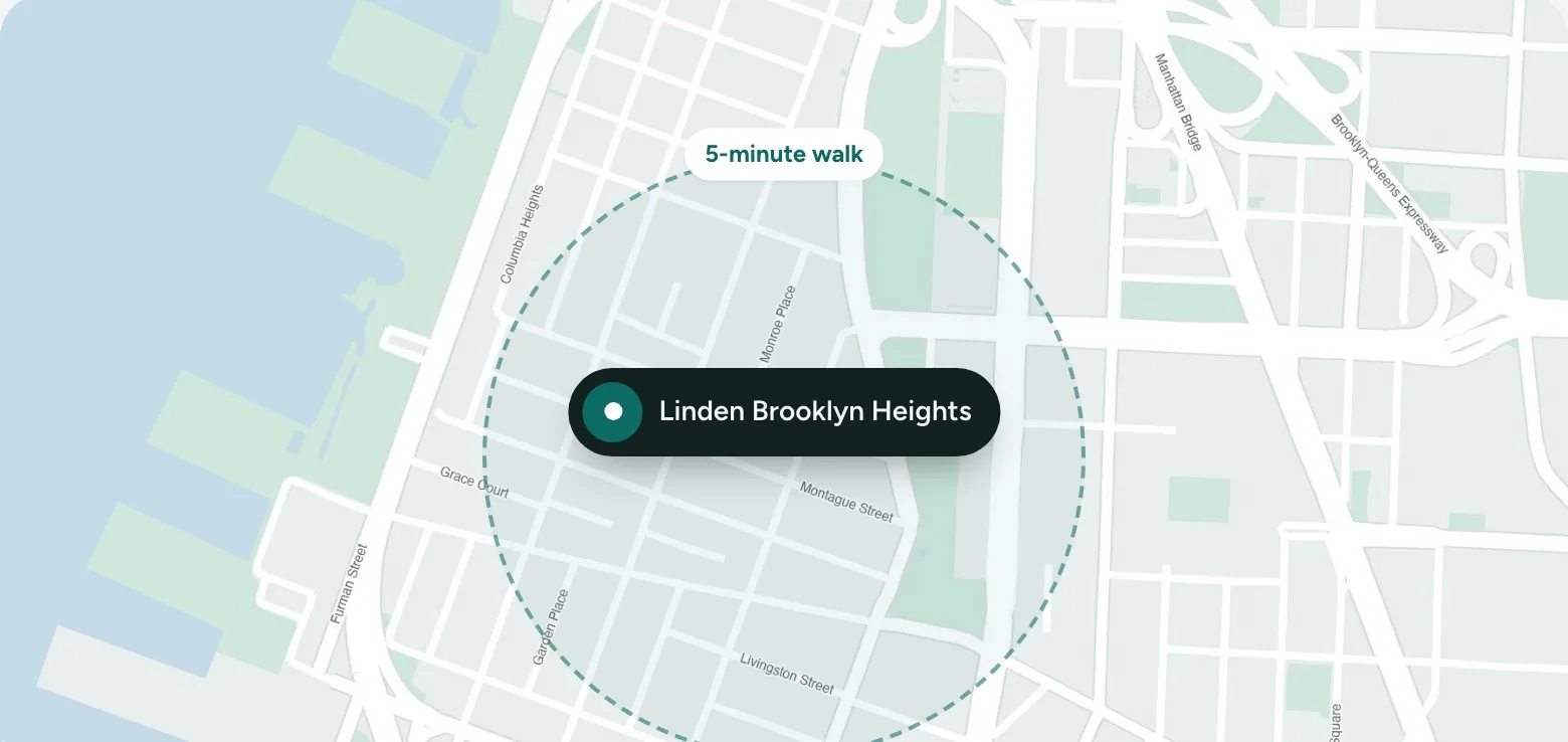
    Brooklyn Heights street map with the clinic and a 5-minute walk circle
    5-minute walk · Clinic page
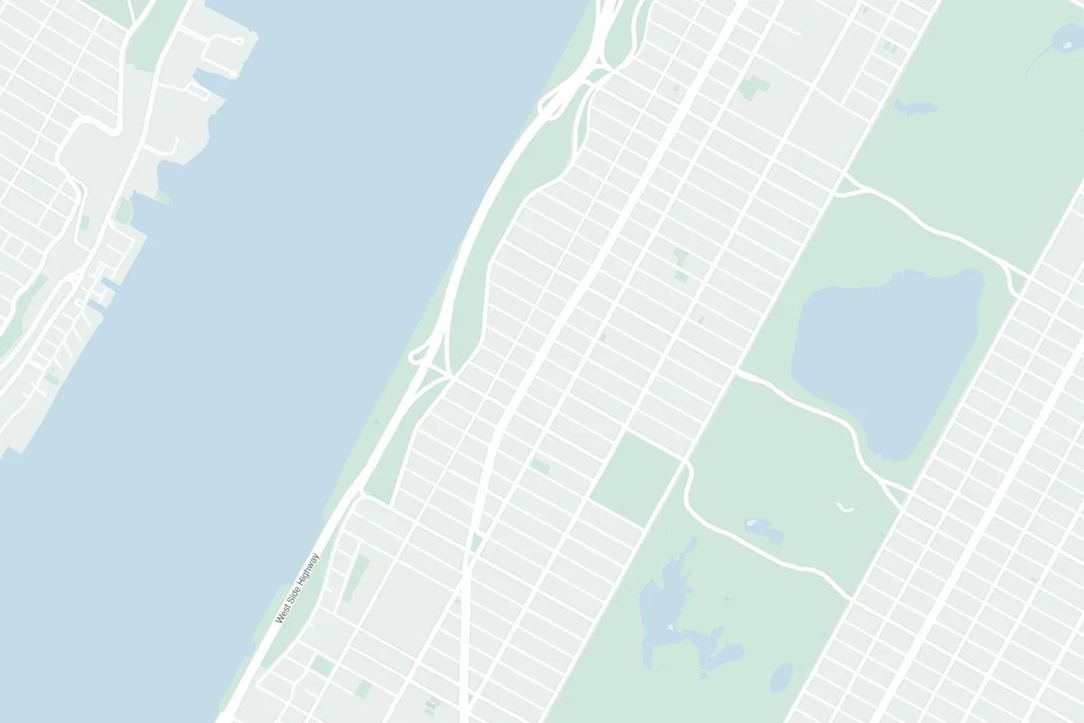
    Upper West Side street map
    Upper West Side
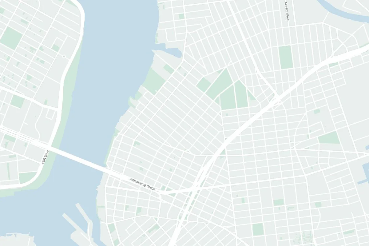
    Williamsburg street map
    Williamsburg
    Mobile

    Built for the phone in one hand

    Most people look for a doctor on a phone, often while unwell. Every page works at 390 px with no sideways scroll.

    Book button always on screenBooking opens as a bottom sheetFilters scroll sidewaysTap targets 44 px and upEnglish · Español
    Home
    Primary care
    Doctors
    Clinics
    A clinic
    Prices
    About
    Visual system

    Calm, clinical, still human

    People open a clinic site when they're worried. The system's job is to lower the pulse: soft surfaces, one strong colour for action, and red held back for real emergencies. Everything is built from tokens, so light and dark themes come from the same file.

    Type scale
    See the right doctorDisplay · Instrument Serif · 96 / 0.96
    Need a doctor today?Section · Instrument Serif · 64 / 1.02
    Sick visit · Same dayCard title · Figtree 600 · 19
    Tap a time to book it, or see a doctor by video in about 15 minutes.Body · Figtree 400 · 17 / 1.55
    PRICES & INSURANCELabel · Figtree 600 · 13 · +8% tracking

    Two families, clear roles. The serif carries emotion in headlines only; every price, time and button is in Figtree, which keeps numbers easy to scan.

    Why these fontsAa
    • Instrument Serif feels like a neighbourhood practice, not a hospital chain.
    • Figtree has open shapes and tabular figures: $129 and 2:20 PM line up in lists.
    • Headlines are never under 32 px, so the thin serif stays readable.
    Colour has a job
    Linden#0D6B66 · buttons, links, selected6.3 : 1 with white
    Ink#12201E · text, dark cards15.4 : 1 on page
    Wash#E3F0ED · calm panelsbackground only
    Mint#D8EEE7 · Free, covered, open now7.2 : 1 with its ink
    Sky#E4EDF7 · video visits7.7 : 1 with its ink
    Amber#FFF1D6 · waitlist, heads-up6.7 : 1 with its ink
    Urgent#B42318 · chest pain, call 9116.6 : 1 with white
    Dark theme · same names, new values

    Each colour means one thing everywhere. Mint is always good news, Sky is always video, and red appears only where someone may need emergency care. Every text pair passes WCAG AA in both themes.

    Components and states
    Buttons
    Book a visitBook this visitDirectionsCall 911
    Toggle · one choice flips the whole list
    Self-payWith insurance
    Time slots · the main booking control
    2:20 PMBrooklyn Heights3:40 PMSelectedVideo, nowAbout 15 min
    Search field
    What do you need help with?Symptom, specialty or doctor
    Tags · exceptions only
    FreeVideo visitsNew patients: waitlist
    Price row
    Sick visitPrimary care · 25 min
    $25instead of $129

    Every component is built from the same tokens and shows a visible focus ring for keyboard users. Slots and toggles are the controls people touch most, so they get the biggest targets.

    Shape and space
    Pill · actions
    22 · cards
    14 · slots

    Rounded, soft shapes and a 4 px spacing step. Tap targets are 44 px and up, and sections breathe with 64 to 120 px between them.

    Five rules the whole site follows
    1. Free means Free.A zero price reads like a mistake. Covered care says Free; ranges say Up to $15.
    2. One tag per fact.Tags mark exceptions. If every doctor takes insurance, no card says so.
    3. Red means urgent.Never used for sales or decoration, so it keeps its weight.
    4. Each photo once.No photo repeats across pages; no needles, blood or scary scenes.
    5. Real places.Maps come from real streets, so clinics feel like somewhere you can walk to.
    Iterations

    What changed on the way

    Every round was checked against Nielsen's heuristics and on a real phone width.

    Yellow accent, generic nameLinden, in medical green

    A name that sounds like a neighbourhood, colours that feel like care.

    Hero photo of a cityA doctor with a patient

    In one second you know it's a clinic.

    Grey boxes as a mapReal OpenStreetMap streets

    Trust comes from details that look true.

    11 blocks on the homepage6 blocks, one path

    Prices, clinics and doctors got their own pages.

    Tags repeating each otherOne tag per fact

    “Video visits” and “Online” said the same thing. One stayed.

    Blood-draw stock photosCalm lab photos

    Nothing that makes an anxious patient close the tab.

    Linden Health, its clinics and doctors are fictional. Prices and reviews in the screens are mock data. Photos: Unsplash License. Maps: © OpenStreetMap contributors, rendered for this project.
    CASE · REGULATED FINTECH · CRYPTO + IBAN LEAD UX/UI · FIGMA NIKO TECHNOLOGIES · 2024 →

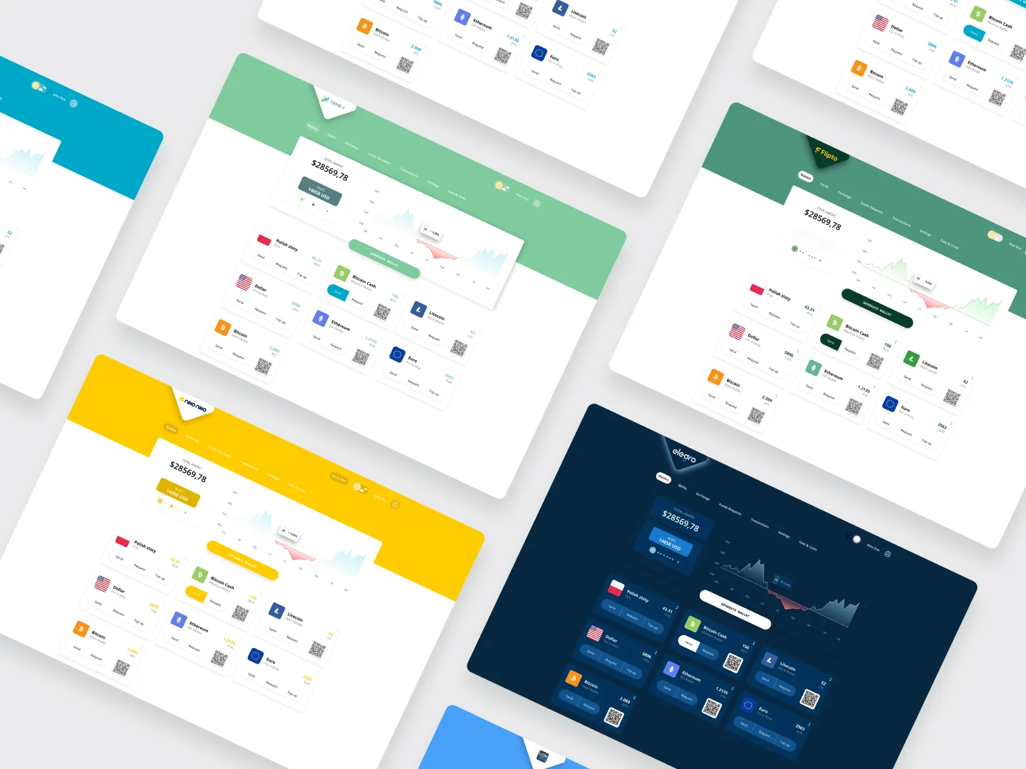
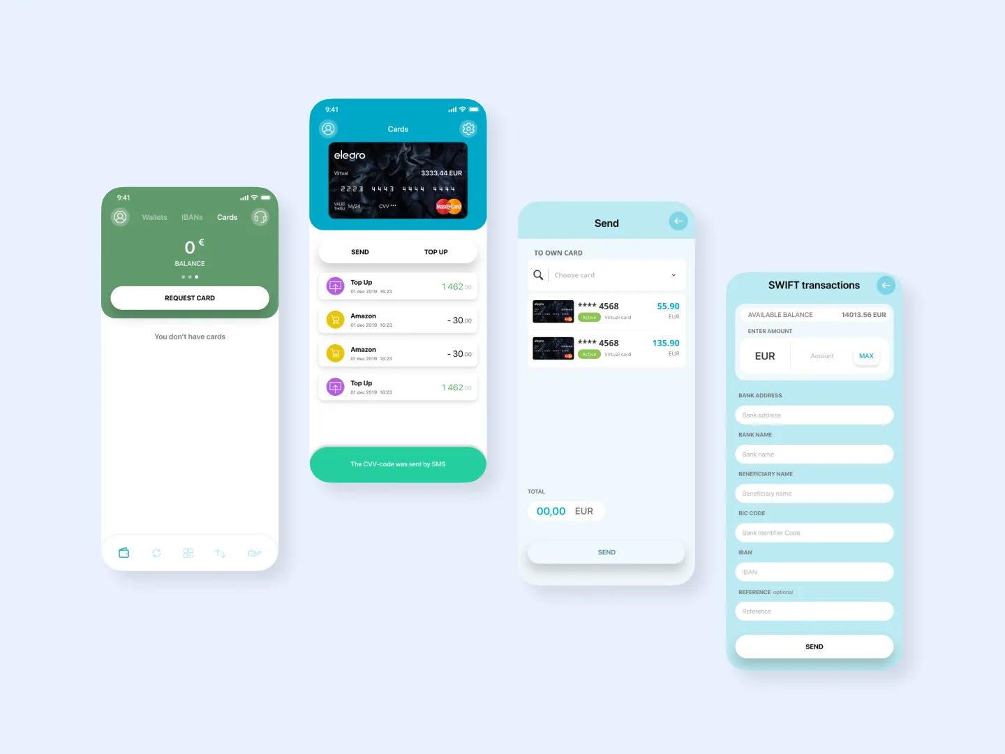
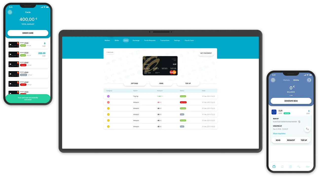
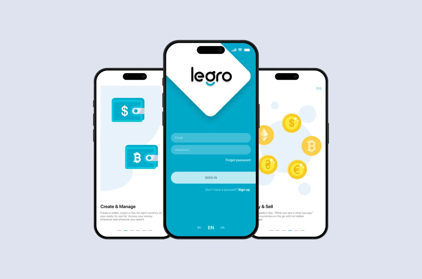
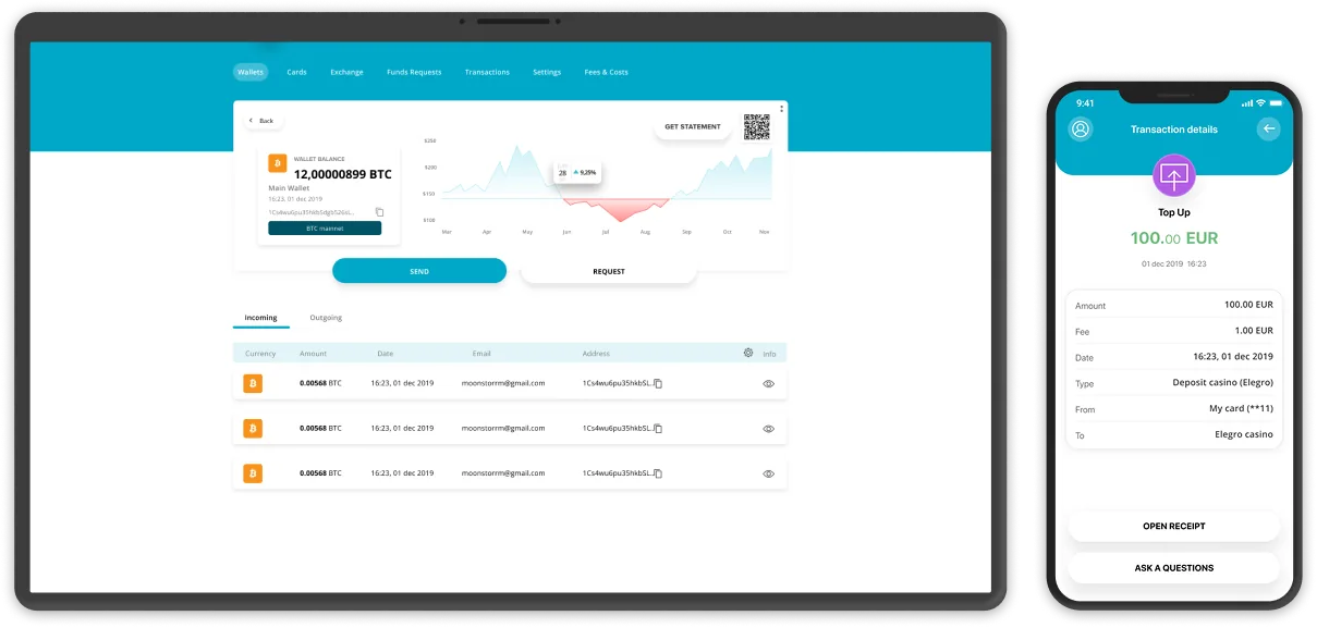
    Lead designer on a live, licensed European crypto payment platform — ongoing since 2024. A dedicated-IBAN and crypto-acceptance product: businesses hold a European IBAN, transact fiat 24/7, and accept crypto online and in person. Design system, merchant dashboard, checkout, mobile wallet, onboarding / KYB, error library, and analytics — plus 6+ white-label versions for partners.

    ◆ BUILT FULLY IN FIGMA

    Design-led · ongoing engagement

    I own the product surface in Figma; an in-house team builds from it.

    This is a standing seat at the design table, not a one-shot redesign. I hold the entire product surface as a token-based system in Figma, and the in-house engineering team builds from it. It predates my Claude Code workflow — this is where I do regulated-fintech product design through a classic designer-to-engineering loop, on a product that's been in production the whole time.

    The brief

    A licensed European payment platform that bridges traditional banking and crypto: a dedicated business IBAN for fiat (SEPA, SWIFT, mass payments) alongside a gateway to accept crypto online, in-store, and via a payment terminal. The bar was the trust quality of a regulated bank, for a product moving real money across 50+ countries — and it has to convince a merchant's compliance team as much as the merchant.

    Every screen serves two readers at once: the merchant moving fast through a daily flow, and the compliance reviewer who has to be able to audit it later. The design's job is to keep both of them satisfied on the same surface — no quiet trade-offs.

    Payment gateway — checkout desktop flow

    Visual direction — a token-based design system

    Designed entirely in Figma on a token-based system built for the product — colour, type, spacing, radii, elevation, motion. One component library shared across the IBAN / business wallet, the crypto-acceptance gateway, checkout, and onboarding, so every surface starts from the same vocabulary.

    The visual register is deliberately restrained, appropriate to a regulated-fintech context: a calm, bank-grade palette, clear hierarchy, and no decorative elements drawn from speculative crypto culture. In this category, looking trustworthy is a feature — a 5AMLD / GDPR-compliant product has to feel as safe as it is.

    Payment gateway — design system tokens + components

    Built to scale — 6+ white-label versions.

    The system wasn't designed for one brand. From the same token base and component library I produced 6+ white-label versions for partners — each re-skinned through tokens (colour, type, logo) without forking the design or the flows. A new partner brand is a token swap, not a redesign, which is what made shipping that many viable.

    Merchant dashboard

    Balances across fiat and crypto, transactions, payouts, mass payments, and team access — a lot of data fighting for one screen. I led with the two questions a business actually asks daily — how much do I hold, and what's moving — and pushed the rest behind progressive disclosure, so the dashboard reads as a control surface, not a spreadsheet.

    Payment gateway — merchant dashboard transactions + payouts

    Mobile wallet & checkout

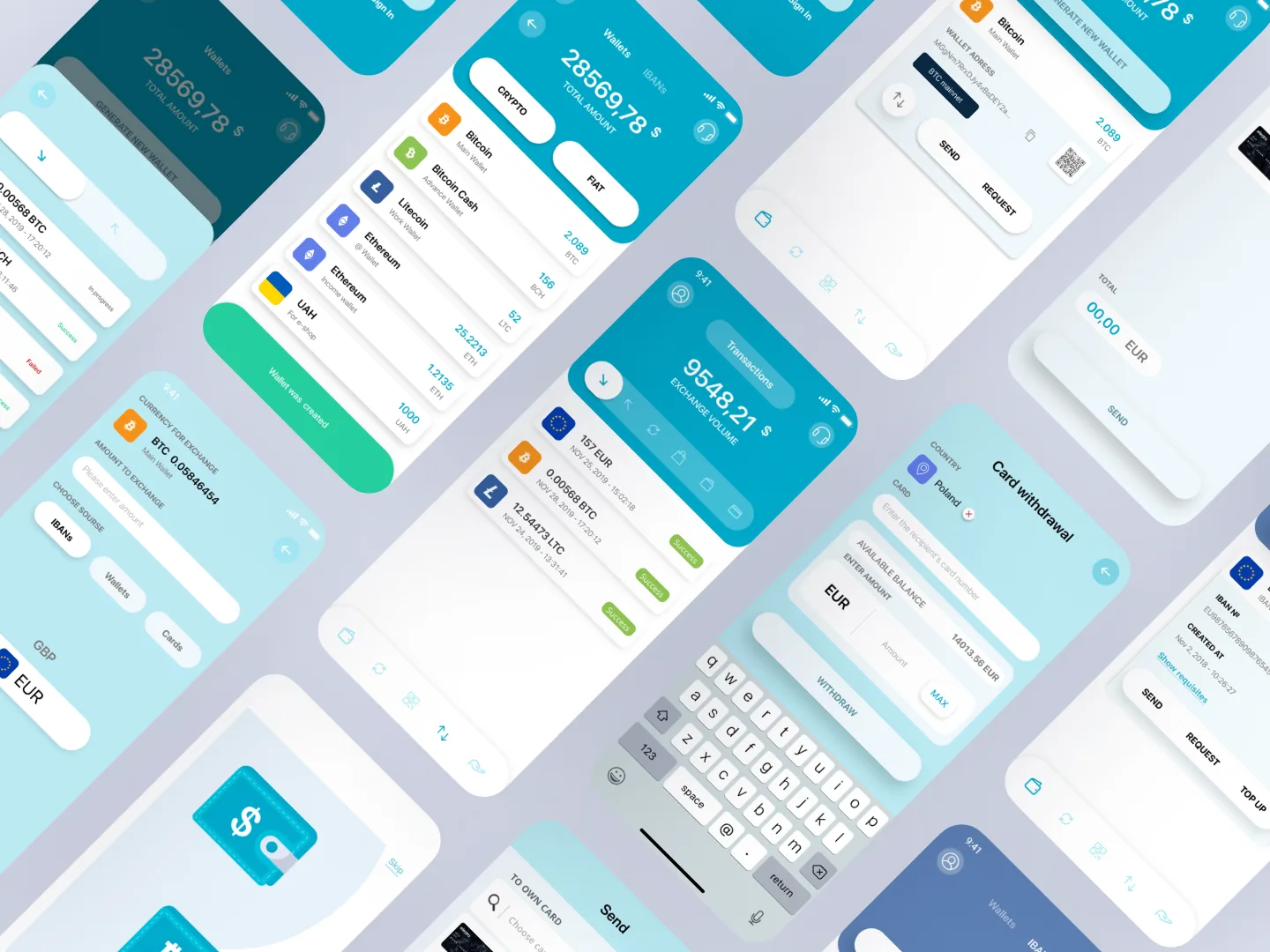
    A mobile wallet for fiat and crypto, designed for a thumb: large numeric input, one purpose per screen, top-up via SEPA / SWIFT / card, and balance and transaction history a glance away. Currency and network selectors collapse where the choice is predictable and expand where it isn't — the user never sees a decision they don't need to make. Every failure mode is named and given a next move.

    Payment gateway — mobile wallet + checkout

    Onboarding · KYB

    Business onboarding and KYB split into discrete, save-able stages so a compliance team can review without losing context, with real-time KYC built in. Each stage states what it needs up front — nothing surprises the merchant mid-flow.

    Payment gateway — KYB onboarding flow

    The ongoing engagement.

    Not a one-shot redesign — a standing seat, working in phases:

    PHASES
    PHASE 1

    Audit + checkout

    Reworked the conversion surface first.

    PHASE 2

    Merchant dashboard

    The operator's home, rebuilt around the daily questions.

    PHASE 3

    Mobile + errors

    Thumb-first wallet and checkout, with the error library as a first-class deliverable.

    PHASE 4 →

    White-label + new features

    6+ partner skins, plus reports, exports, and the steady stream of new features. Ongoing.

    How the work happens.

    Figma is the source of truth. A weekly working session with the founding engineer, a Figma branch per epic, and tokens exported as a shared file so spacing and colour never drift between design and front-end — across every white-label brand. Every flow ships with an annotated states sheet — loading, success, and every failure mode catalogued into the error library. When a design issue surfaces in production, it routes through me: I file the fix in Figma and walk it through review.

    Outcomes.

    No vanity numbers — the platform is live, regulated, and in production today, serving businesses across 50+ countries with the design system behind it. Concretely:

    SYSTEM

    A token-based system that scaled to 6+ white-label partner products without a redesign.

    ONBOARDING

    KYB onboarding split into reviewable stages, cutting completion friction sharply.

    DASHBOARD

    Built around the operator's real daily questions — fiat + crypto balances, transactions, payouts above the fold.

    MOBILE

    Thumb-first wallet where every error state is named and given a next move.

    I owned
    All design decisions across the business wallet, crypto-acceptance gateway, checkout, dashboard, onboarding, mobile, errors, and analytics. The token-based design system, the 6+ white-label themes, and documented state sheets for every flow. Production design-QA and bug triage, plus the weekly working sessions with engineering.
    Engineering
    The in-house team builds from my Figma; tokens hand off as a defined export. I own everything up to the hand-off and the design-side QA after it.

    What an ongoing engagement teaches.

    TOKENS EARN THEIR KEEP AT WHITE-LABEL SCALE

    Six partner brands from one component library only works because every decision was a token, not a one-off — the second brand is where that discipline pays for itself.

    ERROR LIBRARY IS FIRST-CLASS

    "What happens when this fails" is half the design work in regulated payments, and it's almost never anyone's first priority.

    DON'T COMBINE PHASES

    Don't redesign the dashboard and the checkout in the same phase. They share complaints but not priorities; splitting them made everything faster.

    CASE · DEFI · 5-SERVICE PLATFORM LEAD UX/UI · FIGMA OMNISOFT · SAUDI ARABIA · 2023

    A five-service DeFi platform for a Saudi Arabian startup — decentralized exchange, NFT marketplace, launchpad, liquidity pools, and yield farming. Designed end-to-end in Figma at OmniSoft, on a design system built from scratch for the platform.

    ◆ BUILT FULLY IN FIGMA

    External case · OmniSoft

    Design-led, Figma source of truth, engineered by a dedicated team.

    This was a real client product, designed 100% in Figma: every screen, every state, and a bespoke design system built specifically for it. A 16-person OmniSoft engineering team built it from my Figma — smart contracts in Solidity (Ethereum + BSC), a React + Redux Toolkit front-end, Node + Express, MongoDB for off-chain state. It predates my Claude Code workflow; it's where I designed a full DeFi platform from zero and ran it through a classic designer-to-engineering loop.

    The brief

    A Saudi DeFi startup's flagship platform — five services on one chain: DEX, NFT marketplace, launchpad, liquidity pools, and yield farming. The bar: the trade quality of an established DEX without the Web3-bro aesthetic. Calm, legible, and trustworthy enough to move real money through.

    Five services under one brand is a coherence problem before it's a screen problem — each tool needs its own surface language so a liquidity pool never reads like an NFT listing, while still feeling like one product.

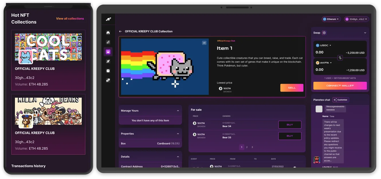
    DexPlanet — DEX trading UI

    Visual direction — a design system built from scratch

    The whole platform was designed in Figma on a system I built from zero for this product: colour and type tokens, a charting and data-table kit, transaction-state components, and a shared wallet / network shell. Five services, one brand, each with its own register — but every surface starts from the same vocabulary.

    DexPlanet — design system tokens + components

    DEX — the swap surface

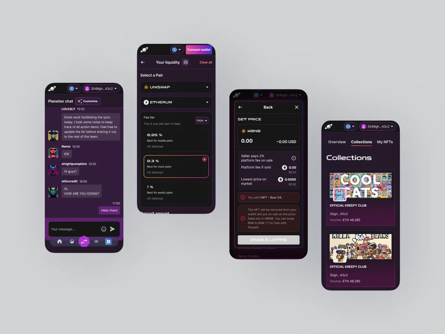
    An AMM swap with price impact, slippage, and route preview surfaced before the user commits. The flow is wallet-first — nothing is interactive until you're connected, so there are no fictional "what if" states. Verified-token filtering is on by default, which keeps scam tokens out of the happy path without the user having to think about it.

    DexPlanet — DEX swap + wallet connect

    NFT marketplace

    Browse, list, buy, place offers. The listing flow names the gas cost up front and asks for approval in a single sentence — no surprise wallet pop-ups mid-flow. A first-time buyer can finish a purchase without leaving for docs.

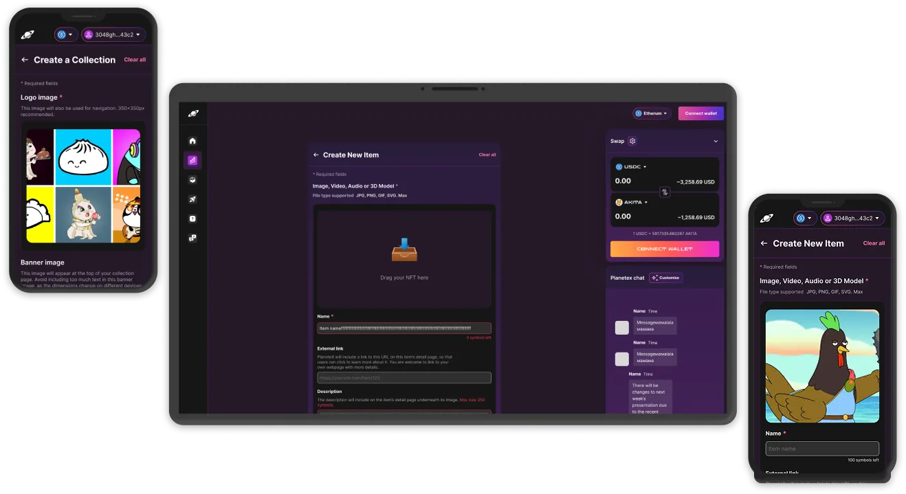
    DexPlanet — NFT marketplace browse + detail

    Launchpad · IDO & vesting

    IDO presales with vesting shown as a real schedule, not a paragraph of legalese. Allocation, claim status, and KYC-gating split into clear steps. The launchpad needed its own component vocabulary — once it had one, the whole flow got clearer.

    DexPlanet — launchpad IDO + vesting schedule

    Six months, four phases.

    Phased rollout — the goal was early revenue from the first surfaces before the whole platform was finished:

    PHASES
    PHASE 1

    Foundation

    Research and competitor audit across the major DEXes and NFT marketplaces. Brand and design system. The wallet-connect flow designed first — everything depends on it.

    PHASE 2

    DEX + NFT

    The two revenue-bearing services first: swap flow, pool browser, NFT listing and detail. Hand-off to engineering in parallel, so the first surfaces were in users' hands early.

    PHASE 3

    Pools + farming

    Liquidity surfaces, the farming dashboard, an impermanent-loss explainer, and the wallet drawer covering every failure mode of the contract layer.

    PHASE 4

    Launchpad + polish

    IDO presales, vesting, KYC-gating, a cross-service activity feed, and a final design-system pass before MVP launch.

    Designed against the chain, not around it.

    Figma was the source of truth, but every design review involved a smart-contract engineer. Gas estimation, transaction states, and approval flows were designed against the actual on-chain shape — not a wishful version of it — so nothing needed redesigning once the contracts landed.

    Outcomes.

    Real numbers from a real client, recorded in the OmniSoft public case study:

    $200K
    Client funding raised
    5
    Services in one platform
    6 mo
    To MVP
    Phased
    Revenue before full launch

    Shipping the DEX and NFT marketplace ahead of the rest put the product in front of real users — and real revenue — months before the launchpad and farming arrived, and that early traction supported the funding round. For the end user: five services that feel like one product, with one wallet connection, one transaction feed, and one design language. A non-degen visitor can complete a swap or a listing without leaving for documentation.

    I owned
    Research, competitor audit, brand, and a design system built from scratch in Figma. All five service interfaces, the shared wallet / network shell, mobile flows, and every transaction-state sheet. Figma was the single source of truth, and I ran design-side QA against the live build through the launchpad round. The OmniSoft team implemented everything from it.

    What six months taught me.

    DESIGN THE WALLET-CONNECT FLOW FIRST

    Every later screen then sat on a real connection state — no fictional "what if it connected" frames floating around.

    DON'T OVER-DESIGN THE EXPLAINER

    My v1 impermanent-loss explainer was three paragraphs where one number and one sentence did the job. The first user test cut it down.

    CASE · WEB3 · DEX + DEFI LEAD UX/UI · FIGMA OMISOFT · 2023

    A decentralized exchange that lets users swap tokens, manage liquidity pools, and earn rewards on farming. I led the UI/UX design at OmiSoft. MVP shipped in 4 months, with farming, governance DAO, bridge, and vesting added in the following 2 months.

    ◆ BUILT FULLY IN FIGMA

    01 · HERO upload

    External case · OmiSoft

    I led the UI/UX design end-to-end in Figma. OmiSoft's engineering team built the product from it.

    I designed the full product surface in Figma at OmiSoft: the swap, liquidity, farming, DAO, bridge, and vesting interfaces. The engineering team built it on the Venom blockchain with Tor integrated at the network layer for privacy, and AWS for uptime. This engagement predates my Claude Code workflow — classic designer-to-engineering loop, Figma as the source of truth.

    The brief

    A PancakeSwap-style decentralized exchange built to become a competitor at a smart price. The product had to support token swaps, liquidity provision, and farming rewards, with Tor and AWS implementation for privacy and reliability.

    The team started with a comprehensive evaluation of existing open-source DEX projects to identify best practices, avoid common issues, and tailor the solution to the client's strategic goals.

    02 · BRIEF upload

    MVP — Swap, Liquidity Provider, Chrome wallet

    Within four months, OmiSoft delivered an MVP including the essential DEX features: a Chrome wallet extension, a Swap tool for token trades, and a Liquidity Provider function. This allowed for early market entry and user testing.

    03 · MVP · SWAP + LIQUIDITY upload

    Tor integration — privacy at the network layer

    The team successfully integrated the Tor network into the platform. This ensured user anonymity without compromising system performance, addressing both the security and usability requirements from the client.

    04 · TOR INTEGRATION upload

    Feature expansion — Farming, DAO, Bridge, Vesting

    After MVP delivery, two additional months were spent implementing advanced features: token farming, a governance DAO, a network Bridge for interoperability, and a Vesting mechanism to manage token distribution transparently.

    05 · FARMING + DAO + BRIDGE + VESTING upload

    Six months, two waves.

    PHASES
    MONTHS 1–4

    MVP

    Open-source DEX evaluation, Chrome wallet extension, Swap tool, Liquidity Provider, Tor integration. Hosted on AWS.

    MONTHS 5–6

    Feature expansion

    Token farming, governance DAO, network Bridge, and Vesting mechanism. Full feature set live.

    Outcomes.

    Recorded in the OmiSoft public case study:

    200K+
    Unique monthly users
    99.95%
    Uptime on AWS
    6 mo
    MVP to full platform
    Broxus
    Ecosystem-based DeFi

    A PancakeSwap-like set of services shipped as a fully functioning Broxus ecosystem-based DeFi platform. The MVP delivery in four months put the product in front of users early; the additional two months expanded it into a complete platform. Over 200,000 unique monthly users, 99.95% uptime, six months end-to-end.

    I owned
    All UI/UX design across swap, liquidity, farming, DAO, bridge, and vesting. Figma was the source of truth, handed to the OmiSoft engineering team for implementation. Design-side QA against the live build through public launch.
    CASE · WEB3 · DEX AGGREGATOR LEAD UX/UI · FIGMA OMISOFT · US CLIENT · 2023

    A white-label DEX aggregator for a US-based blockchain startup. Enables users to access optimal token swap rates across Ethereum, BSC, Polygon, and Optimism. I led the UI/UX design at OmiSoft; the engineering team integrated 90+ liquidity sources and built the React Native mobile app.

    ◆ BUILT FULLY IN FIGMA

    01 · HERO upload

    External case · OmiSoft

    I led the UI/UX design end-to-end in Figma. OmiSoft's engineering team built the React Native app from it.

    I designed the full product surface in Figma at OmiSoft. The engineering team implemented it with a Dijkstra-based routing algorithm, multi-wallet SDK integration, and a real-time aggregation engine across four major blockchain networks. The product is in MVP Agile phase. This engagement predates my Claude Code workflow — classic designer-to-engineering loop, Figma as the source of truth.

    The brief

    A US-based blockchain startup building a white-label DEX aggregator application that enables users to access optimal token swap rates across multiple blockchain networks, including Ethereum, BSC, Polygon, and Optimism.

    The primary challenge involved integrating various liquidity providers and delivering accurate real-time exchange rates within a highly volatile DeFi environment, while ensuring secure and seamless mobile wallet integration.

    02 · BRIEF upload

    Smart swap path optimisation

    The team implemented a custom algorithm based on Dijkstra's method to identify the most efficient token swap routes, significantly improving transaction speed and reducing slippage.

    03 · SWAP PATH upload

    Integration with 90+ liquidity sources

    The team integrated over 90 liquidity sources, including Uniswap, Curve, and Balancer, ensuring deep liquidity and competitive rates across multiple blockchains.

    04 · LIQUIDITY SOURCES upload

    Real-time pricing & aggregation engine

    A robust data retrieval system that aggregates and processes real-time exchange rate data from decentralized sources, guaranteeing accurate and timely price updates within a volatile DeFi environment.

    05 · REAL-TIME PRICING upload

    Secure multi-wallet integration for mobile

    With React Native and modern SDKs, the team enabled smooth and secure integration with leading crypto wallets, providing users with a frictionless mobile trading experience.

    06 · MOBILE · WALLET INTEGRATION upload

    Business results.

    From the OmiSoft public case study:

    EARLY INVESTMENT

    $50,000 in early investment secured.

    CROSS-CHAIN ACCESS

    Cross-chain liquidity access across 4 major networks (Ethereum, BSC, Polygon, Optimism).

    SECURITY + TRUST

    Enhanced security and user trust through multi-wallet integration.

    SWAP EFFICIENCY

    Improved swap efficiency and user retention via Dijkstra-based routing.

    The project is in MVP Agile phase — OmiSoft continues to work on the MVP release.

    I owned
    All UI/UX design across the white-label DEX aggregator — swap, liquidity sources, real-time pricing, and multi-wallet mobile integration. Figma was the source of truth; the OmiSoft team implemented from it. Design-side QA through MVP.
    TEMPLATE B · PRODUCT SURGERY FINTECH · CARD MANAGEMENT SOLE DESIGNER · FEATURE LEAD 2023 →

    Joined a live fintech product as the sole designer. Built a design system where none existed, then owned the design of every new feature shipped after that.

    The brief

    I joined a working fintech product — customers in market, but no design system, no consistency, and no one owning the visual language. The brief was simple in scope and large in practice: be the design hand on every new feature, and quietly build the system that should have been there from day one.

    02 · MARKETING HOMEPAGE upload

    Visual direction · trust in the small things

    Calm, regulated-fintech surface. Restrained type, predictable spacing, no decorative motion. The bar is "a finance team would trust this." Visual ambition lives in the details — table density, status pills, the way an error state offers the next action instead of just turning red.

    03 · DESIGN SYSTEM · TOKENS + COMPONENTS upload
    STACK
    Figma Design system (built by me) Hand-off to in-house engineering

    Design-only role; engineering is in-house. The design system lives in Figma with tokens exported to a shared format for the front-end team. This engagement predates my Claude Code workflow.

    A design system, built in flight

    No tokens, no shared components, no spacing scale when I arrived. I started with colour and type, then spacing and radii, then a component library engineering could lift from cleanly — built while features kept shipping. The system grew next to the work, not before it, so every component proved itself in production before it became canonical.

    04 · DASHBOARD · OVERVIEW + CARD MANAGEMENT upload

    Feature design, owned end-to-end

    Every new feature on the dashboard and marketing site came through me — transactions, card management, support flows, settings, KYC. The boring middle (empty states, loading patterns, edge cases) got the same care as the headline screens, because in fintech that's where trust is won or lost.

    05 · TRANSACTIONS + KYC FLOW upload

    State sheets per flow

    For every flow I shipped, an annotated states sheet sat next to the happy path — loading, empty, error, partial. Engineering stopped asking "what happens when this fails?" because the answer was already in Figma. It's the deliverable I'm most proud of here, and the one that made edge-state support tickets go quiet.

    06 · STATE SHEETS · LOADING + EMPTY + ERROR upload

    How the engagement runs.

    Not a discrete project — a long-running design seat. Phases shown by what shipped, not by calendar.

    PHASES
    PHASE 1

    Audit + system foundations

    Audited the live product. Identified the worst inconsistencies. Drafted color, type, spacing, and radius tokens. First three shared components — button, input, status pill — replaced the worst offenders.

    PHASE 2

    System grows with features

    Every new feature added one or two components to the library. Component spec lives next to the feature spec; both go to engineering together.

    PHASE 3

    Marketing site refresh

    Brought the public site into the same visual language as the dashboard. Single source of truth for color and type across both surfaces.

    PHASE 4 →

    Ongoing

    Continuing feature design. Periodic audits against the system. Small consistency passes on legacy screens as adjacent features touch them.

    How the work happens.

    Classic designer / engineering loop, done well. Figma is the source of truth — features ship as branches off the main file and merge once live, tokens shared as JSON. Every flow ships with an annotated states sheet so engineering never has to guess what an empty list or a failed payment should look like.

    Outcomes.

    Quiet results, the kind that don't show up in launch posts. A more coherent product, month by month.

    SYSTEM

    A working design system where there was none. Tokens, components, state sheets. New designers and engineers onboard onto a shared vocabulary instead of having to read the whole product to learn its quirks.

    CONSISTENCY

    Legacy screens converge on the system as features touch them. No big-bang redesign, no marketing-driven brand shock — the product looks more like itself every quarter.

    VELOCITY

    Feature design starts from existing components. Engineering builds from the same library every time. Time spent on visual debate drops to near zero.

    CRAFT NOTES

    The state sheet pattern is the deliverable I'm most proud of here. Engineering never asks "what about empty / error / loading?" — the answer is always in the Figma file, next to the happy path.

    I own
    All design across the live product and marketing site. The design system, top to bottom. Feature design end-to-end. State sheets for every flow. Working sessions with engineering.
    Engineering
    In-house team. Builds from my Figma. Tokens shared as JSON. Bug triage on visual issues runs through me.
    Note on workflow
    This engagement predates Claude Code in my practice. Newer projects in this portfolio (Veyrun, Rivel, Knowlio, Hush) use the paired workflow.

    What a long engagement teaches.

    WORKED

    Growing the design system inside features, not as a separate "system project." Every component proved itself in production before it became canonical. No unused parts.

    WORKED

    State sheets next to every flow. Engineering stopped asking "what happens when this fails." Support tickets about edge-state bugs went quiet.

    DIDN'T

    Trying to align legacy screens in one big sweep. Slower and louder than a screen-by-screen consistency pass. Reverted to the steady-state approach after the first attempt.

    DIDN'T

    Documenting components only after they shipped. Now I write the spec next to the Figma frame as part of design, not after — engineering uses it the same week.

    CASE · UX RESEARCH HYPOTHESIS-DRIVEN PROJECTOR INSTITUTE · 2024

    Hypothesis-driven UX research on Rork, a Ukrainian reading and book-notes app. The question: why free readers don't convert to paid, and what would move conversion and retention. 14 user interviews, 6 hypotheses, 4 prototyped solutions, 2 rounds of testing.
    ROLE
    UX researcher
    TEAM
    4-person design team
    PROGRAMME
    Projector Institute · Product Design
    YEAR
    2024
    01 · BACKGROUND

    Rork — a Ukrainian reading and book-notes app.

    A mobile product where readers track what they read, take notes, and join reading challenges. The product has a free tier and a paid premium tier.

    02 · PROBLEM

    Too few free readers convert. Engagement drops off.

    Rork converts too few free readers into paying subscribers, and engagement drops off over time. The brief wasn't "redesign the app" — it was to find out why, and to test specific interventions against real users before recommending anything to the product team.

    03 · GOAL

    Find the cause. Test the intervention. Hand back a roadmap.

    Surface the real conversion and retention blockers through interviews, frame them as falsifiable hypotheses, prototype the proposed solutions, and validate them with users — twice — before recommending anything.

    04 · APPROACH

    Interviews → hypotheses → prototypes → testing → recommendations.

    This is the product-thinking layer of how I work — framing the problem and testing the assumption before committing to a design. Every hypothesis was tied to a testable claim, a prototype, an expected result, and a clear criterion for being wrong.

    05 · Research

    Hypothesis-driven, two rounds. I ran 14 interviews — 9 with active Rork users — to surface where the product lost people. Each finding became a hypothesis written in if / then / validated-if form, so a prototype could prove or kill it rather than just look nice. Six hypotheses consolidated into four prototyped solutions, each tested across two rounds.

    Rork — research scope: 14 interviews, 9 with Rork users
    06 · HYPOTHESES

    Six hypotheses, each falsifiable.

    Each hypothesis written as because / if we / then users will / we're right if — the validation criterion fixed before testing, so a result couldn't be rationalised after the fact.

    Because… If we… Then users will… We're right if…
    Users don't see the value in paying for premiumlet them try the paid version free for a weekfeel the value and not want to lose itpremium subscriptions increase
    Users lack motivation and connection around interestsadd interest-based groupsfind like-minded readersretention increases
    Challenge conditions don't suit userslet them create custom challengesbuild challenges around their own goalschallenge participation increases
    Users have no way to share insights from bookslet them create and share notes and quotesshare insights in groups and sociallysession length increases
    Users lack reading recommendationsadd an interests survey during onboardingget more personalised recommendationsusers engage with recommended books
    Users don't know premium exists or what it doessurface premium and its benefits in onboardingunderstand premium and its valuepremium subscriptions increase
    07 · PROTOTYPED SOLUTIONS

    Six hypotheses → four prototypes.

    Three of the six hypotheses converged into one onboarding prototype; the other three each got their own.

    Onboarding — premium awareness + free trial

    A single onboarding prototype carried three hypotheses at once: surfacing premium and its benefits, offering a free trial, and an interests survey feeding recommendations. The point was to test whether awareness (not price) was the conversion blocker.

    Rork — onboarding prototype

    Interest-based groups

    Groups built around reading interests rather than generic social feeds — testing whether connection, not features, was what kept readers coming back.

    Rork — interest-based groups

    Sharing notes

    A flow to turn private book notes and quotes into something shareable, in-app and to social networks — testing whether giving readers a reason to come back out of the app would paradoxically increase time in it.

    Rork — sharing notes prototype

    Custom challenges

    Letting users define their own reading challenges instead of accepting fixed ones — testing whether participation was blocked by relevance, not motivation.

    Rork — custom challenges prototype
    08 · TESTING

    Two rounds, validation criteria fixed in advance.

    Each prototype went through two rounds of user testing, with the validation criterion decided before testing so a result couldn't be rationalised after the fact.

    09 · DELIVERABLES

    Tested recommendations + a documented roadmap.

    A set of opportunities surfaced in interviews that didn't fit the four tested solutions. Rather than drop them, I handed them to the product team as a documented roadmap — separating "tested and recommended" from "worth exploring," so the team knew which was which.

    10 · REFLECTIONS

    What this taught me.

    WRITE THE FAILURE CONDITION FIRST

    Deciding what result would prove a hypothesis wrong before testing kept me honest — it's the difference between research and looking for evidence I already wanted.

    AWARENESS MASQUERADES AS PRICING

    Several "users won't pay" assumptions turned out to be "users don't know what they'd be paying for."

    TALK TO USERS BEFORE PROTOTYPING

    The interviews reshaped which hypotheses were even worth building — the cheapest version of being wrong is being wrong in a conversation, not in a prototype.

    Curriculum vitae · updated 2026

    Anna Rogotska — AI product designer

    I design products and ship them myself: research and UI in Figma, production front-end with Claude Code.

    RoleProduct designer · design engineer
    Based inParis · UTC+1 · open to relocation
    Experience5+ years · 20+ products shipped
    AvailableProduct design roles · from 2026
    In numbersWhat I bring
    20+products shipped across AI, fintech, crypto and e-commerce
    2–3×faster delivery than a classic design-to-dev hand-off
    5+years designing web and mobile products
    ExperienceMost recent first
    • Aug 2023 — now
      Remote
      Senior UI/UX Designer · Niko Technologies
      • Lead UX/UI for AI products: chat interfaces, media generators, document assistants.
      • Shipped 20+ products end to end, Figma to deployed, incl. Veyrun, Rivel, Knowlio, Hush, Genly.
      • Built multi-brand design systems with tokens and white-label versions for partners.
    • Jan — May 2024
      Kyiv
      UX/UI Designer · Projector Institute
      • Full research-to-design cycle on live products Rork.ua and Vchasno.ua.
      • Interviews, hypothesis prioritisation, usability tests, stakeholder reviews.
    • Jan 2022 — Apr 2023
      Remote
      UI/UX Designer · OmiSoft
      • Led platform design of DexPlanet, a DeFi exchange on BNB Chain.
      • Swap flows, chat, side menu and responsive layouts; team of 2 designers, 6 devs, QA, PM.
    • 2020 — 2022
      Ukraine
      3D Artist · ARVI Lab, Polotno.pro
      • VR quest games in Unity and interactive architectural 3D for the web.
    Selected workAll projects →
    SkillsTools I use daily
    Design
    FigmaFigJamDesign systemsUX researchPrototypingUsability testing
    Front-end
    ReactNext.jsTypeScriptTailwind CSSFramer MotionPlaywright
    Back-end
    SupabasePostgresStripeVercelCloudflareGitHub ActionsSentry
    AI pairing
    Claude CodeClaude DesignAnthropic APIAgent SkillsCursor
    EducationAnd certificates
    • 2024
      Product Design Programme · Projector Institute, Kyiv
    • 2020 — 2022
      UI/UX practice · self-directed study and client work
    Open to roles · 2026

    I design products and build them.

    Product designer in Paris. I take a product from research to UI to a shipped front-end, without a hand-off.

    RoleProduct designer · design engineer
    Based inParis · UTC+1 · open to relocation
    Experience5+ years · 20+ products shipped
    AvailableProduct design roles · from 2026
    What I doThree things, end to end
    Product design

    Research, flows and UI for web and mobile products, from first sketch to tested prototype.

    Figma · research · testing
    Design systems

    Tokens, components and themes that keep a product consistent across brands and screens.

    Tokens · components · WCAG AA
    Front-end build

    I ship the designs myself in React and Next.js, paired with Claude Code, 2–3× faster than a hand-off.

    React · Next.js · Claude Code
    ToolkitWhat I reach for
    Design
    FigmaFigJamDesign systemsUX researchPrototypingUsability testing
    Front-end
    ReactNext.jsTypeScriptTailwind CSSFramer MotionPlaywright
    Back-end
    SupabasePostgresStripeVercelCloudflareGitHub ActionsSentry
    AI pairing
    Claude CodeClaude DesignAnthropic APIAgent SkillsCursor
    How I workFour principles
    1. Clarity beats cleverness.
    2. Ship to learn, not to launch.
    3. Systems over screens.
    4. No hand-off: the designer ships.
    ExperienceFull CV →
    • 2023 — now
      Senior UI/UX Designer · Niko Technologies

      AI products: chat, media generators, document assistants. 20+ products shipped.

    • 2024
      UX/UI Designer · Projector Institute

      Research-to-design programme on live products Rork and Vchasno.

    • 2022 — 2023
      UI/UX Designer · OmiSoft

      Led design of DexPlanet, a DeFi exchange on BNB Chain.

    • 2020 — 2022
      3D Artist · ARVI Lab, Polotno.pro

      VR games in Unity and interactive 3D for the web.

    CertificatesVerified where possible
    Quick answersAsked most often
    • Speed
      How fast can you ship?

      A landing or MVP front-end in 1–2 weeks. A full product MVP with auth, dashboard and design system in 4–6 weeks.

    • Team
      Alone or with a team?

      I lead the design end to end. On existing products I join your engineers; on new builds I lead the front-end too.

    Available · from 2026

    Let's talk.

    The quickest way is email. I reply within 24 hours, Paris time.

    Open toWhat I'm looking for
    Product designer

    In-house role on a live product, owning flows, UI and the design system.

    Remote or Paris
    Design engineer

    A role where I design and also ship the front-end in React and Next.js.

    Remote or Paris
    Project partnerships

    A focused build: MVP, landing or redesign, delivered end to end.

    1–6 weeks
    Helpful to includeSo I can reply with something useful
    • What the product is and who uses it
    • The team I'd work with and the role
    • Timeline, and a link if there is one
    ElsewhereOther ways in